Monthly Charts, Multi-Markets
We have not strolled down big picture lane for a while and some of what I see is pretty interesting. Some of it makes sense, some of it scares me.…
This man who is staring at you right now also stared at his charts and noted that the damage has been done to the stock market. “From a technical perspective,…
As I prepare for another disjointed day mostly away from my screen, let's take a look at the bigger view of some items. Dow has crashed all the way down…
Yet another post about why hype in markets can really hurt less experienced casino patrons who believe that experts exist in this realm. Was this pattern not hyped as the…
Time again for a rundown of the big picture macro, beginning with the 3 Amigos. Stocks vs. gold lurks beneath its likely limiter. Party on Garth until such time as…
Time once again for a review of the big picture, because... perspective. For example, in my mind I feel that training has been done to not expect a real whopper…
Sometimes I like to trot these lumbering monthlies out so we can quiet everything down and see where various markets are slowly heading. First of all, as I go down…
Every once in a while I like to trot out the monthlies so we can refresh the big picture view. So, here they are on a few varied items. The…
The S&P 500's 'Trump Trade' is still intact per a chart guy actually worth listening to, Rich Ross, who I met 7 years ago when he worked at the firm…
I had to add all the !!!!! because as in the mainstream media, this little outpost wants to get your attention and get you all riled up. Here's the headline…
Just a few of the many charts I am trying to keep an eye on (and yeah, my head is spinning... but in a good way). First, here is my…
With all the hype and noise built in to daily and weekly market management, sometimes it is worthwhile to dial out, calm things down and touch base with markets on the big picture. Here are views on various markets (with limited commentary) by way of some NFTRH monthly charts.
Let’s start with currencies, since they are a reflection upon global policy making, which has been unprecedented in its direct market interference over the last few years.
Nominal Charts – Currency
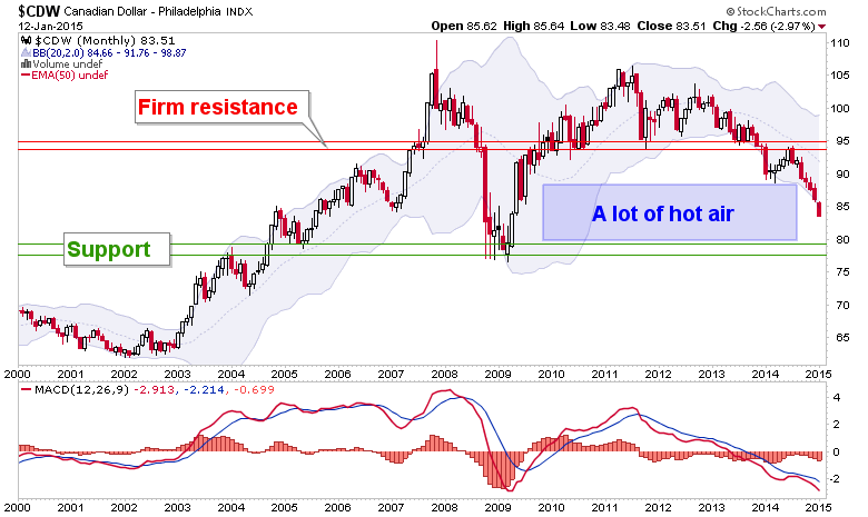
We noted the hot air patch in the Canada dollar last year. I had thought CDW might stop and find support at 85, which is a measurement from the topping pattern; but so far, no dice.
Fellow commodity currency Aussie is at what should be a strong support zone.
[edit] evidently my uninformed use of stockcharts.com’s symbol for the Rupee is incorrect. I have had input that this chart is an inverted view of Rupee-USD. Looking into this.
It looked like a few rats tried to jump ship as the bell rang on 2014. But it is hard to trust any one day or week as a guide…