

Summary
A brief summary of the work done in this week’s report and in the updates and reports leading up to this point. Please read the detailed report for the complete picture. There are many granular details that cannot be summarized so briefly.
Precious Metals (bull market)
Sector in bottoming mode. Correction still technically in force. [unchanged & Goldilocks would be unfriendly macro-fundamentally, if she has truly arrived]
US Stock Market (bull market)
Market is fanning out to include more areas. In other words, breadth is broadening, which is bullish. Short-term sentiment is supportive of rally activity. [unchanged, but if Goldilocks holds sway, sector selection will be important]
Global Stocks (bull market)
Hawkish Fed drives USD to spike, yet ACWX (Global ex-US ETF) rose vs. SPY (US). Interesting, and I do not yet have a clear interpretation. Theoretically, global would under-perform the US in that case. But that is extrapolating years of trend from a different macro (ended in 2020-2022) to the current time.
L/T US Treasury Bonds (bear market)
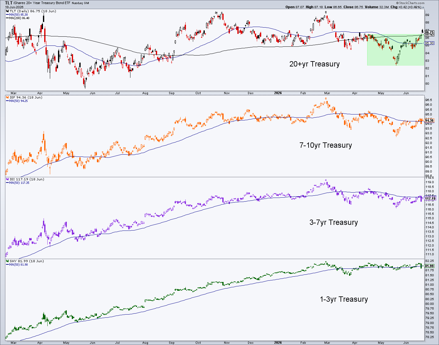
Bonds finally being driven into the interim rally we’ve expected for so long. TLT breaks upward from its pattern amid the disinflationary implications of Goldilocks and a hawkish Fed.

Commodities/Resources (bull market)
USD & GSR rose last week on hawkish Fed. Some areas would be impaired if that continues. If the Fed is able to control inflation signals, there could be rationale for some areas (like those related to technology, EV and/or AI) to do okay. But generally, the commodity complex would ape the precious metals and feel pressure.
US Dollar (cyclical bear market, L/T still a technical bull market)
Last week: “USD has not broken upward from its base.”
This week: USD is on the verge of breaking upward from its base. This would fit with a Goldilocks market phase, which could target and terminate at point ‘C’ (just a rough sketch for now). It’s actually a bit too soon to even confirm Goldilocks, and thus too soon to talk ‘termination’.

Goldilocks
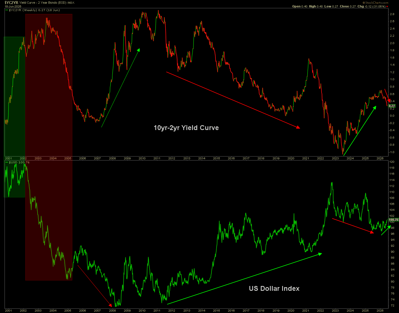
Let’s understand that it was just 2 days. Enter Warsh, showing a hawkish bias and the yield curve bent downward in compliance. That downward bend in the direction of a yield curve flattener is a bend in the direction of Goldilocks, a pleasant, non-inflationary, pro-cyclical environment. A real yield curve flattening trend would run with a boom. This is now favored for a phase only. But the other options are that last week was a knee-jerk move on the macro soon to be undone, or… a hawk-talking Fed could bring on a liquidity crisis rather than a gentle disinflation.
She made the scene when Warsh made the scene. Per my public article on Friday (A ‘Goldilocks Market’ Arrives), I believe a couple of big brains (Bessent & Warsh) are aligned and working together to fix (as in “the fix is in”) the macro, much like their daddy (Bernanke) did years ago. My hunch is that Bessent selected the new Fed chief, not Trump.
The essence of a Goldilocks market is that it features inflation “not too hot and not too cold”, but rather, “just right”. It would, through relatively hawkish monetary policy, firm up the USD. It would probably bias the Gold/Silver ratio upward, but gently, not cataclysmically, as disinflation rather than deflationary liquidity crisis engages.
At this time, I think it’s a phase, a thing that could be here today, gone tomorrow, err, within months if not weeks. That is how I initially viewed the Bernanke Goldilocks (yield curve flattener beginning with Op/Twist in 2011) as well. Then it persisted into 2019, kicking off a bear market in gold that ended in, yup, 2019.
That just happens to be the year that gold broke through the “bull gateway” (as we called it, in anticipation and in real time) of 1378.

While gold is in a major bull market, the monthly chart above shows no support until the 3400 area. That does not mean gold will drop that far, but if Goldilocks persists with a time frame measured over several months, that would be a downside objective.
Gold’s daily chart shows a clear loss of support in the 4250-4300 area, which needs to be taken back promptly or else our operating target will be 3400. This is just a bearish looking chart as it stands now.

And if gold elects a bear phase, what of silver? If Goldilocks is attended by a rising Gold/Silver ratio, even if it rises gently (as currently favored), silver will very likely bang the major bull market support area in the low 50s.

Technical Objectives (assuming a Goldilocks phase)
Downside for gold to objective (3400): 18%
Downside for silver to objective 1 (53): 18%
Downside for silver to objective 2 (50 +/-): 22%
Strategy – Precious Metals
Folks, the herds were trained in 2025. They were trained that gold is bullish, silver is bullish and ‘wheeee… I’m making coin!!’
Putting aside that gold is about serious macro monetary issues, not “making coin!”, It is important now to avoid the trap of feeling like you’re on a team. Team Goldbug, Team Permabear, Team Permabull, Team Whatever. The Bugs, especially, have a way of creating an ‘us against them’ ethos, and I understand why that is.
To be a gold bug, you are aware that the system is no good and you want to be apart from it. But… PHASES. Stick to your ideals. I do. But I realize I am in a casino rigged by house rules, not those of my ideals. Sometimes we need to play by those rules, when they can hurt you if you don’t. In this work we are anticipating a phase that could be distinctly galling. If it engages, let’s capitalize on it, or at least avoid being directly victimized by it. Eh?
This is where experience comes into play. When you have evil genius at the controls (I say that with 3/4 disgust and 1/4 admiration of the genius aspect of their willingness and ability to manipulate), you better believe that the honest monetary rock can go on the outs for a phase, or as in 2011-2019, a bear market.
Gold has been on the outs all year. Our target for manipulative policy has been to/through the mid-term elections. Now perhaps we see the mechanics of that objective.

Assuming Goldilocks, the good news is that it’s a phase (IMO). The bad news is that it is here and I am sure many a gold bug has not adapted. Either to the 2026 risk and correction we’ve already factored, or the potential of this new, more real-time cyclical disinflationary situation.
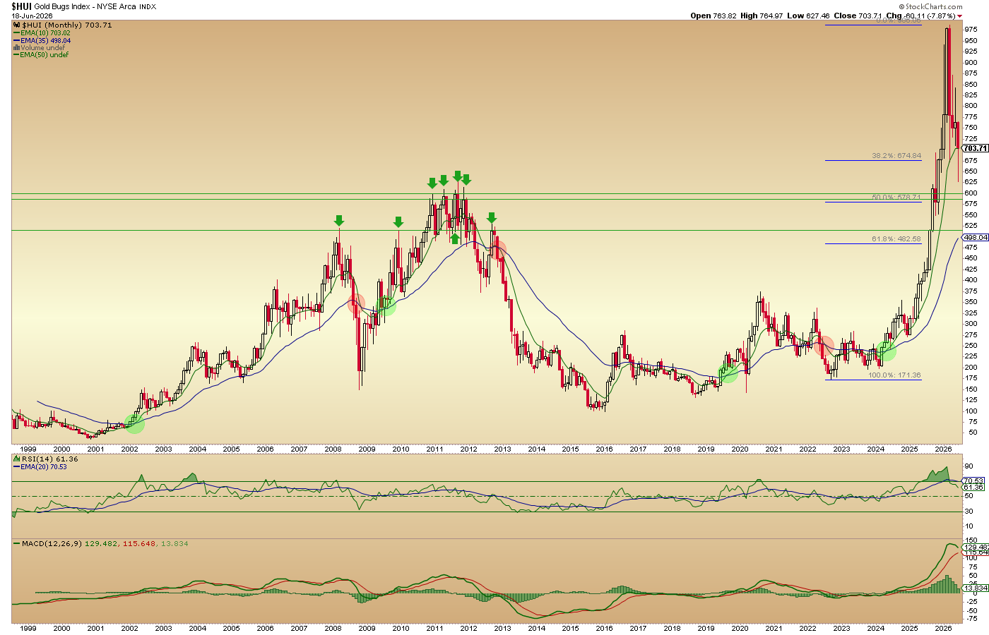
At the very least I am keeping HUI’s 590 target well in view. Indeed, 590 is a 50% Fib retrace level measured from the final low of the 2020-2024 correction, coinciding with the major support of the 2010-2012 top. If we measure it from the lowest point of that correction, as per below, we’re looking at 578. If we take it further, to a 62% Fib retrace we’re looking at 482.
As a side note to the above, a loss of the long-term breakout on a decline to 482 would not mean a failed breakout. The index has broken out. Any downside shakeout worth its salt would make unprepared Bugs pray to their Golden Godz for deliverance, i.e. capitulation.
Frankly, I am considering selling most/all gold stocks and keeping the hedge as an outright short. I did not mention the hedge (DUST) in the in-day notes, as last week was personally intense and spent mainly at a hospital (my daughter is stable, but she needs to keep up her after-care).
I took the hedges on FOMC day and immediately got punished for it as the gold stock market flew up and down, machines gone wild. I decided ‘eff you’ and held them. I then endured another sector up morning with the hedges dragging at the portfolios, with an in-day pop and then a reversal on Thursday.
But I am confident we have reviewed the real, as opposed to ‘hoped for’ picture in gold stocks to the degree people can make up their own minds about what, if anything, to have held, hedged or sold. Frankly, not watching the market closely allowed me to hold DUST through all that. I was not able to out-think myself.
Long story short, I will not die on Hamburger Hill, where many a gold bug could be wiped out. I don’t think you should either. But I don’t tell you what to do. I follow the macro and the technical situation.
Unless last week (the whole shebang, Warsh, Goldilocks, USD, etc.) was a head fake and this turn-down from the 50 day average by HUI was a head fake, it is time to have an even higher level of caution, if not outright play the sector to the downside. Dog gone it, that elusive capitulation that we discussed last week may be a thing, after all in the coming weeks or months.
If HUI takes back the 200 and 50 day averages, I will have filled your ears with much bearish noise. But again, mental whipsaw or not, my job is to clearly illustrate what I see and what the potentials are.
- Favored option: Gold stocks go lower from here in line with the current TA trends.
- Less favored option: It’s a whipsaw and gold stocks will bust bullish.

GDX A/D line agrees it’s still “correction on”.

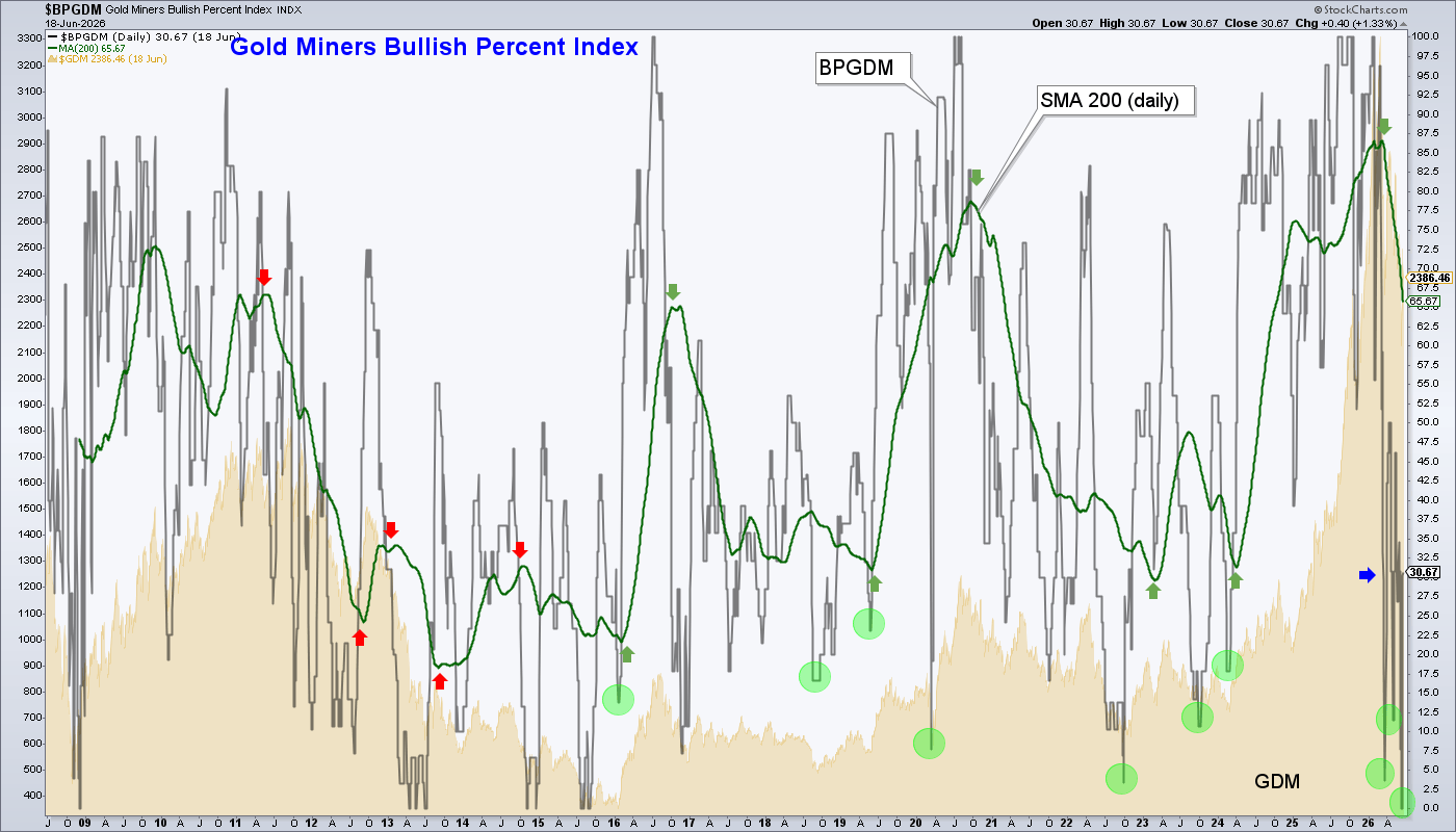
I want to continue pounding the table about the BPGDM, which is thus far playing out to plan. Last week it spiked upward again and our plan is for repeated up and down spikes, whipsawing players who obsess on the immediate action instead of calmly watching the 200 day moving average.
We are looking for this grinding process to bring the SMA 200 to a good ‘higher low’ before the next sector ‘buy’.
Small Caps
The story goes that Small Caps are inclined to perform better with a strong USD and restrained interest rates. That is because they do more domestic business than the giants, who in their exports tend to benefit from a weak currency. Also, because they are less able to withstand the economic pressure of rising interest rates than the giants.
We reviewed Small Caps breaking out vs. MAG 7 last week. Here we check out Small Caps (IWM) vs. a wider array of Large Caps (SPY). As it stands now, the message is clear. An internal market rotation biasing favor toward the Small Caps is in play. IWM/SPY is early in a bottom & trend change situation.
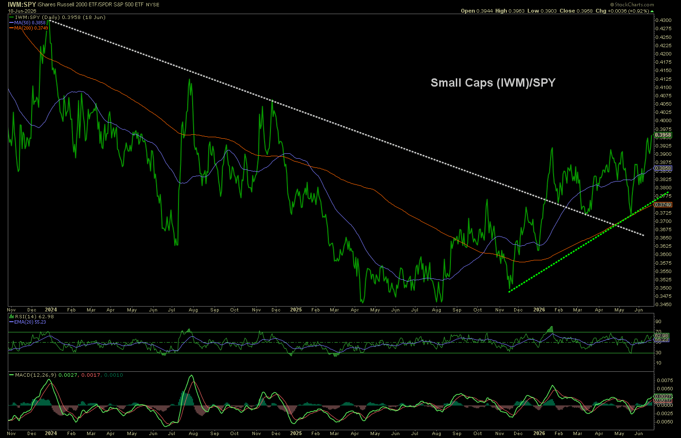
As noted last week, this should make stock picking – as opposed to robotic ‘passive’ ownership of the heaviest SPX and NDX weightings – worthwhile.
Software
Thus far, I am more wrong than right on this sector. I may not think I am wrong, but as the CLOU/SPY chart stands now, it DOES think so.
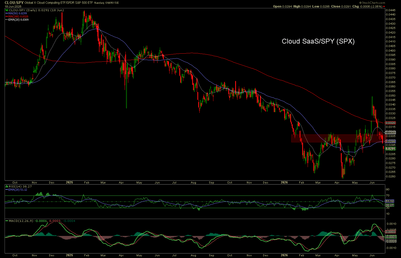
The theory has been that the sector has been dumped due to AI fears. And that is a very good theory. But I’ve been picking up certain stocks among the wreckage; stocks that were unfairly dumped.
However, I think it is more of a Growth/Value thing than an AI impairment thing at this point. Many of these Cloud software items (DDOG, CRWD, NET, SNOW, MDB, etc.) are richly valued (code for over-valued), as are many growth stocks. My perception is that Goldilocks markets are pro-growth. But the chart of IWF (growth)/IWD (value) is not yet indicating that.
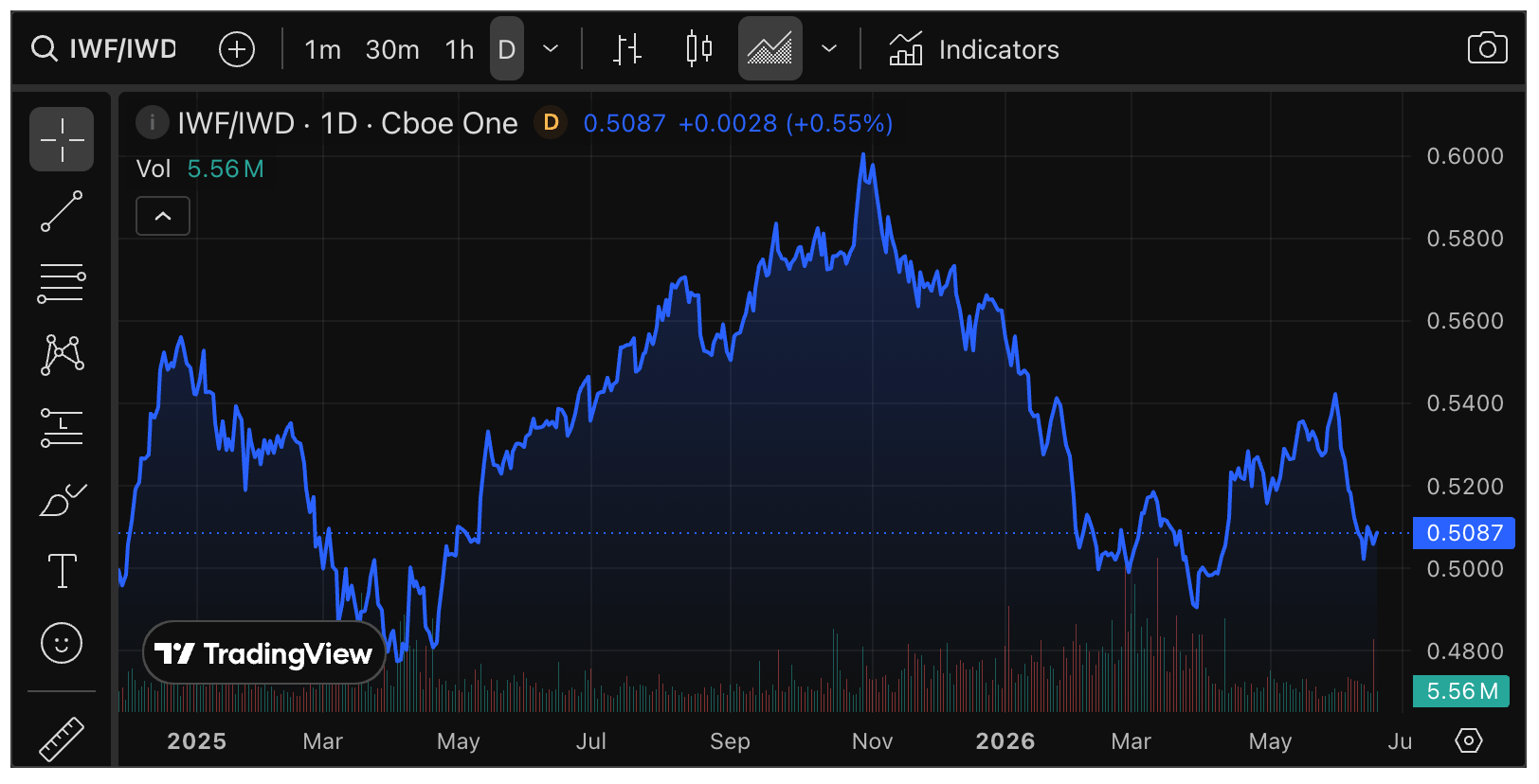
As to CLOU/SPY, chart breakdowns from support happen all the time, so I am not giving up on this play yet. But I may start reducing if this keeps up this week or it becomes apparent that I’ve made a big deal about Goldilocks in unwarranted fashion (in other words, the view proves wrong and something more virulent ensues).
On that note…
Interlude
The stock market does not HAVE to rally amid disinflation. The USD does. Treasury bonds probably do. But the stock market, led by the Semiconductor bubble and ridiculous valuations, does not. I think Goldilocks will play out for a phase and be beneficial. But am certainly not setting that in stone. Just as I am short the precious metals complex, so too would I short the stock market if so indicated. Here are some signs we’ll look for.
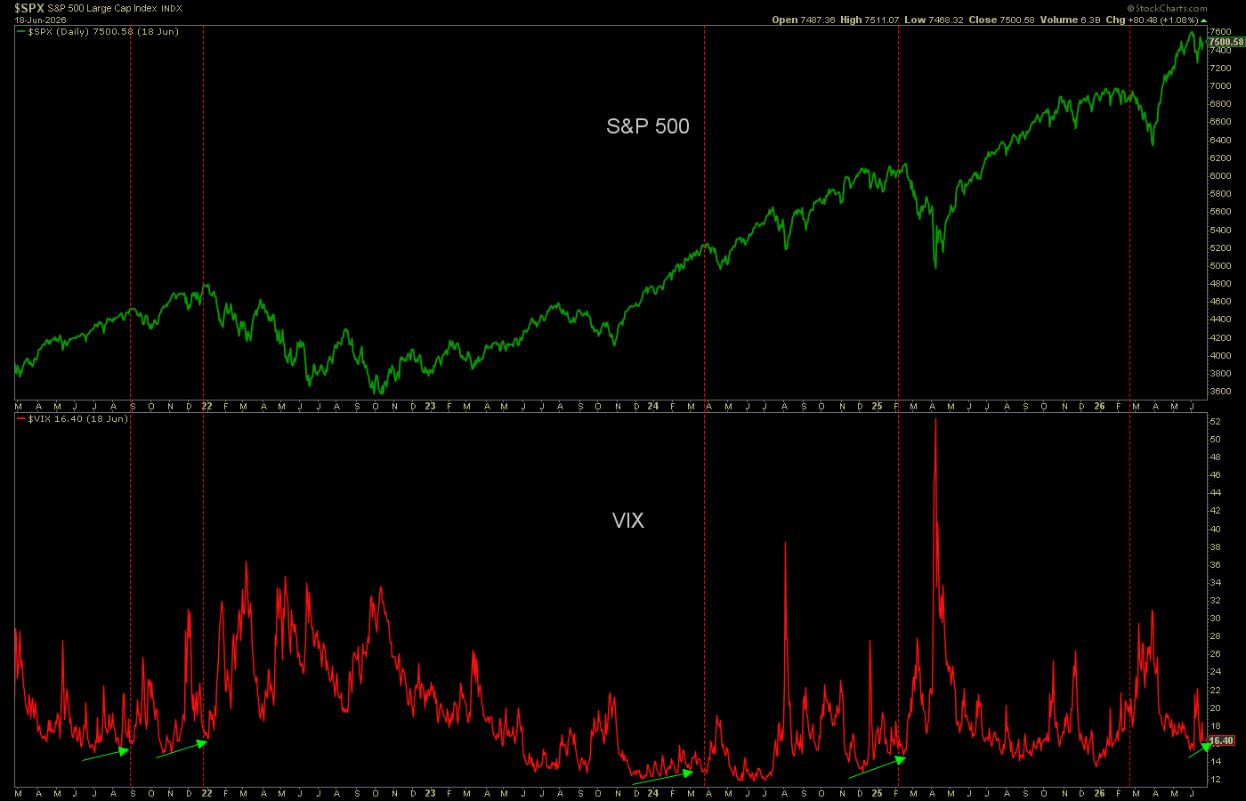
A VIX divergence to SPX has been a reliable indicator to coming bear phases. Not for timing, but for condition. Is a baby divergence starting here? Too soon to tell, but we’ll keep it on watch.
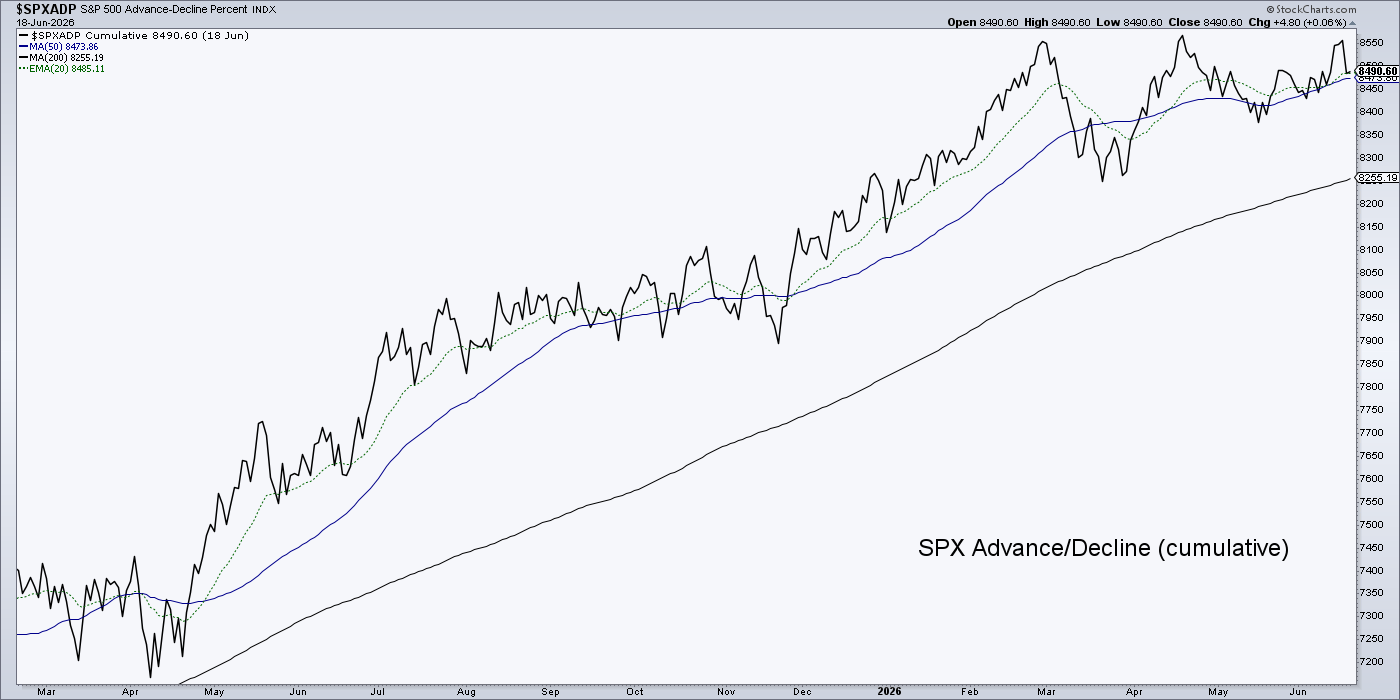
SPX A/D line is intact to its trend. If that changes, we can pay more attention to the above.
–
More Internals
As gold (GLD) continues to decline toward target in relation to SPX (SPY) per the shaded box on this daily chart…

…we also consider that a world full of conventional investors feel all is just fine, markt-wise. And it is… for a phase. A phase that we not only anticipated, but expected.

Macro View, Short-term
Bearish on gold and the precious metals complex, along with other items that do not do well amid disinflationary Goldilocks. Open to more rally in nominal stock markets, with sector selection important.
Macro View, Long-term
Bullish on gold and the precious metals complex, along with other items that do well when Goldilocks is chased from da house and the real, inflationary, macro resumes.
Nothing has changed from recent trends other than a stronger signal against gold and for stocks is in play. It is viewed as a phase, not a secular trend by any means.
Since we’ve circled back to the precious metals, let’s note that the GDX/Gold ratio did not break down last week. So there’s that. A slight measure of hope against my bearish analysis.

Global (ACWX) has not broken down vs. US (SPY) as would have been expected with the strong USD last week, with its policy-stoked (Goldilocks) backing. So again, this could be a divergence against my notice of a Goldilocks market that would feature a strong USD.

But as a chart guy using intermarket ratios, I have to call what I see. What I see is disinflationary winds starting to blow on an interim basis, as has been anticipated all along. I expect it to be a phase measured in months. But some of the charts above have not yet gotten the memo. They state: “Gary, we think you’re wrong and you need to let your readers know you can be wrong on occasion.” [me: “they know!”]
But to this point, long-term Treasury bonds (TLT) are on the disinflation script, while bonds of shorter duration get progressively less bullish. That is the essence of a flattening yield curve. A flattening yield curve is the indication of an economic boom (or for a phase, a boomlet, some relief from inflation fears) with monetary policy firm against inflation. Or so pretending (for a phase).
Bottom Line
I am I guess what you’d call a veteran of markets. Seems like only yesterday, but boy does time fly when you’ve managed cycle after cycle in the markets.
I could be a victim of that veteran status, victimized by my own experience and leading you astray. That is a disclaimer of sorts. But the setup is exactly as I’ve outlined. Now the setup will either do the expected and progress to a phase or it will not.
But as long as it is even a potential, let alone the probability I think it is, it will be noted and analyzed. I will let ideologues and promoters wave their pom poms while we pursue what I think are the valid probabilities. If those probabilities are negated as abruptly as they erupted (last week) I will own my incorrect stance.
The bottom line on the precious metals is that caution and a bear view have been appropriate for the precious metals for all of 2026, and now there is evidence of dynamics that could throw the sector into a final phase of the correction. A brutal phase that does finally bring about capitulation.
If USD and the Gold/Silver ratio continue to rise amid disinflationary signaling (like TLT above and the yield curve flattener), general commodities will not be favored either. Some strategic commodities, in their relevance to modern technological and cyclical society, may outperform, however.
The bottom line on the stock market is that the elements are in place for continued outperformance vs. gold to complete the relief phase we expected and are managing. This would favor some areas (non-inflation sensitive, like Growth stocks) over others (inflation sensitive, like Energy, Materials).
The current plan calls for the bear in stocks (relative to gold) and bull in gold to resume as the major macro trends. But if we get a relief phase worth its salt, it could be months out.
Stock Charts
A few charts of interest as we manage the market we’ve got. As the macro reveals itself, I will try to pop in more long and short setups via NFTRH+ updates in the coming weeks. Charts that have extended too far upward (e.g. ASML, ALAB) are not discussed. Only charts with still viable setups are shown.
Long Bias, Favored If Goldilocks Holds Sway
I displayed a lack of patience in adding DDOG too soon. Great company, rich – but not relative nose-bleed – valuation, and a daily chart that looks like it wants to test the breakout point and perhaps the 50% Fib at 189 and the rising SMA 50 (blue). Be a good Doggie and resist testing those levels? He’ll probably poop the rug instead.

After a previously successful trade, BioPharma GILD was sold near the highs and bought back on the long consolidation. It lurks at clear support but is not activated in any bullish way yet. Holding for now, but cognizant of that increased downside volume.

In a related matter, Biotech stocks are traditionally geared toward lower interest rates and a disinflationary environment. Why? Theories. But the ETF, IBB is poised in a bullish manner.

ServiceNow is another software stock that should be relatively unscathed by AI. “Should be”. I took it for a nice trade off the bottom, but thus far am bag holding the re-buy. Short-term support needs to hold here or patience wears thin.

US Pot MSO GTBIF maintains a trend change structure. The recent decline back to the moving averages looks like a buy opportunity. I may add, or I may look afield for other candidates (after selling GLASF, which has refused to come back down, too soon).

Uranium is one of the commodities that I feel has a chance to buck Goldilocks’ pressure. CCJ’s chart is far from stellar as it puts a hard test on its uptrend. The U’s have been in correction all year, much like the precious metals. But they are worlds different, fundamentally. Uranium is far from favored at this time, but I am keeping an open mind on it, REE, Li, Ni, Cu and other metals/materials of cyclical economies.

–
Final Note on Gold Stocks
I am running out of time, so I’ve got to step it up.
Last week, a known (in my mind) promoter wrote an article titled Gold $4700: Mining Stocks Party Time
Aside from the title, this bit was in the body of the analysis, as if written for children. GDX was at 84.27 when written (now 82.51).
What about gold stocks? Please click here now. Double-click to enlarge this GDX daily chart. All lights are green; a massive bull wedge dominates the technical landscape and RSI, Stochastics, and MACD are all pointing at higher prices.
Rallies from these rare oversold events tend to be followed by enormous rallies for GDX and its component stocks… and for intermediate and junior miners too. The bottom line: The Iran war is over and gold stocks party time is here. The only question I have for gold bugs in the West is this: did they bring big enough golden party whistles and bull era pompoms, to fully enjoy what almost certainly lies dead ahead!

Now, if you will, travel with me back in time. The same source advised his readers of a “drop dead gorgeous bull wedge” in 2015. It was posted at 321Gold, and I made note of it here, including this chart in which I noted his “drop dead gorgeous bull wedge” (DDGBW) and its aftermath.

This wedge promo was doomed to begin with. A bull wedge forms downward within an uptrend. It’s really a bull flag of sorts. 2015’s DDGBW formed within a downtrend and dumped on cue.
While his cheerleading was again met with a price dump last week, what our plucky promoter has going for him this time is that indeed, GDX is in a wedge (per the current daily chart above) it is downward after a major uptrend, and could indeed resolve bullish.
If GDX takes out the moving averages and the wedge’s top line we are right back to where we were. I was constructive on bottom potential. But that was before I witnessed what I witnessed last week in the coming of Warsh, the statement of his intensions and the bond market reaction that followed.
Be aware again that I, a veteran of this stuff, could be getting played by my own analysis (and by history). It’s a new macro, after all. A macro in which the 30yr Bond Yield Continuum was broken into a new dominant phase of inflationary signaling. In other words, Goldilocks could end up in daddy bear’s belly before she can work her gentle deflationary magic.
If last week was just so much noise and Goldilocks is not real, I stand corrected. I am probably 65% real, 35% Memorex with regard to that. But as long as I see potentials of change, I prepare for them and I let you know why. It is up to each of us, however, to realize no one has the magic sauce. Not me, not our excitable promoter above, no one.
Let’s stay open minded to the coming of Goldilocks. Let’s also stay open minded about the fact that she needs follow through and I could be jumping the gun.
Portfolios
Gold is long-term risk management & monetary value/stability in a balanced portfolio.
No time to get wordy this week. No notes, just the portfolios. I think I got wordy enough in the report above.
Savings

The “Savings” account will vary in its positioning. At times when I am confident of bullish markets it will hold positions, while remaining primarily a cash/equivalents account. At times I am not, it will not substantially hold much beyond cash/equivalents.
Trading Account
No positions.
Roth IRA (non-taxable, no contributions)
I’ll want to see that last low turn out to be a good low. It took a lot of effort, while distracted most of the week, to keep this intact, given the way gold stocks ended the week.

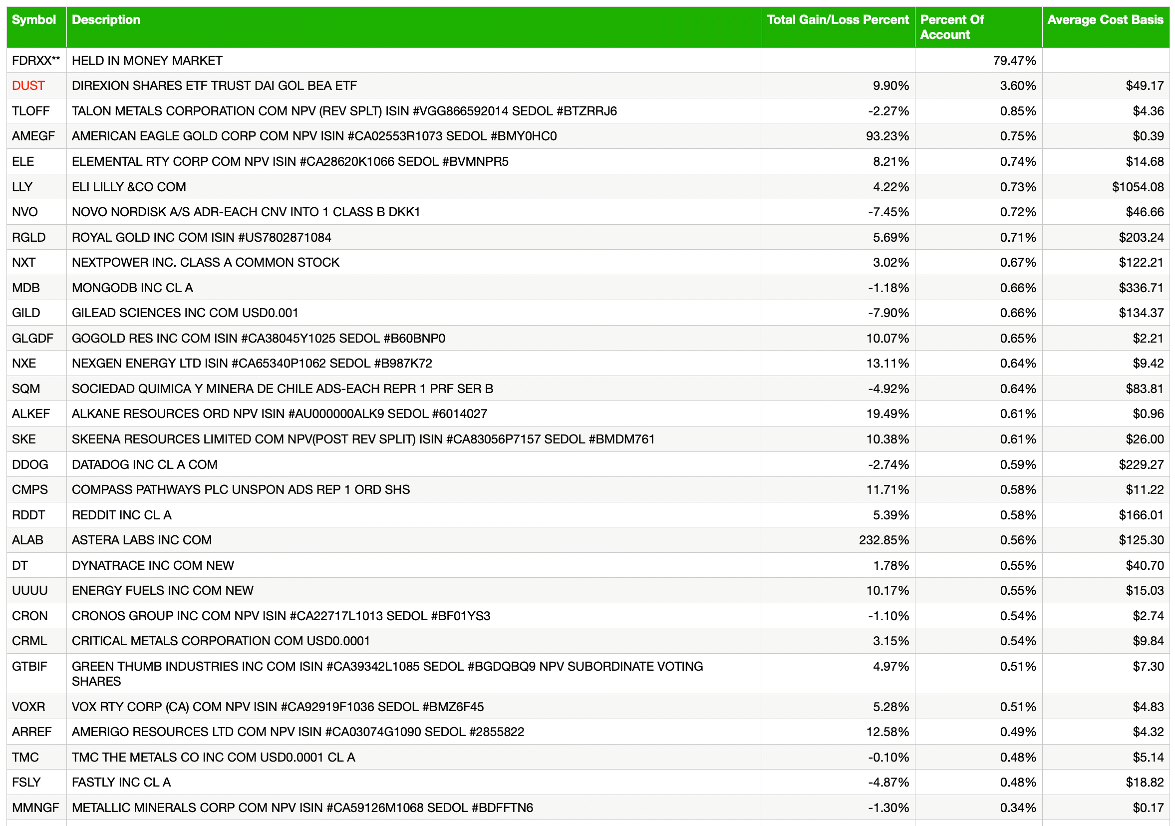
Cash & income-generating Treasury bonds are at levels that are right for me and my real-world situation. Your situation is different. Cash will be adjusted as needed.
Refer to the In-Week Notes under the NFTRH Premium menu at nftrh.com for market talk and occasional trading info, if interested. Also, you can follow on X @NFTRHgt for notice of updates.
NFTRH is not to be distributed to third parties without prior written consent
Notes From the Rabbit Hole (NFTRH) is a weekly market report in which we provide analysis on financial markets. We make every effort to provide accurate and high quality content, but this analysis ultimately represents our opinions and these opinions are provided without warranty or guarantee of any kind. See full terms & conditions of service under the ‘About’ heading in the main menu.
