This Time the Silver Hype Has Macro Backing
I added to my PSLV position way up here in blue sky because of the bigger picture macro, not because of the momentum so obviously in play (until Friday’s knock-down, where I added again).
Silver is not only in breakout mode above the rim of its 31 year long Cup, it is also finally aligned with the proper macro (inflationary), which you know I am and have been a stickler for. The ‘inflationary macro’ view was updated most recently on Friday in a public post.
The big picture target based on the Cup’s measurement is 92. That’s the fun and simple stuff. Let’s dig into the macro stuff, which is where the rubber meets the road between hype and reality.

I was somewhat suspect of the Thanksgiving week breakout in silver and the Silver/Gold ratio, but now post-FOMC in mid-December, the process has continued. Any volatility due to the immensely overbought situation could see a grind in the 45 to 50 area in the coming months. But when we projected the Inverted H&S (and its moderate target in the mid-30s) we’d have taken 45, eh?
Technically speaking, this is a profoundly important breakout that I, maybe you and many others have anticipated since the Cup made its right side rim in 2011. But as I also used to note over the ensuing years…

Of more interest is the big picture macro, and silver’s role in it. We can intellectualize that silver is on the U.S. list of critical minerals, that covert entities are finally being forced to cover their paper shorts, that warehouses are running thin of supply and any other ghost story you want to conjure.
But the fact is that when silver leads gold (as the more inflation-sensitive side of the “metallic credit spread”), the backdrop is indicated to be cyclical-inflationary. If gold were relatively strong (with both metals declining) it would be the opposite, counter-cyclical and deflationary.
And that completely marries up to the theme of our recent analysis (ref. link above) of a new macro, where new inflationary (liquidity) operations by policymakers will be less successful * than in previous decades, when the bond market indicated no real inflation problem. With long-term yields in big picture breakout mode, the indication is that yes, it’s going to be a BIG inflation problem for all to see (and feel).
* Success defined here as the ability to fool the public into believing that they actually fight inflation rather than create it.
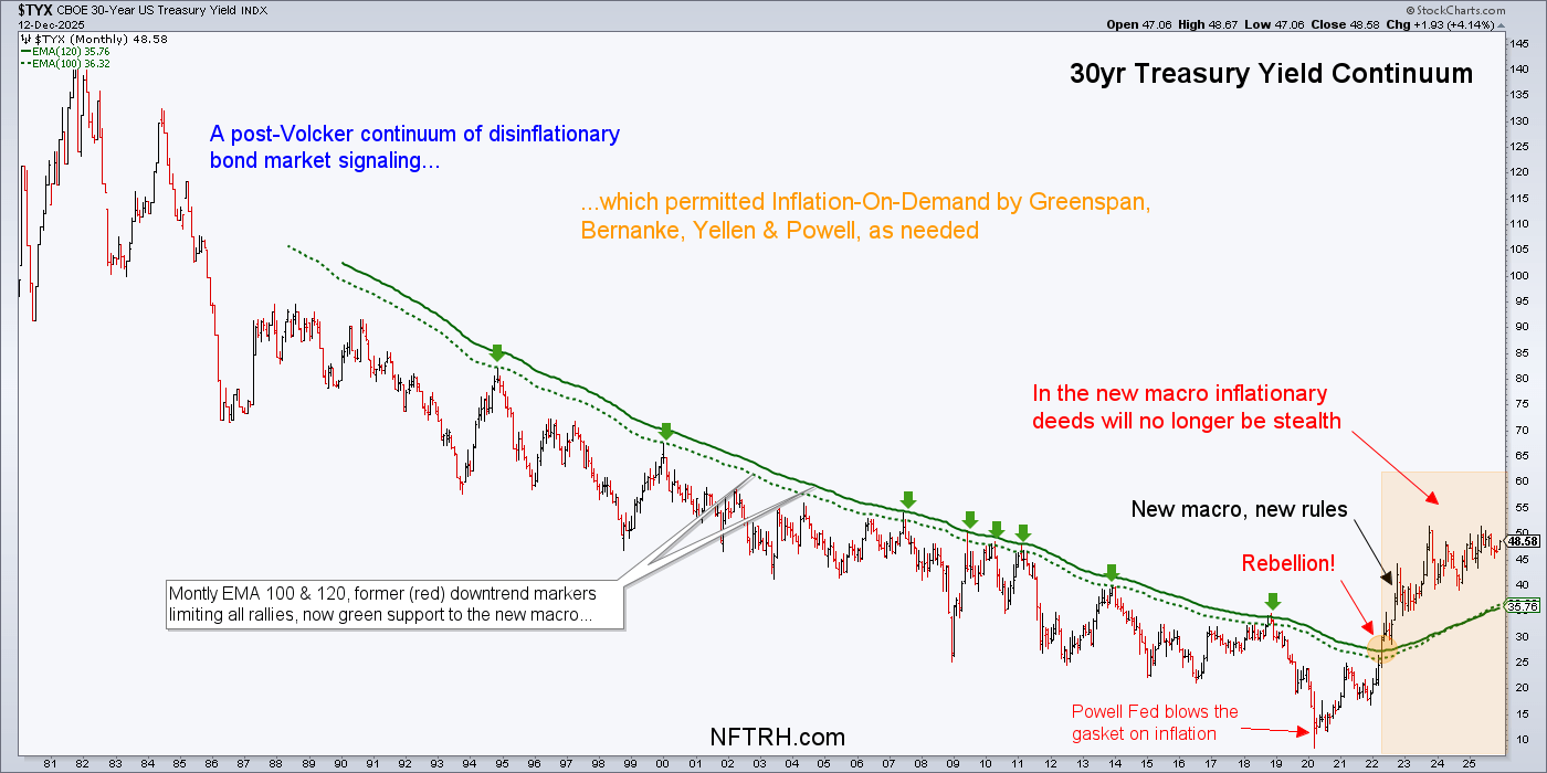
In short, they’ll be trying to inflate in the light of day as opposed to under the cover of the bond market’s previous disinflationary trend. Maybe that is why silver is finally launching in an overt move, and why the stock market appears doomed to fail badly in gold terms, even as inflation may keep it moderately aloft.
To further burnish the macro theory above, the Silver/Gold ratio will need to continue to rise. This long-term chart shows that it has not done anything remarkable yet. As you can see, and as we projected last spring, there are often spikes or extended rallies in the SGR after significant declines (red boxes).
The SGR is still on a spike, and has taken out two highs that we noted would have it be taken more seriously. Now the 2021 high needs to be taken out to keep the play going.

Dialing in closer, you can see the next objective. The reason for paying so much attention to this despite the chart view showing it has not even done what it did in 2021, let alone what it did in 2011, is because of the new, inflationary macro thesis per the 30yr yield chart above.

Let’s now back off our little silver hype fest after viewing one more chart. Since the stock market pretty much is the economy these days and since gold is already making positive moves in relation to SPX, let’s realize that silver has spiked right to a very key level in relation to SPX.
Break through here and things could get wildly bullish for silver. But this is also a classic spot for the forces of evil to make an appearance. A fine line between silver bug pleasure and pain.
Let’s remember that to this point, while the silver bugs are frothing, the average market participant is too busy wondering why his Bitcoin and AI stuff is going down. In other words, sure, silver is big in the gold/silver bug “community”, but the precious metals – including gold stocks – are still an acquired taste among the masses. If Silver/SPX breaks through here, those masses will not only taste silver, they’ll start gulping it down.

Bottom Line
Bull markets are scary. They become very overbought. They present reasons why people should take their profits while they have them. But then they keep going up.
Silver is wildly overbought and thus, scary. But mitigating that is the fact that your letter writer for one has been going on about a new macro since 2022, while trying to define what is new about it. That work is coming into clearer view and it favors silver and gold. It, in its inflationary macro signaling, also favors silver relative to gold. At least for the time being.
I have existed through all those years/decades of ignominy prior to the change in the macro as indicated by the “Continuum” chart. So I am weighing the pressure built up over those years. I am thinking about beach balls held under water and released, slingshots and rebellions.
In short, I am trying to be measured as usual, but aware that the bullish dynamics are currently justified by macro signaling.
All of that said, I for one am going to remain the same conservative trader I usually am. Friday’s little pullback was a hint, a reminder that the pullbacks will come and they will be harsh. Speaking of the precious metals in general and silver in particular, I’ll manage risk by taking out insurance (e.g. SLV puts taken previously) at certain points along the way. But the bull market is gaining steam on the big picture.
Precious Metals (daily charts)
Gold only Fib retraced about 45% of its rally before turning back up. So, no A-B-C correction. RSI is much weaker than at the previous high. That is a negative divergence that could conceivably lead to a double top. But it is also potentially fuel, along with the constructive MACD.

Silver has, after all, hit new highs.

As did the miners. Both silver and the miners reversed downward after the poke upward, and we should know this week whether they are forecasting to pull gold higher or take a post-FOMC pullback, which is always an open prospect.

There is one more vulnerable week for the broad markets, if the machines are going to get aggressive as they did immediately post-FOMC (up & down). You’ve heard of the “vulnerable minute” in hockey, after a team kills off a penalty but is hemmed in its own zone? Well, the ripples of FOMC and the machines that rev up in response to it could still be a revvin’.
Then comes Santa, which is no guarantee of a broad rally, but the markets should be smoothed out by then.
I will stick with the macro fundamental picture, which is…
- Macro inflationary, with silver leading gold and long-term yields in upside rebellion.
- For this to work long-term for gold miners, the inflation would have to be less cyclical, less friendly to stock markets and of the Stagflation variety. That is (IMO) another message of the bond market rebellion noted on our Continuum chart. A more economically corrosive inflation problem than during the pre-2022 continuum.
- The miners have silver’s price leadership (which is usually beneficial to the whole PM complex where “price” performance is concerned) and favorable macro-funda in the form of gold still trending up vs. stocks and commodities.
- Until that changes, I cannot be anything but bullish on the sector, considering its technical trends are also very positive.
- When I get concerned about the momentum in the here and now, I think about all the years of under-performance by gold, silver and especially gold stocks as compared to the beneficiary of the previous macro:
I hit you with certain charts repeatedly. But if a new macro phase has engaged, a chart like this can keep us grounded, remembering that sure, the time was going to come, when gold would finally rise strongly in relation to the main bubble beneficiary of the old macro phase, the stock market.
To this chart of the Gold/SPX ratio, I have added its fellows, silver and the HUI Gold Bugs index in relation to the stock market. When adjusted by the many years of post-Bernanke excessive policymaking, the precious metals complex is barely coming out of its base.
- If you believe policymakers will regain control of the macro this could be all there is to the precious metals bull.
- If you believe policymakers have lost control, per my interpretation of the bond market’s post-2022 rebellion, this could only be the beginning of the bull.
- I believe they are losing control. But dear readers, I am a biased gold bug. That should be considered.

U.S. Stock Market
Speaking of which, despite the cries of “foul!!” by gold bugs that the precious metals “should” have performed better than stocks amid inflation, my theory is that with the stealth coverup of inflation by the bond market’s previous, now broken, downtrend in yields, it was stocks that got the bid, as all was signaled to be well and good in the world of paper.
Money was pumped into the financial markets, into the economy and it was all done with the legendary bond vigilantes nowhere to be found. Well, that is over. It’s all out in the open now and that is more honest. Hence, the case for honest money. It’s pretty simple when you think about it.
Regardless of whether there will be a Santa week rally or not, SPX appears to want to test the SMA 50 and close a recent gap.

With the internals shifting unfavorably toward risk-off (ref. Friday’s NFTRH+ update) even if just short-term, I do not want to be very involved. Hence last week profits were taken (on balance) on “bull stock” positions and some commodity/resources positions as well.

Growth stocks are not looking so good. A Diamond consolidation pattern can resolve up or down, but RSI looks fairly disgusting.

As for more internals, Growth/Value looks even worse than nominal Growth, and nominal Value is bullish.

The U.S. stock market is rotating internally toward the more defensive, safer segments like Healthcare and value stocks. If this remains in effect over the next couple weeks we can expect that the best of the year-end rally is already done.
U.S. Market Sentiment
Dumb money is too bullish. Smart money is fading. Contrary bearish.

Fear/Greed index needs a tuneup, as usual. CNN simply does not interpret the situation accurately in sum. VIX is noted as Neutral, but it is actually at a Greed reading. Junk bond spreads are noted as Fear, and that is far from the reality.

Here is the actual state of Junk bond spreads, implying a herd that is over-bullish and over-confident.

AAII are more bullish than historical average. But not yet jerked in hard, which would be a clear sign of a market top.

NAAIM continued to be over-bullish for a second week in a row.

Bottom Line
Considering the internal market rotations toward defensive and lower risk sectors, the over-bullish sentiment profile, while not nose-bleed extreme, is in my opinion a strong negative.
At the least we are called to protect our 2025 profits* until the dust settles.
* Talking “bull stocks” here. But insofar as those profits have come by way of the precious metals, it’s always legal to take profits there as well.
USD, BTC & Global Markets
DXY did not perceive a vote of confidence from FOMC. Indeed, it dropped after spending a few days slithering along beneath its 50 day average. The drop from the little double top and 3-time failure at the SMA 200 does not seem reassuring to Uncle Buck fans.

Hence, we might expect global market out-performance to the U.S. (over time, global market performance relative to the U.S. tends to be inversely related to USD). The ACWX/SPY ratio has bounced again, but there is no clear signal generally favoring global stocks over U.S. stocks yet.

As an example, I have an eye on BABA, for one, as it flags downward. The favored area to buy would be 140-145.

As part of de-risking, I gave up on my position in Bitcoin tracker, BITO. It had spit out a nice dividend and so taking a loss on it was no big deal. The origins of the trade are still intact (a higher low), but I said sayonara for now. The chart shows subsequent price in activity in BTC/USD continuing to weaken, as of this morning.

Commodities
Along with increasing silver holder PSLV, I also increased Platinum and Palladium holder SPPP. For whatever reason, Pt and Pd seem to have a positive correlation with silver and tend to follow it.
I don’t see how this daily chart can be interpreted as other than bullish.

And the weekly chart? Even more so.

Is the Commodity ETF finally ready to break its long and bull-biased consolidation? Are silver and its leadership to gold real?

The portfolio segment will show which items I’ve held onto. Meanwhile, profits were taken on items like Lithium prospects SLI and LAC, and on Uranium positions. Technical risk was eliminated by taking a loss on LYSDY and any other stock that did not flash an acceptable chart my way.
But bigger picture, in line with the inflationary macro view – which gold led long ago, as it normally does – the commodity complex is expected to catch on in more widespread fashion than it has thus far. Again, the combo of the Silver/Gold ratio and the TSX-V/TSX ratios will guide.
The SGR and the commodity complex will want TSX-V/TSX to prove that its November low was the low and bust above its 50 day average.

Portfolio
Gold is long-term risk management & monetary value/stability in a balanced portfolio.
Taxable Account
In order of position size. A now very risk managed set of holdings. Risk is managed by cash with no short positions or hedges as yet. I’d rather add long positions than start hedging or shorting just yet. But we’ll let the market make such decisions. Right now the U.S. market is rotating defensive.

The taxable account carries high cash levels as long as cash and equivalents are paying out. This is considered a savings account of sorts, rather than a speculation or even investment vehicle. The goal is to speculate around the periphery. In another market phase (e.g. post-crash), the account may get much more in the game.
Trading Account
No positions.
Roth IRA (non-taxable, no contributions)
The chart made its Ascending Triangle breakout on Thursday and got smacked back down on Friday. Have I mentioned how much I dislike FOMC week and its immediate aftermath?

Cash and short-term Treasury bonds got jacked back up to 80% while the Silver and PGM bullion funds were actually increased.

Cash & income-generating Equivalents are at levels that are right for me and my real-world situation. Your situation is different. Cash will be adjusted as needed.
Refer to the In-Week Notes under the NFTRH Premium menu at nftrh.com for market talk and occasional trading info, if interested. Also, you can follow on X @NFTRHgt for notice of updates.
NFTRH is not to be distributed to third parties without prior written consent
Notes From the Rabbit Hole (NFTRH) is a weekly market report in which we provide analysis on financial markets. We make every effort to provide accurate and high quality content, but this analysis ultimately represents our opinions and these opinions are provided without warranty or guarantee of any kind. See full terms & conditions of service under the ‘About’ heading in the main menu.