
Ratio charts are a guide to the inner workings, the ‘guts’ of the market
Any chart jockey can pull up a stock, ETF or index chart and make an interpretation. Sometimes even a good one! That is TA, in all its faultiness.
But ratio charts indicating market ‘internals’ do not lie. For example, if ‘xyz’ is trending up vs. ‘abc’ then the implication is that the current macro is better for xyx than abc, or that ‘xyz’ is indicating a certain macro backdrop to come based on xyz’s characteristics. Not rocket science. Just logical.
With that, let’s look at some ratio charts with quick interpretations. You can find a stock group of them at the ‘Indicator Charts’ menu link above any time. And you don’t have to use the ones I’ve pre-set. Each chart can be changed any way you’d like. Ratio chart, stock chart, daily, weekly, monthly, in-day, add moving averages, momo indicators, markups, etc. But I keep the page there as a quick reference on some of what I tend to find important.
It’s an important moment for figuring out the market’s internals in the here and now and going forward. Bessent and Warsh are doing the heavy lifting where macro engineering is concerned. Later, we have the commercial banking sector eventually* joining in.
In NFTRH we will be tracking the market’s internals into and coming out of the mid-term elections and then into year-end, and 2027. 2026 has been the year of internal rotations and has been very unlike 2025. I think ’27 is going to be quite different still.
* As it looks now, the 2027 macro will very likely include the commercial banking system more prominently and the Federal Reserve less prominently.
Ratio Charts of Interest at This Time
I am using simple daily charts with 50 and 200 day moving averages.
Gold/Silver Ratio
Bullish biased along with the USD base breakout. This is and has been a negative signal for precious metals and commodities (those not being driven by geopolitical events and associated supply/demand).
A rising GSR is traditionally not friendly to the stock market as a whole. But if USD and GSR do not get impulsive, certain areas that are not overly inflation sensitive – whether BioPharma, general Healthcare, Software and Tech can do relatively well. Throw the consumer (XLP, XLY) in there as well, under condition of gentle disinflation/inflation relief.

With silver still bumbling in relation to gold, the inflation trades are not ready. But that is as expected since we have to deal with this Goldilocks paint job first. Eh?

HUI/Gold Ratio
Although interestingly, gold stocks have not even quite declined to the level relative to gold that we’ve been anticipating. Not yet, anyway. We have been planning on a hit of the (orange) SMA 200, if not a higher low to .15 before a strong warning flag would be raised from this indicator’s perspective.

Gold/Oil Ratio
Meanwhile, either the miners (and their intact status vs. gold) think they know something, like the war is ending and oil will tank, or they stand to get hammered. Or perhaps the correction has already discounted another rise in costs (AISC). But the fact is that another earnings season is here and thus far the miners’ product has done very poorly vs. a primary operational cost input.
The intact HUI/Gold ratio above simply needs to see it proven that perhaps gold has bottomed vs. oil. Otherwise, it would not be good.

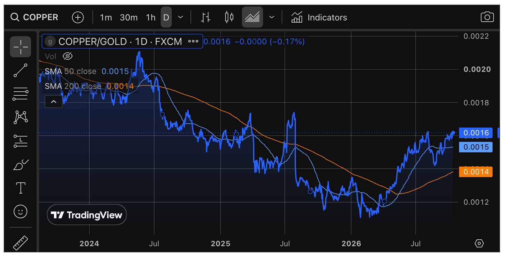
Copper/Gold Ratio
This is a guide to 2027, as we are anticipating a move by the industrial metals complex (GYX) to out-perform gold in a cyclical inflationary macro. It’s been our rough 2003-2007 style forward operating plan in NFTRH.
Gold/SPX (GLD/SPY) Ratio
You need no further proof than this that 2026 has been extremely unlike 2025. The Gold/SPX ratio holds by a thread from making a serious breakdown as it tests the previous low, which was our originally anticipated ultimate low.
Longer-term charts would show that such a breakdown is not a game ender, but don’t try to tell that to bugs who would actively stand in its way with speculative positioning. This. Is. Not. 2025.

ACWX/SPY Ratio
Under the weight of the strong USD the ratio of global stocks to US stocks is on the verge of a confirmed breakdown. This is as it should be according to the historical relationship of the (not yet ‘de-dollarized’) USD and global out/under performance.

SOX/NDX Ratio (SMH/QQQ)
Inside the US stock market there may be trouble in bubble land as AI-driven Semi fades vs. big Tech after making a lame lower high. The play is not broken, but a test of the 200 day average could be upcoming.

NDX/SPX Ratio (QQQ/SPY)
This remains in a stable uptrend, although it too is turning down from a lower high. If some version of a Goldilocks market does engage, Tech would probably hold trend and start to out-perform again in the coming weeks.

XLV/SPY Ratio
Defensive Healthcare has bounced relationally since June, but now the question is whether it will turn back down per the trend, or break out of it. The trend is down and that is the governor unless the ratio makes a higher high to last high. In other words, risk is still ‘on’ by this chart.

XLP/XLY Ratio
Fellow defensive signaler Consumer Staples vs. Consumer Discretionary is further along toward a would be risk-off signal as it attempts to bend the moving averages upward into a new trend.
The attempt to change trend by consumers of things needed vs. things wanted is still in progress; and as a side note, a sign of the pain US consumers are feeling under the weight of geopolitically-driven price increases.

There are so many more ratio charts I could display in order to define the signals inside the markets. But this is enough for now. We will continue to analyze the whole macro in NFTRH, using ratio charts and other tools I find helpful.
We must cut through the bullshit of promotional group-think. We know gold is good. We’re the good guys! We’re the bugs! We’re for honest money. But the markets in which we ply our trade are not honest. Hence folks, you need a bullshit detector. Above are some components of mine.
For “best of breed” top-down macro analysis and market strategy covering Precious Metals, Commodities, Stocks and much more, subscribe to NFTRH Premium, which includes a comprehensive weekly market report, detailed NFTRH+ updates and chart/trade setup ideas, and Daily Market Notes. Receive actionable (free) public content at NFTRH.com and subscribe to our free Substack.
