Market Talk
At this point, far into the broad market recovery rally with gold stocks so close to the primary target (HUI 500+/-) I want to make sure I am speaking clearly as a human, rather than mechanically as a TA or macro funda dork. That will probably shorten this report and possibly the next few reports to come, until something big happens.
Big? Well, a broad top and breakdown would be big. A Fed policy shift would be big. A significant US Dollar rally would be big (given it would be against a government that seems bent on devaluation), a precious metals upside blowout and reversal, a commodity failure, a precipitous decline in long-term Treasury yields, or a resumed rise in those yields. All big.
But for now we’re in the slop. The oh so predictable recovery rally in stocks is grinding on while signs of slippage in the economy continue and the media continue to be focused on what it calls “inflation” (it’s not).
Economy & Bond Market
The big headlines (outside of robo headline maker, Trump) this week? Ooh, mortgage rates have fallen all the way to 6.6%! The media are advising whether Joe Sixpack should consider a refi on his house, assuming he bought the bubble at some higher rate. Well, I think rates will come down quite a bit further before the next inflation phase. And it’s not because the bond market will follow the Fed.
The Fed will likely follow a bond market temporarily shifting back to its traditional role of “safe haven” as the economy decelerates and inflation signals resume fading.
Based on Google Trends searches, nobody is thinking about deflation after deflation fear maxed in Armageddon ’08, after which Bernanke mopped up the macro with years of ZIRP (zero interest rate policy) and other unconventional policies of inflation (as permitted by disinflationary macro signaling). As a side note, the 2020 deflation hysteria pulled the Powell Fed into action so quickly that Ma & Pa did not have a chance to really start banging their keyboards about deflation before…

…the next and greatest inflation problem of this century manifested in 2021. At that point they started banging keyboards alright, and inflation remains by far the more prominent of concerns among the public.

So back to our trusty Continuum (30yr Treasury yield, monthly chart), the macro changed in 2022 and the inflation problem became all too obvious to the public. This is Captain Obvious speaking, but it is also relevant to the analysis because trends have broken. Trends in Google searches and trends in the bond market. It means something.

In my opinion, that something is that a contracting economy would probably see traditional bond market activity (declining yields) for a while, but not anywhere near the levels that allowed Bernanke to inflict ZIRP upon the world.
However, the daily version of the chart above is still trending up. So let’s be clear that the favored disinflationary view is not yet signaled by the 30yr yield. This is very likely due to noise about and effects of the tariff war and pricing. Again, this is not inflation. It is an effect of the trade war.

The 10yr is a bit more suspect, however. Take out lateral resistance and the moving averages and the two could join in a message that is yield positive and bond bearish. Until then, the 10yr yield is suspect at best and the 10yr Treasury bond is biased bullish.

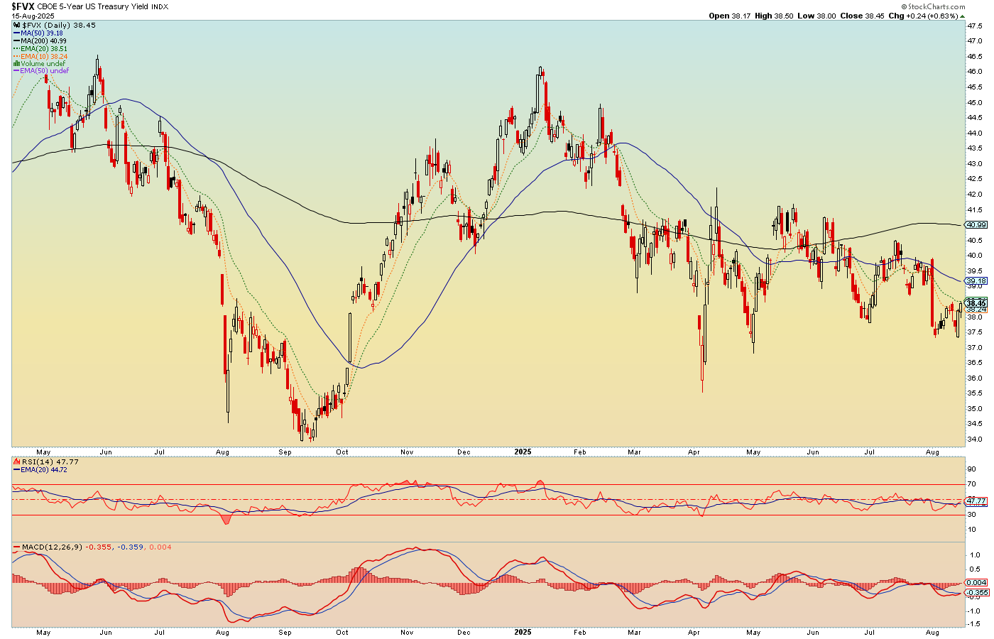
As we slide down the duration curve to the 5yr yield we find a worsening picture as yields of shorter duration become more bearish (shorter-term bonds more bullish). This has been the plan for however long I’ve held short-term bonds direct from Treasury and also the SHY (1-3yr) fund in my accounts.
I recently added IEF (7-10yr) and that is in line with the prospect that the chart directly above would slide bearish, following the 5yr below. It should be noted that when including dividends, the 10yr Note has been firmly trending up for all of 2025.
This (bullish short-term bonds to still suspect long-term bonds) is of course in line with the steepening yield curve (10yr-2yr). Which is an economic bust signaler, with the question being “inflation problem or deflation problem?” Either way, short-term yields would decline relative to long-term yields.
The signal is that players are fading the long end in favor of the safety of the shorter-term. They are either fading inflation or liquidity problems. My bias is that they are slowly fading an oncoming liquidity problem and whiff of deflation.

And so it may come down to the question of whether it is different this time when yield curves steepen. Bear market example #1 below was a deflationary steepening. Bear #2 was even more pronounced deflationary.
The 2020-2021 steepener started deflationary (nominal yields dropping) and quickly morphed inflationary (nominal yields rising) after the Fed went balls out (monetary inflation) in tandem with the Trump-led government (fiscal inflation). The market rally that came with it was an “inflation trade”.
After that the curve flattened hard and inverted. The market correction of 2022 was based on fears of a hawkish Fed, but at the time we noted a flattening yield curve, which was not consistent with a real bear market. Indeed, it was just a solid correction.
Today the signal is high risk for the stock market as it rises in tandem with the steepening yield curve. By the will of Trump or just that it’s different this time in the new macro, I suppose there is a chance this will not manifest in a terrible bear market. I am not going to bet on that chance, but I will allow for the 1970s blueprint noted below, that could see stocks run flat nominally, but wildly under-perform gold in this new macro.

Stock Market & Strategy
The bottom line is that we continue to await a market correction and likely bear market as signaled by the steepening yield curve. If the curve steepens deflationary, odds greatly favor a nominal “bear market”. If it steepens inflationary, we may have something like 2021-2022 or more historically, the 1970s, when markets went nowhere nominally, but were in a bear market in “real”, gold adjusted terms.
A long-term chart of the SPX/Gold ratio:

Either way, it seems a very good bet that stocks are going to greatly under-perform gold in the coming years. Eh? Can you find a fault in the logic? If so, please comment below. Seriously, we need to get the macro right. There are no egos involved here.

Meanwhile, after all the negativity expressed above toward the stock market, on a personal level I continue to “play” it. I love my bull stocks, present and past. ALAB, AAPL, ANET, CVNA, NET, ZS, GOOGL, NET, and so on. The strategy right now is to play around, participate and keep perspective (including on my “love” of those stocks, which tend to be overvalued and simply subject to relieved casino patrons piling back in).
More perspective I am keeping is to try to marry the analysis above that sees economic deceleration and degrading macro signals into a coming rate cut by the Fed and a traditional top/bear market in stocks under deflationary pressure, or… a bond market that keeps the Fed in relative hawk mode (despite Trumpian pressure to the contrary) amid inflationary signals.
I want to short the living hell out of Thing 1 (deflationary) and pretty much sit out Thing 2 (inflationary) where stocks are concerned, because in that case gold, and especially silver, would be wearing their inflation suits, similar to the 1970s. The focus would be on precious metals and commodities.
At this time, I remain biased toward “interim” deflation scare prior to the next big inflation phase.
Precious Metals
But the inflationary/deflationary question could also play into the gold mining view. This is where it gets tricky because if silver is leading gold in an inflationary backdrop it would probably mean the gold miners would rise as well. But a rising Silver/Gold ratio could eventually bring on a poor macro-fundamental backdrop for gold mining. That would be similar to the 2004-2008 phase, after which the miners crashed to clear the gross excesses as cyclical commodities often bulled better than gold.
A deflationary backdrop – for as long as it would last – would favor gold over silver and gold mining fundamentals, if not prices at first. Recall Q4, 2008 when the miners crashed while their previously poor fundamentals got flipped over to wildly positive (stocks, commodities and cyclical markets of all kinds were crash in terms of the gold price). Yet still people puked. I was buying (too soon, to start) and writing about it in the fledgling NFTRH.
But there is a difference today. That difference is that gold miners have only just begun to benefit from positive macro-funda, unlike the negative funda that led the 2008 crash. That’s a big difference. Indeed, back then the HUI/Gold ratio had topped years earlier (in 2004, as it should have, given the poor fundamentals the miners would be negatively leveraging).
The 2001-2003 phase was proper for a positive gold mining fundamental view. 2004-2008 was not. Hence, 2008’s deflation fears resulted in a crash in the gold stock sector. What followed was 15 years of ignominy and a sector long forgotten by mainstream investors as the cyclical macro held sway while Bernanke the “hero” and his successors robo-inflated the macro at any sign of trouble.

The current bull market began in 2016 (never missing an opportunity to include this beautiful picture of a bull market, but now, also potential caution, technically at least)…

…but the fundamentals did not start to perk until 2022, which was the year correction leg two (4) of the bull market made its low. The green ovals show us when the “real” price of gold bottomed and turned up.

If this keeps up as expected, the HUI/Gold ratio above should continue upward over time. Again, it topped amid poor (cyclical inflationary) fundamentals and it would theoretically rise with counter-cyclical disinflationary or [stag]flationary fundamentals.
For a fundamental purist, disinflation would be preferred. That is the interim plan. The longer-term plan is inflationary, but not necessarily cyclical inflationary * as per the 1970s or an even worse Stagflation problem.
* Consider again the long-term SPX/Gold chart above.
U.S. Market Sentiment
Let’s briefly discuss other aspects of the markets, trades, etc. before we head into the Portfolios segment.
It’s important to remember that the herd was extremely over-bearish in April. That was the buy. Today, the herd is very greedy. The CNN index shows “Greed” as opposed to extreme greed. However, once again I take issue with the volatility component (VIX), which they factor as neutral, but is actually quite depressed and indicative of extreme complacency.

Smart & Dumb money indicators at Sentimentrader are also flashing over-bullish, but not extreme as smart money is depressed and dumb elevated. This being a recovery rally from extreme over-bearish readings, we do not necessarily need these readings to go equal/opposite to the April readings before a top is put in.
NAAIM (investment managers) are in the same boat. Over-bullish, not hideously so.
AAII (Ma & Pa) have actually eased their bullishness. So they are far from a conclusive signal we are waiting for, which is them to not be able to take it anymore and jerk all-in, hard.
Overall, sentiment is unhealthy, but permissive of a continuing rally if continuation is in the cards.
Commodities
I am sticking with the theme preferring precious metals over commodities. I do not think the big Silver/Gold ratio and TSX-V/TSX ratio trades are ready just yet. Or at least they are far from proven. Again, the favored theme is for an interim liquidity problem and potential deflationary scare. That would be logical with gold’s continued out-performance to silver and commodities.
The big picture continues to see bullish gold and bullish silver. But the Silver/Gold ratio has only put on a small bounce. If this is THE rally in the ratio, which I doubt, we will surely adjust course. But the CRB is dogged so far in its refusal to take out resistance and TSX-V is approaching clear resistance. Also, this big picture shows that, despite its intact daily chart rally (second chart below) the TSX-V/TSX ratio has really done nothing on the big picture. So, as with the Silver/Gold ratio, much follow-through is needed in order to get excited about commodity related inflation trades.

On the shorter-term, we will continue watching these two because a future significant macro change would have to start somewhere. TSX-V/TSX has corrected enough of it upside to be viable for renewed upside. Silver/Gold is also limping along and thus the “SGR trades” could continue.
But the reason we view short-term daily charts is to be alerted ASAP when a plan goes off track. Losing the blue 50 day moving average by one or both of these items would raise caution and also improve the odds of our next goal – an interim market liquidity problem – being imminent. Meanwhile, we remain on the same plan as we have been on to this point.

Global Stock Market & USD
A failure of the two items above would probably come with a resumed bounce in the US dollar. If the USD were to resume bulling, the breakdown in global stocks (ACWX) vs. U.S. stocks (SPY) would probably intensify.

It is no coincidence that ACWX/SPY broke down further when USD bounced hard to ‘C’, and is on a bounce of its own now that USD is pulling back again. If it’s an A-B-C bear market correction for USD, global should get back to outperforming the U.S. If USD has another leg up (target would be 102), ACWX/SPY will probably resume its decline.
It should also be noted that if USD goes for 102, the Silver/Gold ratio and TSX-V/TSX ratio will probably abort their little rallies as well, finishing the “SGR trades” for now.

That could be a sign that the 2 Horsemen – long forgotten in this inflated mess of a macro – could be ready to ride again. The destroyers of market liquidity, the Gold/Silver ratio and the US dollar. Both may be good and pissed by now. This too fits our plan for “interim” liquidity problems and potential deflation scare before a new and likely problematic inflation phase out ahead somewhere.

Portfolio
Gold is long-term risk management & monetary value/stability in a balanced portfolio.
Taxable Account
In order of position size. I did a little more profit taking last week per the in-week notes, but also seeded in couple items, IBB and the richly valued, high quality Au & Ag royalty, WPM on its pullback toward the SMA 50. It’s not a relative value, but it was time reclaim this item, taking a profit on RGLD, which ramped up while WPM pulled back.
Favored gold stocks are held here and an out of favor one was added, EQX, which promptly proclaimed “I wanna be favored too!” I only hold MP due to tax considerations on profits in this account. Were it in the IRA I am sure I’d have sold it by now.
In general, we have gold stocks as number 1, but also a few “bull stocks” and bonds, along with a lot of interest bearing cash.

The taxable account carries very high cash levels as long as cash and equivalents are paying out. This is considered a savings account of sorts, rather than a speculation or even investment vehicle. The goal is to speculate around the periphery of that. In another market phase (e.g. post-crash), the account may get much more in the game.
Trading Account
No positions.
Roth IRA (non-taxable, no contributions)
The chart tells my story. I’ll stay in the game – taking profits here, replanting there – as long as the orange consolidations go sideways and don’t break down. But I do think the clock is ticking and Q4, if not late Q3, could trip the alarm. Q3 reporting season should be a doozy, if commercial real estate and homebuilder indications, among other indications we’ve been reviewing, mean much.
I want to protect capital more than I want to increase gains at this time.

Cash and equivalents is 83% after some profit taking and loss limiting. Again, quality gold stocks are my thing. But to illustrate other modes, partial profit was trimmed from ALAB and the FTNT was added. FTNT is still a quality stock, but when these over-valued growth stocks don’t quite match expectations, the market hammers them. So, I am trying to play this game where I take profits and re-plant elsewhere as long as the music keeps playing.
But I want manage risk like nobody’s business right now as well because from the beginning of the broad market rally I saw it as relief to reset casino patrons’ emotions. I still see it that way. I don’t see it as an investment.

Cash & income-generating Equivalents are at levels that are right for me and my real-world situation. Your situation is different. Cash will be adjusted as needed.
Refer to the Trade Log under the NFTRH Premium menu at nftrh.com for trade info, if interested (not that you necessarily should be). Also, you can follow on X @NFTRHgt for notice of updates.
NFTRH is not to be distributed to third parties without prior written consent
Notes From the Rabbit Hole (NFTRH) is a weekly market report in which we provide analysis on financial markets. We make every effort to provide accurate and high quality content, but this analysis ultimately represents our opinions and these opinions are provided without warranty or guarantee of any kind. See full terms & conditions of service under the ‘About’ heading in the main menu.