

Summary
A brief summary of the work done in this week’s report and in the updates and reports leading up to this point. Please read the detailed report for the complete picture. There are many granular details that cannot be summarized so briefly.
Last week’s comments still displayed, with [new comments italicized]
Precious Metals (bull market)
Correction still technically in effect for gold and gold stocks. Silver is on the verge of leading the sector out of the correction and to a potential rally. Parameters are detailed below. Volatility is expected in the coming months. Long-term, it’s a bull market. [Volatility arrived last week and we now watch to see if silver fails and leads the sector back into correction or was perhaps a 2 day event]
US Stock Market (bull market)
Broad SPX hit the 7400 target last week. This coincides with a personal shift away from broad diversity into a combo of risk management and more strategic positioning. A correction or pullback in SPX can come at any point. Semi and Tech are extended to the upside. [Market rotating, but if broader correction develops, SPX would eventually follow]
Global Stocks (bull market)
The world, on balance (ACWX) has based, bottomed and turned up vs. US stocks. If/as this holds (a weak USD would be helpful) continued interest in global stocks is warranted. [USD quite unhelpful last week]
L/T US Treasury Bonds (bear market)
Technically, long-term Treasury bonds are biased bearish (yields biased bullish). But a post-war (if the darn thing is actually ending) disinflationary phase could drop yields/boost bonds. Long-term, it’s a bear market, you know. [View unchanged, even w/ recent up-surge in yields]
Commodities/Resources (bull market)
Commodity-related stocks should play a primary role in a post-war, bullish broad market scenario. We are no longer narrowly focused on the precious metals. Individual commodities are all over the place. Oil is a war-related wildcard. Critical and specialty commodity producers/explorers are favored. These include u3o8, Cu, REE, Li, Ni and Ag. [Bull view compromised S/T on bond market tantrum, L/T bull expected]
US Dollar (cyclical bear market, L/T still a technical bull market)
The US policy playbook hinges on a weak dollar and the cyclical trends are down. Hence, global markets are prospective. But USD should continue to gain holders at times of asset market correction. Long-term, it’s going to take much more downside (below 89, w/ current being 97.84) to break the technical bull. [USD gained holders, alright. Now we see if it gains a liquidity bid amid market correction]
The Game is Taiwan
We can look at the news and see the oil price still ramping because we see no clear end to the war in Iran… because we see Trump departing China with little to show for it; bupkis, by all appearances.
Not only that, the war that was supposed to be over 2 months ago sent Trump to China, hat in hand. At least that is how I think the market perceived it, and the market does not like what it perceives. Not only is there no apparent material progress with China on the trade front, there is increasing potential of cataclysm with respect to Taiwan.
It’s like Trump is the worst chess player in the world. He has boxed himself into a war he no longer wants, and may have given Xi a clear road map on Taiwan. I mean, everybody’s doing it! “It” being invading countries almost at will. Putin on Ukraine, Trump on Venezuela/Iran (with side noise about Greenland and Cuba) and Xi… on his most prized target, Twaiwan? Or Xi could simply say “You want help with Iran? Let’s talk Taiwan.”
Taiwan, he of the global Semiconductor giant Taiwan Semiconductor. Taiwan, a lynchpin of the global Semiconductor industry. I think the markets are afraid that events are being led by an old maniac who’s losing his faculties. That’s not me saying it. It’s the bond market and lots of talking heads. But that’s my interpretation. Can you imagine the strategic loss the US will take if Xi takes Taiwan?
Trump came home with (apparent) Bupkis. Maybe there is some art in his deal somewhere. But it’s not yet apparent. I think he may be the dumbest president in history [in his current mental state at an advanced age, not so coincidentally the age Biden started losing it]. Not just a bad president, but a president at whom the rest of the world is cringing, laughing and/or getting frightened by, and real “America First” people are increasingly sickened by. Regular Americans should be frightened too, if current appearances turn out to be reality (TV).
In my opinion, the game is Taiwan. In my opinion, Xi is winning the game.
Bond Market Tantrum
It’s not a ‘Taper Tantrum’, whereby the bond market would flip bearish in the face of a Fed planning on tapering QE. The fledgling trend in the Fed’s balance sheet does not show tapering. It shows a Fed setting up for QE, with a Fed chief hand picked by Trump (and Bessent) taking over from here on.
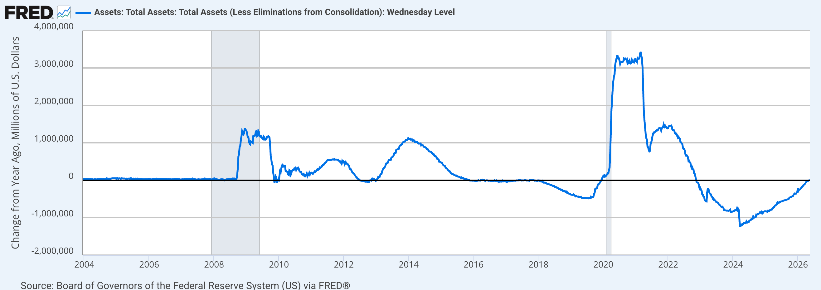
But the hysteria surrounding Trump’s failures (geopolitical and economic) is getting pretty loud and “inflation” is being used as a political football now. It’s not inflation, it’s prices rising because we have an out of control old man building a ballroom, putting his name on everything and screwing the pooch in war, politics and the American economy.
But it’s not just the US. Germany, UK, Japan and other developed economies are suffering rising long-term yields. But the US is the epicenter of today’s global/geopolitical problems. And those problems are driving inflation fears. Hence, the bond market’s souring reactions.
The 10yr “real” yield is under control. In other words, the bond market is keeping up with officially reported inflation by holding yields aloft.
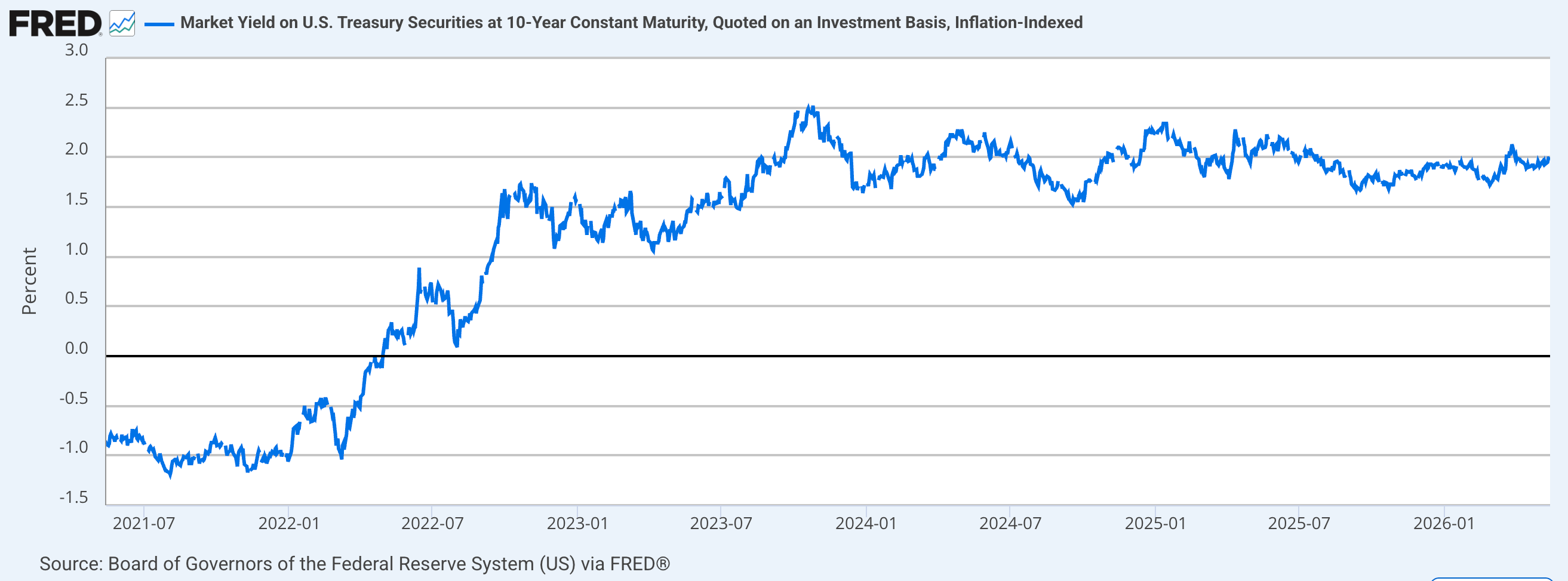
But the 10yr inflation break-even shows accelerating inflation fears, ticking highs last seen in 2023.

The 10yr yield breakout noted previously, continues apace. There is a line in the sand at 4.8%. Halt there and I think an interim deflationary thing will happen (what better play with 99% of the herds on the inflation train?).
Break through there and we’d be in the next phase of the new and inflationary macro.

The big picture on the long bond (notice how I didn’t call it the “Continuum” anymore?) has taken on a dangerous look. The yield is poking the top of the blue consolidation box. A breakout there would mean a new and virulent phase of inflation and, in my opinion, Stagflation.
That has been our primary macro view all along since 2022. But a breakout would call into much question the interim disinflationary view. Or at least delay it indefinitely.

But I am leaning toward the spike in yields finally summoning the forces needed for that interim deflation scare I had been anticipating (but with the Silver/Gold ratio’s up-surge, had been on the verge of abandoning).
More Indications
So, what of the ratio? It ended the week having cracked the Option #2 parameter per the May 13th update.

That horizontal green line is now orange dashed. In other words, it has failed as support. Now we move on to Option #3, and I for one am not giving it the benefit of the doubt. Not in precious metals, not in commodities and not in the stock market either. Cash was raised significantly. If I got played by volatility, so be it. The goal always was to manage risk and retain profits we’ve worked so hard for over the last year.

A bullish Silver/Gold ratio would indicate a time where we almost cannot help but make money. But if that was a bull trap reversal, it’ll be harder to make money. There will be bounces, rallies, rotations and of course shorting opportunities.
That on an interim basis to the next phase in the “inflation trades”, which may not come about until something cracks in the markets and/or economy and Trump and Warsh (with a little Bessent on his shoulder whispering in his ear) spring into stimulative action.
The way it usually works is that heretofore bullish markets submit to Fed fears initially, but then find a bottom from which to project new upside when it becomes obvious that monetary and fiscal authorities are weakening and springing into inflationary action. i.e. creating the next inflation problem.
I know this stuff is confusing. But I don’t know how to chase so many details around without sounding confusing. Inflation doesn’t just happen. It is man-made. It has, over decades, enriched the rich and impaired the not rich, driving the gaps between classes and ruining society itself. Look no further than… RIGHT NOW!
Market Internals & Status
We knew that the gold trade was going to back off after a hysterical 2025. The Gold/SPX (GLD/SPY) ratio has done great work at that. Trend line adherents will be interested in whether or not gold has declined vs. SPX to a limit point, which this chart shows at the blue arrow.
However, it is the precious metals and while 2025 was fun and nearly effortless, the volatility often goes further than you’d expect up front. Gold/SPX merely needs to make a higher low to the last low in 2025.

Let’s again flip it over and expand the view to the long-term SPX/Gold ratio. The bounce was expected. Now we can keep in mind that market moves often go further than you think they will when projecting ahead of time.
So, SPX/Gold is at the resistance target area. This could be all she wrote. But the chart above could slip further and this one spike higher and it would be normal (and still a counter-trend move in the big picture bearish SPX/Gold ratio).

Indeed, all nominal SPX did was get dinged a bit. But two things that bring caution:
- The measured target was achieved amid over-bullish sentiment, and…
- The precious metals tend to lead the upside, and folks, they tend to lead the downside as well (sometimes with significant time lag).

Internally, Semi leads Tech and Tech leads broad, so in real time, the market appears fine. But again, are the precious metals going bearish again, and are they leading? Important questions.


Let’s put up a couple more happy indications before getting to the ‘BUTs’. Growth/Value is still looking good in its bounce. It makes sense in light of the strong USD, because growth stocks often do relatively better in a strong dollar/Goldilocks/disinflationary backdrop.
WHAT??? What did he just write?? He wrote that the USD is strong and so is growth vs. value. He also wrote “disinflationary”. This could actually support our thesis of interim disinflation, which after the Silver/Gold ratio took off, went on life support. It is possible that the market’s internal rotations are forecasting just that, after the bond market tantrum plays out. It’s a story to be developed as we move forward.
Discretionary/Staples weakened last week. The consumer is getting more concerned.

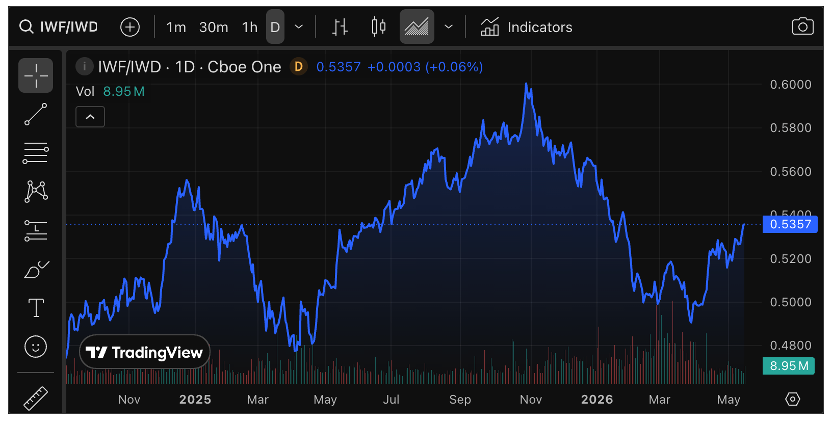
The global stock market is now testing important support vs. the US stock market. Again, this is a logical reflection of the recent strength in USD.

SPX A/D line continues to look double-toppy. That is not a positive.

Nor is the ongoing hard decline in Equal Weight SPX vs. Headline SPX. The machines are rotating, roving and trying to seek out whatever is working. These things take a long time to manifest in bearish markets, but eventually they do when there is nowhere left to hide.

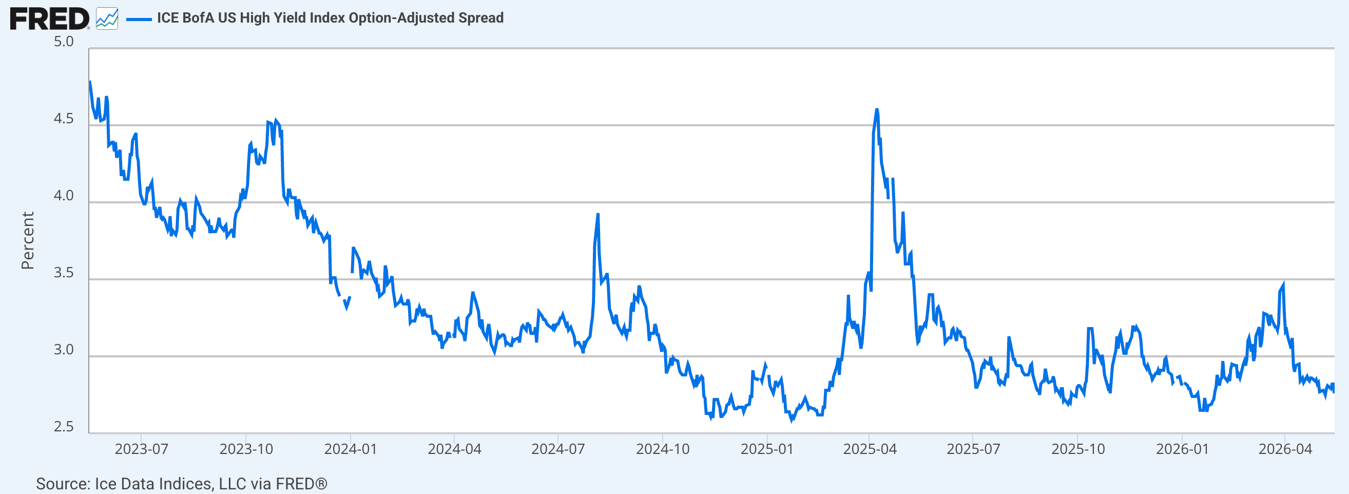
But as of today, there is no sign of stress coming from High Yield spreads. Casino patrons are cozy and confident in the bullish backdrop beyond the weekly ups and downs.
Precious Metals Internals
The GDX/GLD ratio has not lost the Triangle and thus is not broken. The possibility remains that last week was just a spooked market soon to be remedied. Of course, there is the other possibility as well.

Gold needs to stop its decline in relation to inflation expectations, or it is likely to get worse for gold stocks before it gets better. Reference the chart of HUI and the Gold/RINF ratio that we used last year in gauging the gold stock rally. HUI reliably followed the ratio. If this breaks down, the sector likely would as well.

Again, the GDX A/D line and its intermediate downtrend within a long-term uptrend. It fits with our view of a correction within a bull market.

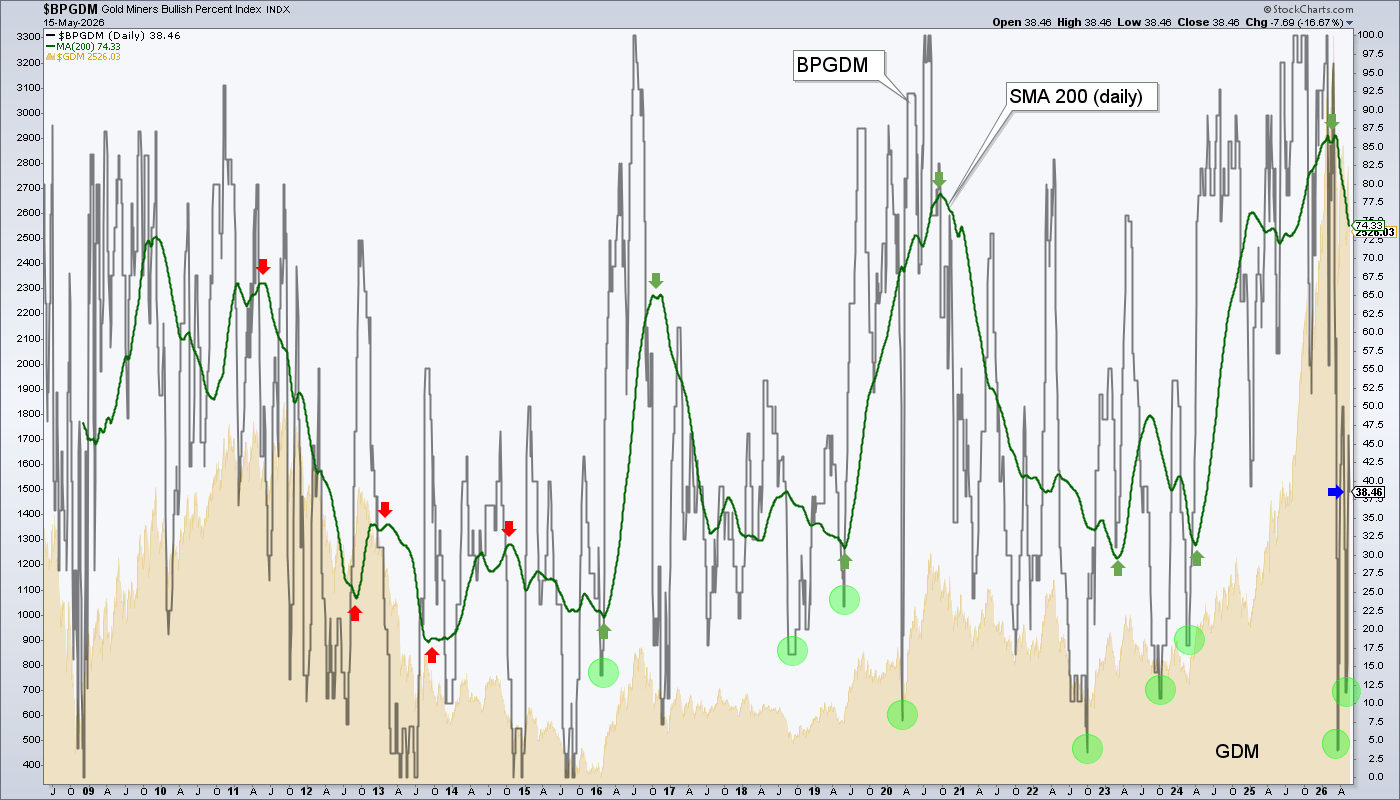
Gold Miners Bullish Percent index rebounded off the floor again. Sure, a great rally could bring it to overbought amid a nice sector trade. But it may also stop right here if the green SMA 200 is bound for a major down swing within the bull market.
And gold’s ratio to oil prices is back to the lows. We have noted that this needs to remedy quickly in order not to impair the miners’ next quarterly releases due in late July/early August. If this important fundamental remains in this condition much longer, it is hard to imagine the market not marking down forward earnings, as oil is a primary cost input of the mining industry.

And that goes for miners of other metals as well, like copper miners. It’s just that gold (less cyclical inflation utility) miners are a bit more heavily impaired than copper (more cyclical inflation utility) miners.
We can continue to view a test of the base breakout in the GDX/COPX ratio as an important one. If the current macro continues to degrade into a negative economic backdrop, the gold miners would be expected to resume upside leadership at some point during the counter-cycle.

Gold, Silver & HUI
Gold (daily chart) faked a little trend line breakout, but resistance and the 50 day moving average governed the situation (remember our preference for moving averages and support/resistance over trend lines). A drop to test the rising 200 day moving average (orange) would be normal, especially since gold already fibbed 62% on its previous test.
What would be abnormal is a drop to a lower low. That would break the daily technicals. So the 4300 (+/-) area is quite important.

My name is Gary and I was whipsawed into giving my subscribers bad information. Sort of. We did maintain a ‘show me’ attitude for silver and its ratio to gold. But it’s pretty evident that I had flipped to a bullish bias because that is what my tools told me to do. I was wrong, at least for a couple days.
With this failure, silver (daily chart) needs to hold the April 29th low of 71.23, or its chart is cooked for a while. Perhaps it would finally get that test of the 200 day moving average while making a higher low to the March 23rd (pre-market) low of 61.02. A real cataclysm and monster buying opportunity would be a test of the big long-term breakout in the low 50s.

HUI (daily chart) would be well advised to hold the rising SMA 200 or the support level just below it at 683 would likely be tested. The lack of a higher high last week suggests that test or a breakdown lower to 637 (+/-) would be more likely.

HUI monthly shows another level just above 600 that could be tested as a sort of companion to silver in the low 50s. We discussed these months ago as would-be no-brainer buy levels (macro willing, of course).

Commodities
Specialty, strategic and critical minerals are preferred. However, if the sector’s guide, the Silver/Gold ratio goes bad, commodities and resources as a whole would be likely to go bad.
As with the precious metals, if last week was just a hissy fit and the indications recover, so too does the bullish view. It’s not rocket science, now is it?
Market Sentiment
NAAIM (market managers) were spooked as of May 13th. The market went up. Makes sense. At 77% bulls NAAIM are in a mushy middle ground, contrary sentiment-wise.

AAII (Ma & Pa) were pretty mushy themselves on that same day.

Fear/Greed index is mushy as well. Its amalgam of inputs are greedy on balance, but tempered.

Portfolios
Gold is long-term risk management & monetary value/stability in a balanced portfolio.
Trading Notes
No positions.
Roth IRA (non-taxable, no contributions)
Last week in this segment:
I am going to tighten up because I caught myself getting a little greedy and self-satisfied last week. Then I saw SPX at the 7400 target (not a stop sign, obviously, but still…) and soon to have far less overall cash [buying a home], I want to tighten everything up, risk management-wise and focus-wise. In other words, I am probably done parroting “diversity” to you. Time to tighten up, G.
Done!
The chart hooked down hard from a lofty level. I had already begun tightening up the risk management before the hammering. But that was just trimming and planting. On Friday I got serious.

The YTD view shows the support area I am intent on defending, no matter what I have to do to the portfolio below.

Cash is 51%, Treasury equivalents are 27% and that leaves equities at 22%, with no short positions (yet).
Riff raff and core positions alike were let go or trimmed. Favored stocks remain in the precious metals and critical minerals. Stuff that had been beat down and could get a short up cycle, like software, Reddit, are held. CBT is testing its base breakout. Hold, I’ll hold. Lose it, I’ll lose CBT. Simple.
I don’t think I want to play the hedging game very much now. If the market goes bad and I decide to hold a few gold stocks, I’ll hedge ’em. Same goes for the broad. But I’d rather lock this thing down for the next clear buying opportunities. Again, that is IF the market cracks.
The view for precious metals, commodities and probably stocks remains bullish. But it’s the interim potential we are discussing here. If the thing cracks and rolls over, I want to nimbly trade short. Have a little fun. Probably mainly in the trading account if I see clear setups.
BTCI and ARREF are oddballs. They are in the portfolio because they pay good dividends. I’ll think before just releasing them in any further risk management to come.
Meanwhile, on the chance (it’s not broken, after all) that the Silver/Gold ratio regathers a bullish orientation, I’ll buy back several items. Whipsawed, but not much the worse for wear.
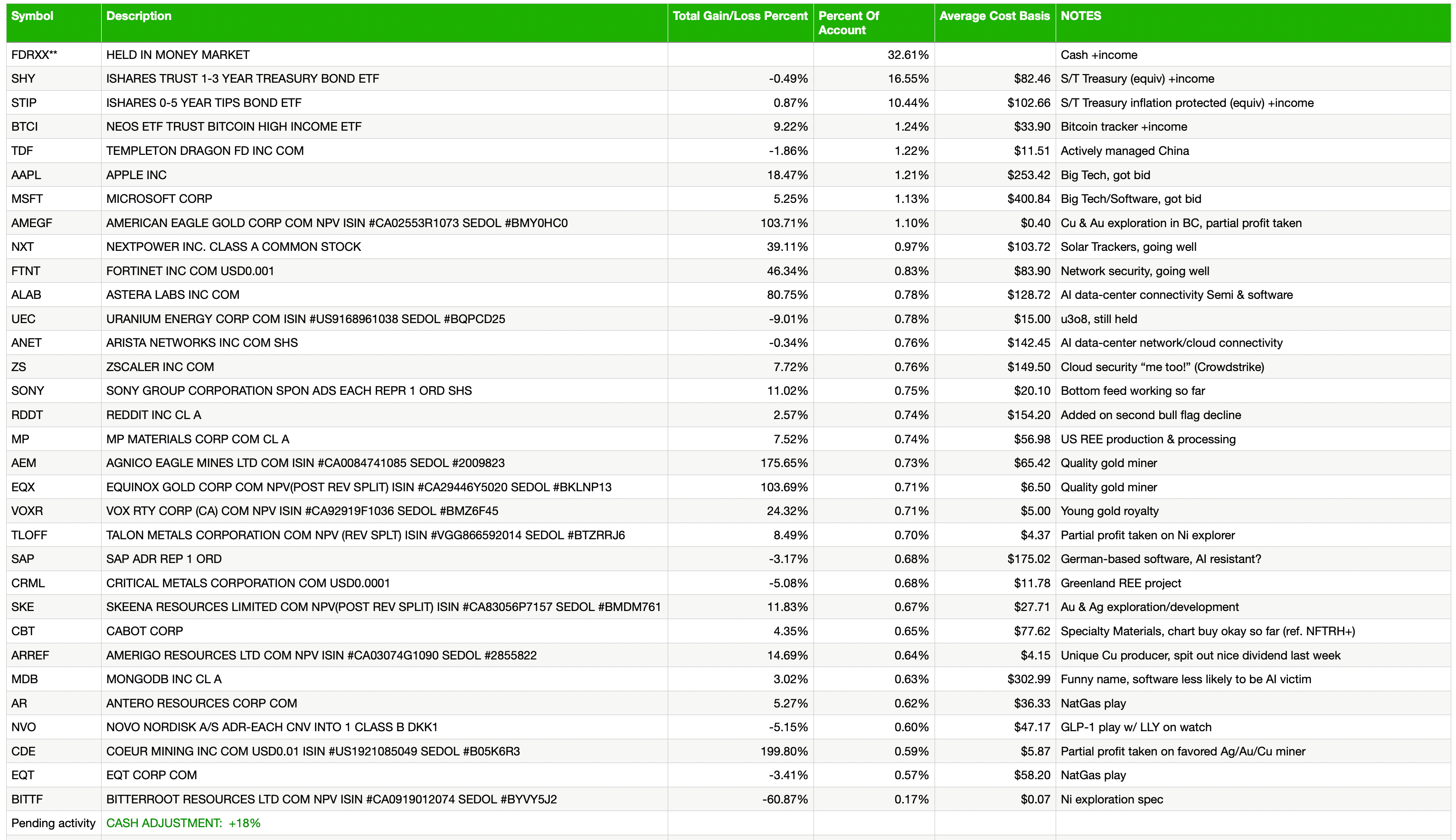
Cash & income-generating Treasury bonds are at levels that are right for me and my real-world situation. Your situation is different. Cash will be adjusted as needed.
Refer to the In-Week Notes under the NFTRH Premium menu at nftrh.com for market talk and occasional trading info, if interested. Also, you can follow on X @NFTRHgt for notice of updates.
NFTRH is not to be distributed to third parties without prior written consent
Notes From the Rabbit Hole (NFTRH) is a weekly market report in which we provide analysis on financial markets. We make every effort to provide accurate and high quality content, but this analysis ultimately represents our opinions and these opinions are provided without warranty or guarantee of any kind. See full terms & conditions of service under the ‘About’ heading in the main menu.
