Two Geologists Walk Into a Bar Stumble Into the Rabbit Hole
With Talon Metals as the focal point, I have a little angel on one shoulder and a little devil on the other. One is very high on Nickel prospect Talon Metals (TLO.TO), and the other has a level of caution about it. They also each have views on Au/Cu explorer American Eagle Gold (AE.V) that I find very helpful.
The angel and the devil are both mineral exploration geologists with projects of their own and much experience in the industry. What a resource to be able to call upon, right from within the subscriber base. I love this job.
Regardless of how Talon works out (so far, so good), I have bounced the idea of a Podcast that may help educate us on the thrills and spills that define the mineral exploration industry in general. Both of these gentlemen, Michael and Greg, * have agreed to participate.
In mineral exploration, there is so much more to know than what a killer hole implies, or what some newsletter thinks. There is an entire industry (mining) that has been impaired by relative lack of interest, regulatory issues, and demands from investors for bottom line results to the tune of near asphyxiation of the metals exploration industry due to the evaporation of capital.
But in the current macro backdrop, where we see gold as the first mover it usually is, silver revving up, and industrial metals/materials (including critical minerals) also revving up to varying degrees, it is time to look at this forsaken sector (well, we’ve actually been tracking it for months now, but it is time to think more seriously about it) and think about the implications of a horrible bear market since 2007 that may have ended at the 2020 crash low.
TSX-V, with components from other industries, is not a wholly accurate picture of the exploration sector, but it is representative for our purposes.

In a long and interesting phone call with Greg on Friday, I – just another neophyte where mineral exploration is concerned – was struck by the real world details of how badly the exploration sector has been beaten and also how compelling the case is (assuming I have gotten the forward macro right) about the future needs of the mining industry to find viable deposits.
If all the macro ducks align as expected, there will be more demand for new metals (Au > Ag > Cu > Ni > Pt > Pt, etc.) projects even as the gold mining industry has largely eliminated its internal exploration capabilities. In the old days, majors like Newmont and Barrick had in-house exploration units. Now? Not so much. Again, demands from investors have tightened the reins, and purse strings, to shorter-term bottom line management.
So if you’re wondering why the metals exploration theme has been slowly creeping into NFTRH lately, it’s because I have been slowly putting 2+2 together (duh) and realizing it may be time to take on the risk (of which there is plenty) and the reward of a sector that has been long-abandoned but may see a feeding frenzy, first from producing miners and then from the wider investment community.
The majors have offloaded exploration and the independent explorers out there have been nearly asphyxiated by a lack of capital flow. If that spigot opens up again it will pay to know what is real and what is a scam in the exploration industry. It will pay to have the educational base to give us a leg up. Through years of interaction with Michael, I know he’s got the goods (he guided me/us with Great Bear Resources). Through a few emails, one highly informative phone conversation, and his bio, I know Greg does as well.
Hence, the Podcast discussing the exploration industry could be the right subject at the right time (after a 17 year bear market, which may have ended). I am targeting October because it’s summer and because I have an 8 week course of treatments ** upcoming, which will be just a bit distracting.
Finally, with the sordid corners of the speculative resources spectrum and its paid promoters disguised as newsletter writers and analysts, I will make clear that I am in no way compensated for anything by anybody other than the subscription rate for the value you as my customers perceive and receive with NFTRH Premium. There is an old boyz (and girlz) club out there wink winking, back scratching and making bank by lathering up readers/listeners/marks. Somebody’s gotta pitch those holes in the ground, eh?
That shall not happen on my watch. Never has, never will. My compensation, if the POD is successful, will, aside from my own personal education and improved investing abilities in the exploration space, be in attracting more people to NFTRH’s already highly intelligent and no b/s audience.
* While I am not identifying them at this time, full bios will be presented when the Podcast actually gets off the ground.
** I suppose I should announce (like so many people seem to do) that my surgery in February was for prostate cancer, and follow-up treatment (radiation) is needed to “mop up” some localized horses that got out of the barn. Prognosis is good after treatment, but the treatments, from surgery to mop up, are a drag. October, baby!
The “SGR Trades” & Commodity Super-Cycle
Generally, our view has been that when silver leads gold a tailwind is in place for commodity-related investments. That tailwind is still blowing and the TSX-V/TSX ratio continues to show an uptick in speculative behavior in the commodity/resources space. So for now, it’s “steady as she goes”.

I find myself getting greedy and that emotion needs to be watched. For example, I took a profit on Lithium prospect LAC and then watched it pop higher. That was irritating. LAC was MY bottom feed, I tell you! But it is also indicative of emotions that need to be kept under control. The Li price is languishing and it’s almost like the machines are out there roving around looking for the next commodity play, whack-a-mole style.

But the way the macro is aligning, it is all to be taken seriously in my opinion. I do believe there is a good shot that the Commodity Super-Cyclers may finally be right. Without dragging out the Continuum and other indicator charts I often hammer you with, the theme generally goes like this:
- An era ended in 2022 as long-term Treasury yields broke a decades old downtrend.
- That trend was disinflationary in its signaling.
- That signaling permitted all manner of inflationary policy, dialed up at will to the enrichment of the rich and the relative impairment/impoverishment of the not rich and poor.
- That in turn laid the foundation for a split society driven half insane with hatred and resentment, not really knowing where to place the blame.
- I place it directly at the feet of the Federal Reserve system, with inflation its primary tool.
- Enter Trump, human battering ram, and his agenda to pretty much bring the U.S. back to the 1970s.
- You know, before the Continuum in bond yields began?
- With the Fed’s ability to inflate impaired by the bond market, inflation would now increasingly be compliments of government (fiscal policy)…
- Not so much by the Fed (monetary policy), working its magic behind the cloak of deflation fears.
- While we may have deflation scares along the way, they will be in the context of an inflationary macro that can no longer sweep inflationary excess of the past under the rug. This rigged game hit its saturation point in 2022 with the epic trend change long-term yields.
- It will now be more obvious, more overt inflation, as it was in the 1970s. Not this sneaky and shadowy Bernanke big brain monetary magic.
- In other words, no more Bernanke (Greenspan, Yellen, Powell) hiding behind deflation bullshit.
- Powell blew the gasket in 2020 and Trump, through his words and actions, appears intent on not replacing that gasket any time soon.
In short, while the stock market and its Mag 7, its AI, its this and its that, its stories du jour, may lurch along not in an obvious bear, the macro as noted above would see paper (stocks and bonds) greatly under-perform precious metals and commodities. The ole’ Commodity Super-Cycle, eh?
In light of the still-held view that there may be an interim liquidity event of some kind, I’ll plan to buy on dips/pullbacks, and try not to chase. Also, I’ll evaluate whether to do some selling or hold through said would-be liquidity event . But if the big picture evolves as speculated above, we will want to make like Old Turkey for long stretches, because it’ll be “a bull market, you know.” (see more Reminiscences Of A Stock Operator references below).
Stocks & Gold
Primary beneficiary of monetary policy of the previous era, SPX (nominal):

SPX/Gold ratio shows the bear market in SPX in gold terms, in the 1970s as nominal SPX above pretty much went nowhere. Side note: What thing below looks like the other thing? Eh?

Gold has already gotten a leg up on the new macro. It is amazing to look at that paper bubble on the right side of the nominal SPX chart and then see its “real” nature on ratio chart. Gold, a real value instrument, is calling b/s on the whole edifice.
Tying it back in to the “SGR trades”, let’s keep in mind that gold usually leads. Gold first, then gold miners and silver, then broader commodities is roughly the way it goes. First, a look at what is going right for the commodity trades in 2025. Then a look at what is not nearly confirmed yet.
A short-term (daily chart) view shows TSX-V leading TSX (orange), silver leading gold (grey) and CRB index trying to grind out a low vs. gold.

However, the long-term view is about a million miles from conclusive. So we have to use macro-fundamental analysis to gauge the backdrop and shorter-term technical analysis to gauge whether or not things remain on track. As of now, per the above, things remain on track. But much more follow-through is needed for confirmation.

Meanwhile, gold’s still-intact leadership to commodities is not necessarily a bad thing for the commodity/resources trades. It’s just that these trades have been more selective and subject to rotation. The situation is as it has been, we want to watch Silver/Gold and TSX-V/TSX as the main guides. By the time the big picture charts start to confirm, a chunk of the bull may already be over. Hence, we follow the short-term guides.
At this point if the forward “Commodity Super-Cycle” speculation is correct, it’s very much a matter of…
“After spending many years in Wall Street and after making and losing millions of dollars I want to tell you this: It never was my thinking that made the big money for me. It always was my sitting. Got that? My sitting tight! It is no trick at all to be right on the market. You always find lots of early bulls in bull markets and early bears in bear markets. I’ve known many men who were right at exactly the right time, and began buying or selling stocks when prices were at the very level which should show the greatest profit. And their experience invariably matched mine that is, they made no real money out of it. Men who can both be right and sit tight are uncommon. I found it one of the hardest things to learn. But it is only after a stock operator has firmly grasped this that he can make big money. It is literally true that millions come easier to a trader after he knows how to trade than hundreds did in the days of his ignorance.”
― Edwin Lefèvre, Reminiscences of a Stock Operator
That book was a revelation when I read it about 25 years ago. But still I tend to be much more common than Jesse Livermore, the iconic stock operator. Being a chart guy I tend to need confirmation before claiming to be right about the market. That kept me (and NFTRH) out of trouble for years and years by keeping us away from “perma” ideology and in line with whatever the hell the markets were doing.
But if this is a real macro change and if that change is as anticipated, it may well pay to figuratively shut off the brain and let ‘er ride. Wait for new ideology to replace the dogma of the old era. Until one day far out in the future, this new ideology becomes dogma once again.
Okay, I am riffing too far afield here. The bottom line is that intellectually speaking we can see the elements of a situation where we can be early to what one day would be common knowledge… at much higher prices. Personally, I’ll think about how many years ago, had I simply held Intuitive Surgical (ISRG), a then-customer of mine, in the single digits, instead of trading it for chump change… ah, water under the bridge. How many of us have similar stories?
Right or wrong, that is how I view the potential of the mineral exploration story in the current macro.
The commodity trades are popping. In a related high risk/high reward segment, the metals exploration trade has had a 17 year bear market clean-out, a classic contrary sentiment profile (it’s been left for dead), and the fundamental, yet still theoretical rationale that resources need to be replaced as metal demand increases. But the wider commodity spectrum has been kicked to the curb as well. If the macro turns as anticipated, a lot of them will bull while paper vastly under-performs.
TA On Random Markets
Gold (daily) is sneaking along sideways on its 50 day average. Key supports are shaded green. Previously overbought RSI looks nice now. Not really bullish, but nice and calm. MACD has also reset. If gold is of a mind, the daily chart says it’s okay to rally.

Silver (daily) got less than a buck from its measured target, which does not need to be a stop sign. Anecdotally however, I am disturbed by the amount of silver cheering going on at X. Whatever, the trend is up, although silver is pulling too far away from the SMA 50. So maybe at or around target a reaction may come about.

GDX (daily) is floundering in consolidation at short-term support corresponding with the 50 day average. Lose that and I remain ready to hedge a bit, or do more selling. Hold that and I remain ready to…

…hold and add for the bigger target per the HUI monthly chart, at around 500.

I had peeled off some of the RGLD (daily) position before the Sandstorm acquisition tank job and after watching it hold support for a couple days I decided to add some back.

Solid gold miner turnaround NGD is one that I decided to hold and am still sitting on that decision. No problem. The question now is “to add or not to add?” at 4.10 or perhaps 3.70.

Gold mine developer RIOFF (RIO.V) has barely even put on a correction. A bullish person who wants to buy/add could think about doing so at the point where the rising SMA 50 will meet the first clear level of short-term support around 1.

A monthly view of the CRB index continues to show an incline within a pattern that would target 385 if 320 is crossed with authority.

Within the commodity complex, Palladium (weekly) is on the verge of activating a target of 1800 to 1900. It is also somewhat overbought. It can get more so, but could also be ripe for a pullback (says RSI).

WTI Crude Oil (weekly) asks “what commodity trade are you talking about, sir?” as it trends down. It is at clear resistance, and if it gets through there it’ll probably try for the downtrend channel’s upper bound.

I’ve been having some patience with the Copper Miners ETF (COPX, daily) and even increased the position on this pullback to support.

Last week the following was noted for Copper miner SCCO (daily):
Over in the copper patch SCCO is testing initial support. I originally bought it for the shaded pattern and see no reason to sell it at this time. This could be a buy/add opportunity, but a better one would be a 3’fer with a gap fill, support test at the pattern top, and converged moving average test in the 95 area.
Welp? It’s a 3’fer. I will think about adding, as I did not notice this on Friday.

Aussie REE play LYSDY (weekly) does not have the oomph that MP and IDR have, being American stocks with significant policy tailwinds. But it is fanning higher in a volatile manner, nonetheless.

Similarly, I messed up uranium by not being in American companies UUUU and UEC, which both popped big. But I am in Canadian company NXE. I expect these type issues to smooth out in time. It’s no problem that NXE is merely looking good above its moving averages. I don’t want to get greedy.

I decided to add NatGas play AR back at support just above the 200 day average. It’s still got a pattern of sorts and it’s got the seasonal aspect as well. Plus a still-intact uptrend.

Energy sector (XLE, daily) is fumbling around between support and resistance (roughly around the SMA 200). I will have limited patience here.

Moving on to broader stonks, SPX continues doing what experience has shown me it will tend to do when it appears to be a bloated hog in need of, well, you know. Levitation. I don’t like it and if/when the economic indications roll over just enough for the herd to start to get nervous, a nice correction or bear market – potentially making a lower low to April – could be in store. As yet, no real divergence by RSI like the one that eventually resolved into the February-April mini crash.
Bottom Line: The pig levitates, as per usual.

NDX is oh so similar, and it may be coming time for me to at least think about unloading some more bull stocks which, in my case, tend to be Tech oriented. Or taking more profits and re-seeding other potential bottom feeds/laggards. For now, I look at stocks like GOOGL for example, and see “still-bullish”.

Last week we got some poor signaling from the tip of the spear’s tip. What I mean is the Semi Equipment sector that is the front end of the front end of the SOX > NDX > SPX market leadership chain. While the SOX held up okay, it has filled its gap (objective), and…

ASML released fine earnings but unpleasant forward projections, which hammered not only its nice looking chart (and my profit). I am not sure the degree to which its issues are trade war related or global economy related (ASML is very global). But if this spreads through the Semi Equipment sector, the indication for broader markets would not be good.

Still holding richly valued AI growth stock ALAB (daily), anticipating an upside gap fill and possibly more.

Serial pattern maker GOOGL (daily) is still eyeballing the upside gap (target) at 202.

XYZ (AKA, Block, AKA Square, daily) bonked resistance on Friday. Still holding because frankly I was not watching it. If I had been I’d probably have kept holding for a shot at the gap at resistance around 81. Ref. June 27th NFTRH+ update.

Let’s end the charting with one of if not the most important, the US dollar index. DXY is still fooling around below the downtrending SMA 50. As such, it is in a classic position to fail. But – and maybe I am thinking too much here – it seems so obvious a failure point that I wonder if it will be.
Per the July 15th NFTRH+ update we are looking for USD not to exceed 99 to keep things nice and comfy for anti-USD markets. A bounce to 100 would also be normal, but probably bring more pain in the short-term. A take-out of 100 would be a caution signal, especially in the more anti-USD flavored markets like commodities and precious metals.
If USD is to remain in the bearish trend below the 50 day moving average, little bounces like this are exactly the thing that refuel the downside. In other words, USD no longer has a short-term oversold RSI condition going for it.

Economy, U.S. Market Sentiment, Indicators, Unicorns & Rainbows
The big beautiful bill passed and Art Laffer is so bullish he’s nearly beside himself:
Economy Set To Boom and an economic “golden age” is upon us (video interview by Adam Taggart).

I don’t want to dismiss this outright because I think Adam Taggart is a forthright guy and I know little about Art Laffer, other than he has been intimate with Republican politics for many years, going back to Regan, I believe. Laffer is seeing Unicorns and Rainbows in the Big Beautiful Debt Bill.
There is also undoubtedly some positive stuff in there for the economy and the stock market, eventually. Regardless, a bill that just passed is not likely to stop an oncoming economic trough or recession. But it is one more reason to believe that on the bigger picture the macro is going to be inflationary, giving the illusion that Mr. Laffer and the Republics would want, a stable stock market and an okay economy, especially in certain areas that benefit from inflation relative to others.
I don’t see a reason to change NFTRH analysis because new debt is being used to goose certain economic areas. In fact, I have been factoring it all along. But the Laffer stuff is going to be the mainstream stuff. And the mainstream stuff is the stuff of market sentiment, and market sentiment is…
…right in line with the Laffer stuff. Unicorns and Rainbows.

Rainbows and Unicorns.

NAAIM was a little bit contained on July 16th, which just happened to be a day the market dropped handily, but then recovered. The week ended with stocks higher and so too most likely, NAAIM bullish sentiment. As it stood on the 16th, NAAIM were still briskly bullish after pulling back from an extreme.

AAII are still mushing around at moderately over-bullish. One day if/when we see an upside jerk by Ma & Pa we may have an actionable signal for a correction.
A couple items from indicator land. These are more traditional than the homemade charts I often cook up to look for alternative views inside the markets.
The “real”, inflation adjusted yield on the 10yr Treasury shows that the bond market remains tight. Is it more the bond market pinning the Fed to its relatively tight stance, or is stubborn Fed policy keeping the real yield aloft? Maybe a combination of both, but I favor the bond market’s signal influencing the Fed. “He’s always late!” but it’s the bond market’s fault. He is a slave to the bond market and the banking system.

95% of CME Traders expect the Fed to hold the Funds Rate steady this month, and in the absence of some kind of outlier event in the next 10 days that is what they will do. But CME traders are now about even on a cut for September after having been more heavily in favor. Then in October they see a 75% chance of at least one percentage point, and possibly two.

It feels ripe for some more obvious things to start breaking in the economy and a classic October downfall. A reminder that our target for obvious economic damage to show up is late Q3, or into Q4.
Commercial Real Estate may be a canary in the coal mine for the economy. We already know that Homebuilders are increasingly building at a loss (news reports, beyond what we highlighted from a subscriber/homebuilder a couple weeks ago, have since come out about the bad current situation for the Homies) in order to offload commitments. But Commercial RE is business related RE, and prices are declining, meaning demand is softening, meaning businesses are softening.
Indeed, the message of this chart is that we may already be in a recession, and it is highly debatable whether Art Laffer’s Unicorns and Rainbows will show up in time to arrest this condition.

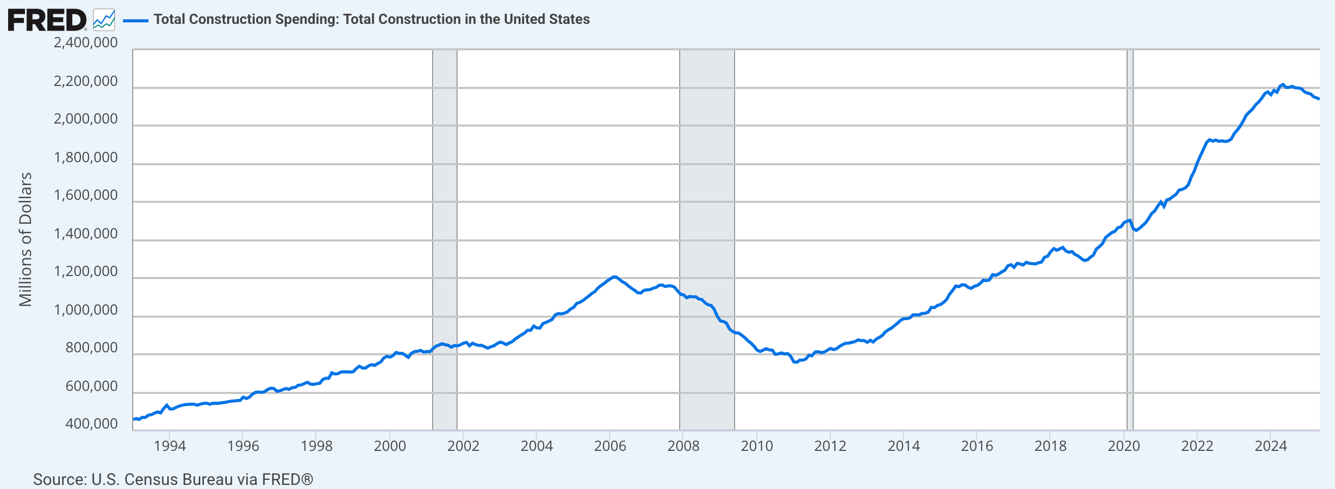
Construction spending has started to roll over. It looks like no big shakes, but it does have the look of what would do prior to a recession (shaded areas). Again, will the Unicorns show up in time?
Housing starts have a wonderful record of declining prior to recessions (shaded). Housing starts are and have been declining. A Unicorn or at least a Rainbow sure would be nice right about now. But one is a fantasy and the other is just pretty mist in the sky.

Finally, I want to make clear that I am playing no politics here. While it is hard to quantify the Trump blunt force policy and its wax on/wax off mayhem with respect to the short-term fate of the economy, the recession I think is coming is the product of the Biden years, and in particular the pre-election pumping it did to keep an economy that wanted to roll over (Yield Curve steepening among other signals) from doing so.
Portfolio
Gold is long-term risk management & monetary value/stability in a balanced portfolio.
Taxable Account
In order of position size. The mix is preferred gold stocks, some bull stocks, some commodity related stocks and increasingly (but slowly), mineral exploration.

The taxable account carries very high cash levels as long as cash and equivalents are paying out. This is considered a savings account of sorts, rather than a speculation or even investment vehicle. The goal is to speculate around the periphery of that. In another market phase (e.g. post-crash), the account may get much more in the game.
Trading Account
No positions.
Roth IRA (non-taxable, no contributions)
The 1 year chart is still butting its head on the ceiling as it ponders whether to break through to new highs. Stay tuned. Adding exploration stocks may either drop the chart or send it orbital. Week-to-week as usual, speaking personally.

Cash is 79%. About right as I sit on my perch deciding whether to lever in or stay guarded about the “interim liquidity event” possibility. As noted, more little TSX-V denizens are finding their way in here as I have decided against outsized gambles on 2 or 3 of them in favor a basket.

Cash & income-generating Equivalents are at levels that are right for me and my real-world situation. Your situation is different. Cash will be adjusted as needed.
Refer to the Trade Log under the NFTRH Premium menu at nftrh.com for trade info, if interested (not that you necessarily should be). Also, you can follow on X @NFTRHgt for notice of updates.
NFTRH is not to be distributed to third parties without prior written consent
Notes From the Rabbit Hole (NFTRH) is a weekly market report in which we provide analysis on financial markets. We make every effort to provide accurate and high quality content, but this analysis ultimately represents our opinions and these opinions are provided without warranty or guarantee of any kind. See full terms & conditions of service under the ‘About’ heading in the main menu.
Hi Gary,
I have a glimpse through a friend that is going through the PC you are dealing with. I’m confident that you have the best of health care and will get through the challenge. Hang in there.
D
You bet I will, D! Thank you.