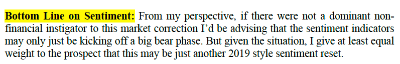
[edit] As the market bounces from what we showed to be heartily recoiled sentiment due to Corona-fear, let’s edit into this TA post the final thought to NFTRH 588’s Sentiment segment having nothing to do with TA…
I remember him on the TeeVee financial news when I used to watch it, like two decades ago. So who am I to argue that this preeminent man who stares at charts is not the Godfather of all we subsequent men, women, casino patrons and other chart jockeys?
Before going further, I’ll make clear that while this post makes fun of chart staring hallucinators for their grand pronouncements based on lines and squiggles it is not making fun of the subject ‘man who stares at charts’. You’ll see why below. But first…
“Acampora says that damage from the coronavirus is ‘going to get a lot worse before it’s over and that will slow economic growth in China’”
Okay, but if I were the Godfather of TA the first law I would render from on high is that in staring at your charts you should not let non-technical factors influence your thinking. Otherwise, you are not being an unbiased technical analyst. You are being a fundamental analyst. So why not keep the damn Coronavirus out of it (or at least demand that the MSM not sensationalize the content)? The technicals are what they are, regardless.
A pioneer in the field of price chart-based trading, Acampora told MarketWatch during a Friday interview that he thinks that the coronavirus fears are a catalyst for a market that had gotten too pricey and was due for a substantial pullback.
Many a fundamental analyst thought the market was pricey before the Coronavirus trigger and this man who stares at charts who is writing this very post for you saw SPX ding target #2 at 3300 and was fully preparing for a top, either there or after an upward acceleration to target #3 (3500).
Here’s the weekly chart from NFTRH 588. Price had extended an equal amount above the 2018-2019 average price estimate (the blue shaded box I conjured up) as it had below it into the Christmas Eve massacre of 2018. What’s more, it did so with a sentiment profile that was way over bullish. This would be a poetic end to the bull, neatly closing out that bearish event.

Mr. Acampora (the surname reflects the reverence a garden variety man who stares at charts should have for the Godfather, and Don Acampora might be more appropriate) is making a projection based on the status of the stock market and a trigger to set things in motion.
“The market itself was stretched, which is true, so we were begging for some kind of correction and this is the catalyst,” he said. He is expecting that the stock market will face at least a 10% drop from its recent peak, which would meet the criteria for a bona fide correction held by most market technicians.
Fresh worries grew over an Asian influenza that reportedly originated in Wuhan City, China, has infected 9,500 people, and claimed at least 213 lives, according to reports out of China. The illness, which has drawn comparisons with SARS, severe acute respiratory syndrome that hit Beijing in 2002-03, is being classified as a novel strain of coronavirus, or 2019 nCoV.
The article then drones on about Coronavirus and whatnot, so let’s use this as the jumping off point. The Coronavirus trigger has cracked the market and the Don’s 10% correction view actually meets my routine pullback projection.
Here is a bit from #588 with respect to the daily index charts…
The tricky thing here is in how to call a market intact or broken. For example, a day trader already sees a broken market while a bullish investor looks down to the SMA 200 on SPX and sees a buying opportunity that this correction could provide.
Here is the last part of the weekly index chart review…
Even if just a routine correction, this one looks capable of bringing SPX to the 3000 area.
Doink. The Don and I agree!
However, NFTRH 588 was 63 pages of comprehensive market management and analysis from the angles of TA, indicator ratios, internals, sentiment and a multi-asset/market views. You simply cannot digest mainstream media articles and think you’ve covered the bases. There is a lot to the story, and it includes a lot more than SPX going to its first real support level at 3000.
This cold, uncaring (about either the bulls or the bears) weekly chart has led off the Market Sentiment segment for months and months now. The stock market is bouncing in pre-market but it does show a crack from the Robo-trend last week and it shows that VIX can bump up higher before it hits its next congestion area.

What’s more, this daily chart of the VIX and inverse SPX had us on alert for a correction since well before the word Coronavirus entered the lexicon. So again, why not stick with the charts in a less noisy way and segregate out fundamental/sentiment/value analysis for what they are discretely?

I use charts, often in ratio to one another and across asset classes, to find market signals and to dig out fundamental signals first and foremost. Hence my ‘Men Who Stare at Charts‘ shtick, created to make fun of those (and myself when I think I see something in a chart that turns out to have been a hallucination) who look at nominal charts and baffle ’em with bullshit.
Here we conjure the view of the propeller heads a group of TAs in the back of the shop where they are segregated off from the real analysts, who crack jokes about them under their breath in the office and more boisterously later when getting loaded at the bar. If the TAs actually show up at the bar there may even be wedgies involved.
Subscribe to NFTRH Premium (monthly at USD $35.00 or a discounted yearly at USD $365.00) for an in-depth weekly market report, interim market updates and NFTRH+ chart and trade setup ideas. You can also keep up to date with actionable public content at NFTRH.com by using the email form on the right sidebar and get even more by joining our free eLetter. Follow via Twitter @NFTRHgt or StockTwits.