Amigo #1; Stocks vs. Gold
This Amigo has a ceiling that is higher when viewing monthly charts, but the daily is coming under pressure, depending on whether or not pre-market activity follows through into regular trading. I harp over and over again about the gold sector being counter-cyclical, and this is the best indicator to waxing or waning confidence in the cycle that is in force. Confidence could break down here, on a short-term basis at least.

Amigo #2; Long-Term Interest Rates
10yr & 30yr Treasury yields are higher this morning with bonds of course lower.
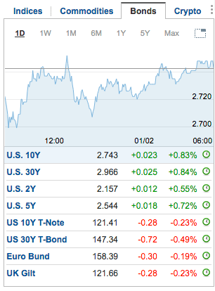
The 30yr yield has lagged as inflation hysterics have not (yet) gotten out of the barn. But both the 10yr and 30yr are in bullish stances and target 2.9% and 3.3% respectively, at least as far as logical long-term resistance goes. But with stocks weakening vs. gold we can be on watch to see if this Amigo stays the course or aborts if Amigo #1 aborts, even temporarily. The thesis has been that yields will rise with bullish, albeit inflationary (anti-USD) broad market activity. While it is no sure thing that yields will not break decades-old limitations (for example, the monthly EMA 100 on the 30yr) the odds favor them NOT doing so at precisely a time when inflationary hysterics are at a peak (ref. Q1 2011 for an inflationary example, and Q4 2013’s “Great Rotation” hype for another).

Amigo #3; Yield Curve
This is probably the least sensitive Amigo. #3’s signal (an end to flattening and/or a beginning of steepening) can come about with significant lag time before markets react in a negative way. The above yields snapshot shows the 10s (and 30s) up more percentage-wise than the 2s this morning. This follows an already constructive posture on the daily chart at yesterday’s close. Maybe this is just another minor disturbance similar to the upturn in 2nd half 2016? Long-term bulls would need to hope so.

Bottom Line
When the Amigos and other indicators (one highly sensitive cycle indicator in particular being held close to the vest as a proprietary one for NFTRH subscribers) turn these turns can indicate a market disturbance or, upon changes in long-term trends, a major economic and market issue. Right now we are only looking at the former. First things first.
Side Notes:
- Amigo #2 can keep riding upward even if the market backdrop goes bearish. There is no rule that rising interest rates must indefinitely go hand in hand with a bullish macro. At some point that can become a headwind… or worse.
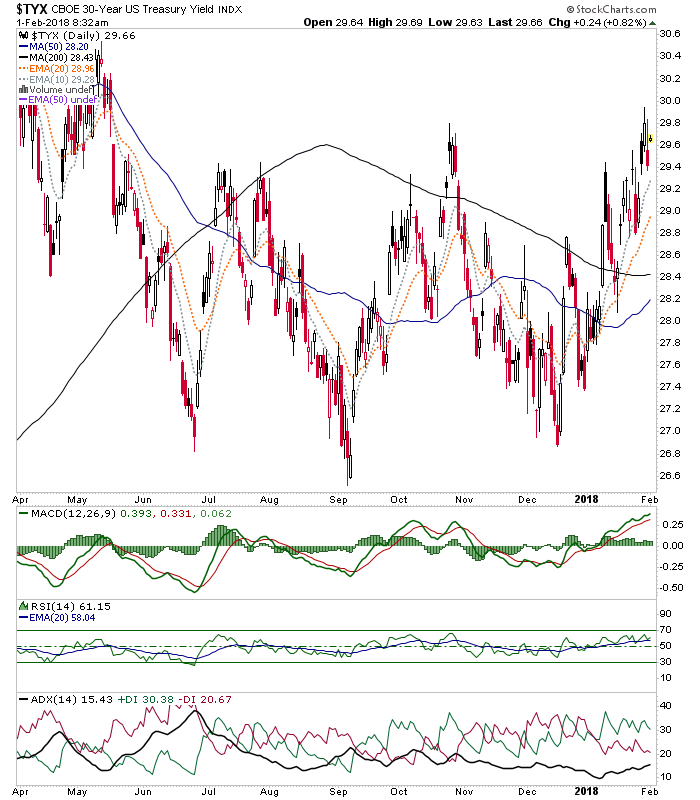
- ADX and DI+/- appear on the charts because I am trying to get comfortable with them again after not using them in a long while. The reason being that they are theoretically at least good at spotting intensity or lack thereof in existing trends and the DIs are sensitive to trend changes. For instance, on long-term yields the 10yr shows an intense daily uptrend while the 30yr shows an exhausted downtrend and fledgling up turn in positive momentum.
Just some shorter-term macro perspective stuff for your Thursday morning.
Subscribe to NFTRH Premium for an in-depth weekly market report, interim updates and NFTRH+ chart and trade ideas; or the free eLetter for an introduction to our work. You can also keep up to date with plenty of actionable public content at NFTRH.com by using the email form on the right sidebar. Or follow via Twitter @BiiwiiNFTRH, StockTwits or RSS. Also check out the quality market writers at Biiwii.com.