A few daily chart pictures to show some repairs in progress for ‘gold vs.’ other asset items, which also means degradation in progress for assets and markets positively correlated to the economy. These represent a bounce back at least, to the interrupted up trends in most of these indicators. Also, an updated view of yield dynamics.
With reference to the weekly multi-market ‘Gold vs.’ charts we review in NFTRH, here are some in-week, in-day views…
Gold-Commodities is on a bounce back, but has not renewed the uptrend by daily chart. The weekly, as we will see in the weekend report has had a very good repair job.

Gold-Oil is making good strides.

Gold-Industrial Metals remains firmly in breakdown mode and is a positive divergence for the stock market, the risk ‘on’ trade and potentially the global economy. Now, a divergence is only that, a hint of a potential outcome.

Indeed, Gold vs. fellow precious metal Palladium continues to improve its standing. This is the one we’ve used as a more sensitive indicator to economic issues. Precious counter-cyclical metal vs. precious cyclical metal. Notice how GLD broke down vs. PALL (below) first (in June/July) and then vs. DBB (above) in September. I’ll stick with GLD-PALL as a more sensitive indicator and right now it is bouncing back toward negatively diverging the economy. We’ll update the weekly view on all of these items and more in NFTRH 420 of course.

Gold-Silver is still in an uptrend from July, which goes with the precious metals (and broad market) correction (silver generally leads the rallies) but the indicator is still in a 2016 downtrend as it is below the SMA 200. A rise above the June high would not be good for markets, economies and possibly, temporarily at least, the precious metals.

Gold-US Stock Market has reclaimed its former status back above the weekly EMA 50, as will be shown in the multi-paneled weekly charts on Sunday, assuming tomorrow does not do something highly untoward (always a possibility in this market).

As has gold vs. European stocks.

Now, moving on to a few other items we have kept tabs on lately. The real time proxy for the yield curve, the 30-5, is still maintaining the break above the SMA 200 and would be a signal of inflation or a counter-cyclical economic backdrop. It is a positive indicator for gold.

And the ‘inflation expectations’ gauge remains buoyant, so the implication is still constructive for the inflationary view.

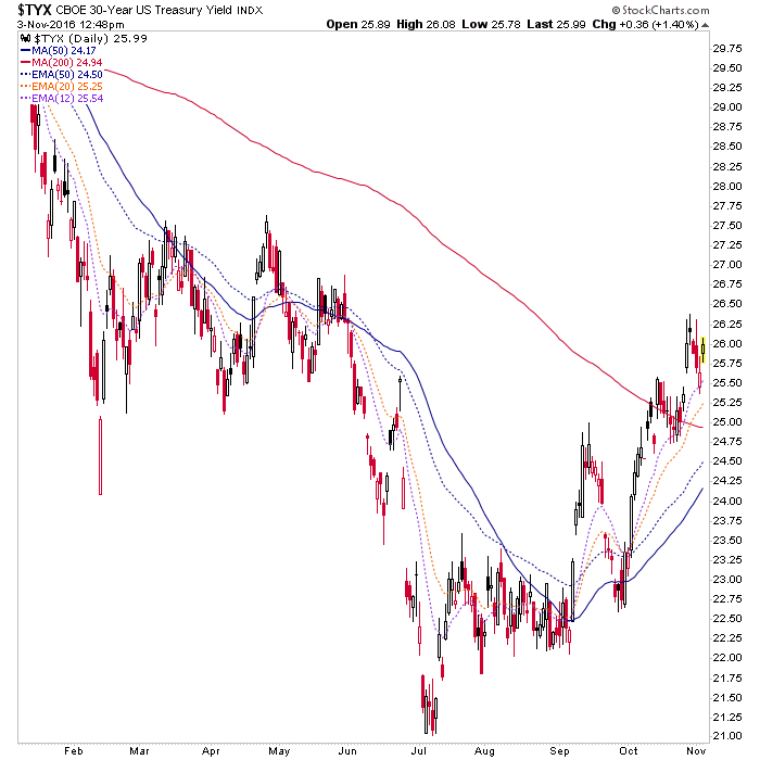
Finally, yields are rising. But with the long end rising faster (yield curve rising), it’s another implication of inflation but also a ‘tell’ that the Fed is responding to the bond market, not the other way around. By extension, it is also a ‘tell’ on our biggest theme entering 2016; a waning of confidence in the central planning clown show. 30yr & 10yr yields…


Subscribe to NFTRH Premium for your 30-45 page weekly report, interim updates and NFTRH+ chart and trade ideas or the free eLetter for an introduction to our work. Or simply keep up to date with plenty of public content at NFTRH.com and Biiwii.com. Also, you can follow via Twitter @BiiwiiNFTRH, StockTwits or RSS.