

Report completed on Monday morning. Abbreviated though it is.
Summary
Precious Metals (bull market)
Correction still in effect for gold, silver and GDX/HUI. Bounce has hit a would-be point ‘B’ of a would-be A-B-C bull market correction, with would-be ‘C’ down still to come. Still resting at that decision point. Current plan is that gold stocks are “nothing special” over the balance of 2026. But reassert leadership in 2027.
US Stock Market (bull market)
With the happy SoH news the stock market rallied and eliminated the A-B-C further correction potential. A lot of noise still in play and the market is likely to be volatile. View for post-acute phase of war is a bullish 2026.
Global Stocks (bull market)
Still a mixed bag of relatively strong and relatively weak global markets. On balance, global is bottoming vs. US stock market. Hence, a target for diversified portfolio holdings.
L/T US Treasury Bonds (bear market)
No market is more subject to the drama and supposedly inflationary effects of the war than bonds. It’s not inflation, but it has been causing revulsion toward US debt. The view is still for an interim rise in bonds/decline in yields as a bullish 2026 engages. As with other markets, bonds will have to clear the acute war phase first.
Commodities/Resources (bull market)
Most will follow gold/precious metals as usual (assuming silver leads gold). In the expected H2, 2026 market recovery, commodity-related stocks should play a prime role. We are no longer narrowly focused on the precious metals. Individual commodities are all over the place. Oil is a war-related wildcard. Outliers like uranium are technically intact and appear ready to rally have begun to rally.
US Dollar (cyclical bear market, L/T still a bull market)
USD continued to ease on rising hopes of a ceasefire/war end. Players had driven into USD not because America is winning (“duh”), but because the tattered reserve currency is where liquidity is found. USD will be subject to the emotions of the war, as with most other items. The more fear and strife, the better for the reserve currency. That has been the theme in the interim to USD’s cyclical bear market.
Comment
Currently viewing the situation much like the 2025 correction and to a more moderate extent, Q1, 2020. What we need to do is not be thinking like the majority of investors, i.e. the herd. Hence protection and risk management first, capitalize second. That second thing is the more fun thing. Indications are that H2, 2026 will be bullish once the current correction runs its course.
Market Internals
Rather than trust the news cycle, or whether or not Trump is lying, or the Iranians are lying for that matter, we should keep our eyes on the ball. Ball = markets. We need to look inside the ball, not just at its outer surface. Inside the market are several signals on the fly. Let’s look at some of them and review brief interpretations.
The Gold/Silver (GLD/SLV) is not indicating any particular imminent danger. Of course, a switch could flip at any time, but all we have to go by is what is the reality… now. If the GSR rolls over it would be beneficial to commodities, precious metals and many stock markets/sectors.
A reminder that many of these charts can be found whirring away live on this page at any time you wish to review them or mark them up, change time frames or otherwise manipulate them.

Gold is rolling over vs. the stock market. If this continues, it would be the first correction (renewal of hope) of the new macro phase we have anticipated.

Here is the long-term view of its inverse, the SPX/Gold ratio, which has broken down on the big picture but has been subject to a bounce. I could see SPX/Gold easily bouncing to 1.65 (currently 1.47) if/as the world finds relief from war and finds ample liquidity courtesy of future policy from Trump, Bessent & Warsh and their global fiscal/monetary counterparts.

Gold/Copper maintains a slightly bull-biased trend, but also the potential to roll over. If it rolls over that would signal party time, likely in commodities and commodity-related areas. I would also be beneficial to many other markets.

Gold got hammered in oil terms. If peace breaks out oil should get hammered and this ratio should bounce back to some significant degree. But if we’re being realistic – which I am always trying to be – the current picture is one of over-valued gold miners relative to this picture (ref. NFTRH 910’s chart and analysis).
There are those out there advising how undervalued gold stocks remain vs. broader stocks. That may be so. But it does not matter. I would not fall for cherry-picked data points. The Gold/Oil ratio needs to get a move on now or the miners will eventually feel the pressure, operationally.

We have viewed a longer-term chart that shows a base/breakout in counter-cyclical gold miners vs. cyclical copper miners. I believe that breakout will hold and the gold miners will again assert amid a counter-cyclical backdrop. But that may be out in 2027, if our analysis is correct about a broad bullish 2026.
In the interim, this is a picture of “nothing special”, which we’ve been calling gold stocks in 2026.

After declining with the war’s bump up in inflation expectations, the Gold/RINF ratio is indicating easing of inflation, which was really NOT inflation, as I’ve belabored. This should start to reflect in bonds, whereby yields would ease and bonds rise.

This post at X shows a breakout by the TSX-V index from consolidation. That is well and bullish for junior exploration/mining.

But we want to see TSX-V/TSX ratio also maintain its low and rise. So far it is doing that. If it continues its a positive signal for the wider commodity/resources/precious metals sectors.

These three charts all tell the same story: Internals have been breaking positive for the US stock market. Growth should lead Value, Tech should lead SPX and defensive Healthcare should decline relative to SPX in order to call it a bullish internal situation. That is what is happening.

Meanwhile, if Tech is leading SPX and Semi is leading Tech such as it is, it’s just a plain bullish internals situation. It may seem obvious now, but it was not a week or two ago when these indications were advising us bullish. Now I’d watch for any negative divergences to the now obvious bull move in the market.

Consumer Discretionary is spiking vs. Consumer Staples. Another sign of risk-on beneath the surface.

Finally, dialing out a longer view of Junk vs. Investment Grade bonds we see a couple patterns within an uptrend from an October low. HYG/LQD is working on a trend line breakout now and if the pattern expresses upward, we’ll have another internal indicator on full bull. Speculation in junk bonds goes well with a risk-on backdrop.

SPX Technical Status
SPX closed the week at a new all-time high. While it is getting overbought and subject to interim volatility, the technicals are now pointing to the next target, which is the pattern measurement at 7400. SPX did not even pull a 38% Fib retrace before it bottomed and took off. So I removed the now-obsolete Fib grid from the chart.

As already shown, both SOX (Semi) and NDX (Tech) are out-performing. So if SPX is bullish, they are even more so.
Market Sentiment
And wouldn’t you know, casino patrons are swinging back to greed, as we knew they would once a bullish backdrop became obvious.

With the Fear/Greed index’s components, notable are Summation index, flipping to greed.
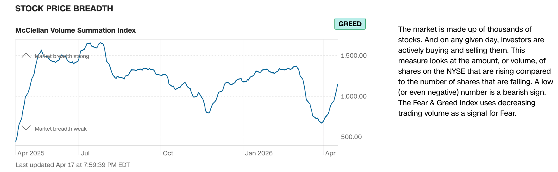
Notable are Put/Call options, tanking to greed.

The VIX has broken down, but I am still holding volatility (UVXY) because… reasons, I guess.

Meanwhile, NAAIM (market managers) has started ticking up on the 15th, and by the end of the week it is a sure bet they are back to bulling (chasing the market).

On April 15th, AAII (individual investors) actually ticked down a bit. They are not as jumpy as the buttoned down investment guys. Hence, NAAIM is a more timely contrary indicator.

Sentiment Bottom Line
Several sentiment indicator dropped deep enough into over-bearish readings to end the correction. That was not the favored view, as I was looking for something closer to the 2025 sentiment profile and at least a 38% Fib pullback in SPX. Not to be. So the rally is on, but it does not have quite as much sentiment fuel behind it as originally planned.
Current profile is quickly becoming over-bullish, but not yet extremely so. With markets already getting overbought, however, this newly happy sentiment profile could see some incoming volatility just to make sure casino patrons get an occasional reminder that it’s not all rainbows and unicorns.
Monday Morning
Precious Metals, Commodities & Closing Out the Report
Thank you for your patience. Yesterday a surprise issue popped up and I was on the road from 10:00 AM until 8:00 PM. I got home in time to watch a hockey game and then zonked out.
It is now Monday morning and to little surprise, this >>>

Well, at least we are getting the tamp down that the sentiment profile noted above implied was needed.
The precious metals are in tow with the broad market, as has been the case all along. Commodities are as well, with the obvious exception of oil and likely any other commodity subject to the drama at the SoH.
I will not proceed robotically with the normal report because we’ve already got this emotional garbage in the headlines, and it’s the headlines that are driving the market situation right now.
Precious Metals
Gold Stocks
Continue to be vulnerable to the A-B-C correction view, last shown in this April 16th NFTRH+ update. However, GDX is down (98.65), but still above its 50 day moving average (98.35) in pre-market. Generally, that is the marker I am watching to either keep GDX viable bull again, or fail and go A-B-C. It should be noted that with the exception of a little pop on Friday, GDX volume has declined on the rally from March 20th. That is a bear flag characteristic.
Gold
Gold, on the other hand, is below its 50 day moving average, as it has been all along the recent rally. A look at GLD shows declining volume during the rise from the March 24th low. That implies a bear flag.
The GDX/HUI to Gold ratios are still intact, even in today’s pre-market. So that’s a positive indication.
Silver
Silver’s robotic rise from March 23rd has also come with declining volume on its related ETF, SLV. This morning in pre-market the silver price (79.25) is easing to test its 50 day average (78.97). A similar situation in that respect to GDX above.
Precious Metals Bottom Line
No change as the segment is subject to the same news cycle as the broader markets (with the exception of crude oil and other items constrained by the SoH, which are subject in the opposite direction).
A-B-C corrections still viable in gold stocks and gold. Silver and the miners are testing the 50 day averages this morning. A failure would amp the correction view, especially since volume has been declining in bear flag fashion.
If somehow the news cycle turns the broad markets bullish again and the PMs hold/retake the 50 day averages, the bull market likely resumes. If not, our targets are roughly…
GDX: 65 (+/-) per the update linked above.
Gold: A possible re-test of the SMA 200 around 4200.
Silver: A possible re-test of its SMA 200 (60.50) or perhaps a plunge – in true silver fashion – to test major breakout support around 53.
Commodities & Closing
Folks, I’m about done. Cooked. Please pardon me, but I am just too tired to go over too much old ground.
I like commodities for the post-war, balance of 2026 into 2027 phase. Especially critical and strategic commodities like Uranium, REE, Battery Metals and so on. Oil? I’m not touching that pig or the headlines driving it.
The portfolios hold pretty much what they held previously. Favored gold stocks, with a couple profits taken and an emphasis on royalty and exploration. The exploration names tend to be multi-metallic and they, along with a majority of miner holdings, tend to be US or Canadian as I am in no mood for bullshit, where political noise is concerned.
Beyond that, the portfolios remain diverse across several sectors and there is some global diversity in there as well. If the war looks like it will bite deeper – or if markets start losing short-term caution points (like the 50 day averages noted in the PMs above), I’ll add to my bear positions (currently SPXS and UVXY) and view the war as a buying opportunity.
Imagine that. Unbelievable tragedy, waste, lies and evil (and I’m not just talking the US) as “opportunity”. Well, that is my job in this context.
The IRA ticked a new high last week. That is likely to prove a bull trap, in the short-term at least. Oh well, onward with the drudgery of managing a market through a major geopolitical event.

Cash & income-generating Treasury bonds are at levels that are right for me and my real-world situation. Your situation is different. Cash will be adjusted as needed.
Refer to the In-Week Notes under the NFTRH Premium menu at nftrh.com for market talk and occasional trading info, if interested. Also, you can follow on X @NFTRHgt for notice of updates.
NFTRH is not to be distributed to third parties without prior written consent
Notes From the Rabbit Hole (NFTRH) is a weekly market report in which we provide analysis on financial markets. We make every effort to provide accurate and high quality content, but this analysis ultimately represents our opinions and these opinions are provided without warranty or guarantee of any kind. See full terms & conditions of service under the ‘About’ heading in the main menu.
