He’s at it Again
Trump is badgering Powell relentlessly about interest rates. Aside from being great theater (of the absurd), the odds are near zero that the Fed will cut in June and very small they’ll cut in July. CME Group, which we have noted tends to be more of a wind sock than an accurate prediction tool, currently sees the winds blowing to the tune of 97.4% “no cut” in June and 83.3% “no cut” in July. Come September they start to favor a .25% cut.
Meanwhile, he’s at it again.

Suddenly Trump wants to be more like Europe? This is a president who wants what he wants and is used to getting what he wants. I believe he built his empire out of sheer force of will. I also believe he doesn’t know WTF he is doing. He’s just doing it, because “winning… duh”.
“Go for a full point, Rocket Fuel!” Trump wrote in a Truth Social post.
Trump is speaking as if to children, and playing to the crowd. In this case a crowd that is not at all sophisticated in the workings of the financial markets. Various Republicans who are versed in economics (Rand Paul comes to mind) are gathering among the legions of sycophants in the party to raise their voices against Trump’s spending bill (and its new trillions in debt), and I imagine they are also shaking their heads about this delusional demand for 1% rate cut.
Trump wants to punish paycheck-to-paycheckers, savers and grandma’s “safe” income. Is there enough cutting in the tax bill for the little guy to offset this? Meanwhile, with trillions more due to be added to the national debt, Trump is also planning to continue the punishment of future generations. I am not being anti-Trump. I am stating facts, just like I did with Biden, Trump 1.0 and so on and so forth.
Meanwhile, the long bond’s yield is trending up on a daily chart.

Yields are elevated across the Treasury spectrum, and the 10yr2yr yield curve is un-inverted and steepening.
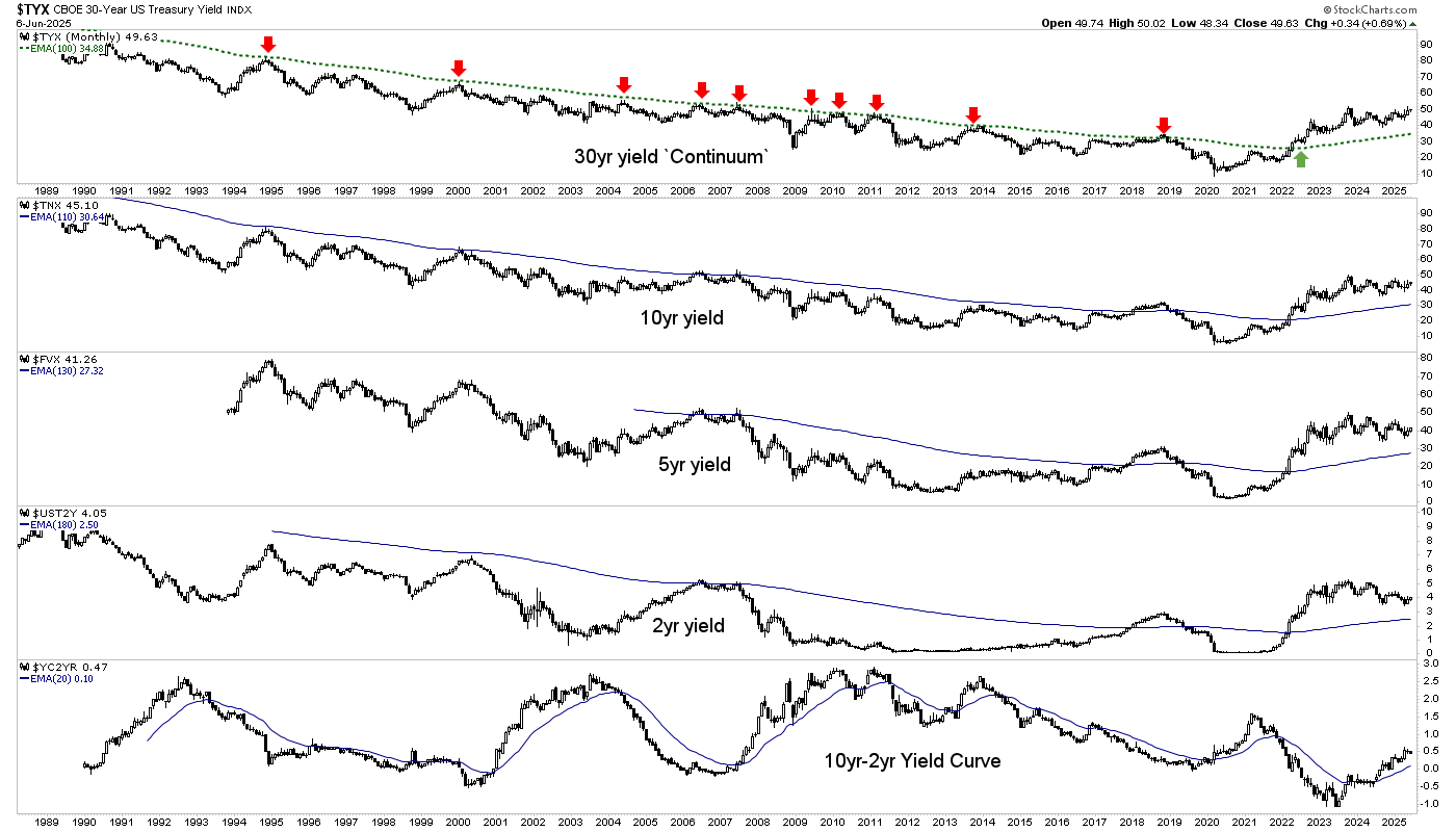
Yield Curve Warning Still in Play
However, a comment from Friday’s post on the yield curve:
Yes, need to be bearish. Or at least a need to not be dismissive of the bear case and jump the bull bandwagon, FOMOing the relief rally that we knew was coming due to unsustainable sentiment and Trump’s waffling jawbone. We planned for it well ahead of today’s MOMOs who are playing it, FOMOs who are chasing it, and true believers who… well, believe in it. We planned for it while most people were affixing their crash helmets.
I don’t see the yield curve’s big picture as anything less than a warning that the last two real bear markets came as/after the curve had de-inverted and started steepening. The signal remains.

“He’s always late”
Trump is right. Powell was late in 2018 when Trump harangued him relentlessly to cut rates despite the Continuum flashing “code red” about inflation anxieties. Back then Powell listened to the bond market, as the Fed will.
But soon after, the bond market did indeed begin to drop rates, finally climaxing in the deflationary liquidation of Q1, 2020. At the behest of the deflation-signaling bond market, Powell sprang into action and gunned the system with inflationary rocket fuel that persists to this day in some areas.

Now I call your attention to my “tardy Fed” shtick, circa 2021-2022, when 2 year Treasury yields began to rise while the Fed sat on its ass with absurdities like “transitory inflation” emanating from its multiple orifices, along with a political angle as Treasury Secretary and former Fed chief Yellen parroted those words from her own orifice.
The bottom line is that the Fed will likely be tardy again. As it was in 2000 and in 2007. But economic items like Friday’s payrolls report (moderately positive vs. expectations, before revisions) keep the bond yields firm for now and thus, keep the Fed firm. Sort of like 2007, eh?

Trump as “market seer?”
Ah, no. Trump as the boy in the sandbox who wants all the best Tonka Trucks and other toys. Indeed, he wants the whole sandbox. Trump cannot be taken seriously when he at once touts the strong economy (due to tariffs) amid the bond market’s fears of inflationary effects, but calls for rate cuts as in Europe.
Is America not “great again”? Or are we led by a man who is another in a long line of ‘debt-for-growth’ (at all costs, especially to future generations) proponents? Trump built his fortune in real estate, after all. That means debt leveraged for growth. He built an empire out of debt (and a strong personality). But this is a sovereign country and economy, not a real estate empire. Yet Trump wants what he wants, and he wants it now.
Trump is an easier target than the Biden/Yellen operation was. They played the game, hid behind an opaque presentation of normalcy. They gunned their agenda as well, only they were sneakier about it. Trump is a battering ram. He is, in my opinion, no better economically, but maybe not so much worse. What he is… is out in the open. But I do not believe he “sees” much of anything, other than his agenda with so many moving parts it is hard to believe that there is a sensible conclusion built into the plan.
US Stock Market
I took a couple profits, forcing myself to sell winners ZS and CVNA because I was in love with them. I thought I was pretty smart for having the guts to buy them when people weren’t buying, and hold them well into the phase when people were buying (aggressively now).
Since the ‘B’ high was taken out, our plan for SPX has been for a test of the highs (pending volatility). A test of the high and resistance is happening now. But we know how this story often goes. You are brave when you buy the fearful lows and you sell when the herds get brave again. Then the pig keeps going up! But risk is rising right along with said pig.
So my plan allows for, if not expects, new highs. But I felt it was time to take some profits and be on the lookout for other items across US and global markets that have not yet done much. Relative bottom feeds, if you will.

One example is premier global Semi Equipment maker ASML, which was presented in an NFTRH+ update (actually ++, which has since been handed over to Hammer, mainly) on May 28. The hold at support coinciding with the SMA 200 (orange) is key to keeping this constructive as a bottom feed. Obviously, to activate bullish it needs to take out the 782 area.

Another I have my eye on, especially since ZS was released, is ZS’s little bro, TENB. He of the more modest valuation and lesser growth (but still growth). Man stares at cool little bottoming pattern with positive divergence by daily RSI at the low, and RSI and MACD working their way northward. Man also sees rising volume profile. Man wants to replace ZS with this item. Man will likely do that this week if the broad market remains okay.

Man does not recommend TENB specifically. He uses it to illustrate a technical bottom feed/buying opportunity.
US Stock Market Sentiment
Not much new to report. Sentiment remains in the same over-bullish but not yet extreme status. Risk rising, but not necessarily ready to be realized.
Dumb money is over-bullish and Smart money is fading.

Greed is still the word of the day, but not extremely so.

Investment Managers remain over-bullish, but not extremely so.

Ma & Pa are in a middle ground, as they tend not to work well as contrary indicators until they finally jump in whole hog after holding out for a long time. They can give a good signal when they finally relent to the bull case when the FOMO is too much to take.

Commodities and the Silver/Gold Ratio Trades
Calling it an “inflation trade” seems not totally appropriate because commodities have all too often failed to do much during inflationary phases over the last decade. That is due to the market’s fixation on the Great and Powerful Fed (of Oz) and its powers of hawkishness supporting the US dollar.
So let’s call this the “Silver/Gold Ratio” trade. And let’s also note that it is already well along, per an NFTRH+ update on Friday morning. Flipping it over to its evil twin, we see the Gold/Silver ratio, no friend to commodities, already nearing its 200 day moving average.

TSX-V/TSX ratio has been trending up as we’ve noted, and now finally the Silver/Gold ratio caught on. This is our signal that the projected trades are engaging more broadly, but also a potential ticking of the clock toward termination. Unless silver is about to go on a big heater vs. gold and change trend, that is. I do not favor that scenario, but do give it some consideration.

Various personal trades have worked or are working well, including Uranium, Rare Earths, Platinum/Palladium and to a lesser degree, Copper. But it would be a good idea to be mindful of a potential expiration date with the SGR popping and the GSR dropping, each back toward their trend markers (down and up, respectively).
Oil is a bit of a wildcard because it is so wrapped up in politics and associated supply manipulations. We had an NFTRH+ update on crude oil fund USO on June 4th and that is working well so far. The update highlighted not only a bullish looking (bottom feed) chart pattern, but positive seasonal and commercial hedging (sentiment) alignments as well.
Here is the associated pattern in WTI. Pretty similar to the completely unrelated TENB bottom feed pattern above. It too has an RSI divergence at the low (Head), but not the rising volume profile.

The bottom line on commodities is that the game of Whack-a-Mole is likely to continue, as one drops and another pops (sometimes quite impulsively). But the the Silver/Gold ratio can be a good guide to timing. There remains potential upside headroom (downside in the Gold/Silver ratio), but the play is well along.
Personally, each day that passes sees me becoming more aware of paper profits and the idea that “paper” profits can be taken away in a flash. That goes not only for commodities, but broad markets as well.
Precious Metals
So what of the precious metals complex and the counter-cyclical gold stock sector?
Well, I took profits on the hedge (DUST) that was added on Thursday after a cautionary update on gold mining “froth” on June 4th.
So now I am naked again, holding my gold stocks. Favorable activity elsewhere along with the hedge kept things just fine on Friday as the sector pulled back, I guess on the supposedly happy payrolls news. Froth was in the sector as we know, and it appears the economic news item was the excuse for a pullback.
Now it is time to keep our thinking caps on, not because the sector (except silver, go figure…) got clubbed on Friday, but because this (once again frothy)…

And because, this…
The play is already highly profitable and risk is rising right along with price. The target is HUI 500, but it’s just a target. HUI is about 150% above the ‘4’ low. The target is only about 14% from last week’s high. I believe this warrants consideration of a selling strategy now, rather than after the target is registered, which is “not a sure thing” (Captain Obvious), it is a long-standing projection.

So I am naked, but not afraid to hedge again, or sell and take some profits in starting to prepare for the rally’s end. Now here is something important: I do not know the future. Dots are connecting for me that imply the play is going to end fairly soon. But you may have a different view based on your work or others’ work. I can only report what I am seeing and planning for. The rest is up to you.
However, it is important to keep in mind that the analysis was bullish when appropriate and I am still bullish (with increased risk). Profit is always a good thing. I want some more of it booked, not only in gold stocks but across the markets. As has been the case, we are week-to-week in the markets, and now that includes the gold stocks as well.
I’d have liked to have seen a gap fill on Friday, but not often does what we’d like neatly play out. So I took the profit on DUST and would like to see GDX do no worse than fill the gap and test support. But waiting for gaps to fill can be fool’s gold, so I took the bird in hand. The parameter for a ‘quick reaction’ pullback is to not lose that short-term support level. Lose that and the SMA 50 (blue) is up next.
The SMA 50 does not necessarily need to be tested again, so I am also open to Thursday’s reversal and Friday’s downside being possibly just a quick reaction. That is why I took the profit bird in hand on DUST.

Looking around the precious metals mining landscape, I don’t see much I’d want to buy right now. So to this point it’s been ‘just hold on, Gary’ and steady as she goes. As we climb into risk territory I am going to alter my mindset accordingly. We should also question whether the negative divergence by RSI to last week’s new high was meaningful only to a quick reaction or something more intense.
Gold (weekly) has already done this. Just a reminder that our target was 3000+, established back in 2020. Gold closed last week at 3310. It can keep going because it is a new macro, after all…

…and in that macro there could be a lot of catching up to do.

But these things unfold over time, years, with many interim phases. Nominal gold has pushed the limits of the projected upside. But its ratio to the S&P 500 is implied to have much further to go in the coming years. Either that or I am completely off base about a new macro. But I don’t think that is the case.
Meanwhile, the monthly log chart and its Andrews Fork also show that gold has reached extreme upside targeting. It can always get more extreme but again, the 3000+ target is left in the dust. That was the measurement of the Cup formed from 2011 to 2020.

So is the Fed going to weaken in a timely manner? If so, we’d expect a continued tailwind for gold miners. However, recent signals indicate the Fed will hesitate (Trump notwithstanding). That could be a vulnerability if Fed hawk noise increases. This chart shows a preferred gold stock situation with a dovish Fed (2005-2007 was an outlier and a gold stock bubble against degrading fundamentals).

The HUI/Gold ratio (daily) is a still-positive near-term internal reading for the gold stock rally.

The HUI/SPX ratio (weekly) shows Huey still in decent shape vs. the broad stock market, which itself is rallying.

Meanwhile, the gold ratios charts are doing as expected, with the Gold/Silver ratio dropping while “SGR trades” are in play. That includes copper and oil outperforming gold to varying degrees lately.
It also includes gold’s ratios to stocks declining, which is normal and was anticipated.

The weekly view shows the ratios all above support areas. This is a picture that joins yield curves and other indicators flashing warnings for cyclical economies. It also shows (counter-cyclical) gold mining fundamentals intact.

Joining the intact HUI/Gold ratio above, the SIL/SILVER ratio (weekly) shows silver stocks having made a bottom of some kind and upturn vs. silver. This is confirmation of the move in silver, but not an indicator of a material longer-term change. The trend is still down.

Silver (weekly), unlike gold above, is not very extended. Nor do I expect it to get hysterical to the upside any time soon. What I expected was the 35 target and very possibly the next target of 40. We can hope for much raving about silver “to da moon!” to give an indication about a top for the cycle.
Please understand this is not a top call. It is what is currently anticipated. If silver really goes, and leads gold to a new trend we will party on with Wayne and Garth, by the punch bowl. But that’s a much lower probability, in my opinion. The disclaimer here is that I am a gold bug, not a silver bug. I am a silver speculator.

The bottom line on the precious metals is that the macro has changed in favor of counter-cyclical, risk-off gold and by extension, its miners. But the miners have not leveraged that change yet in the form of out-performance to gold, per this macro chart that tries to say everything it knows all at once.

But with gold extended and silver putting on a show we could be in the late innings of the play for this cycle. That would be dependent upon the nature of the pullback that started on Thursday. A quick flash pullback and resumed upside could hurtle the sector to the projected selling opportunity at HUI 500 (+/-). A continued and grinding correction could refuel the situation for a longer period.
Regardless, I do not yet see the elements in place to call the rally in the Silver/Gold ratio a real and lasting thing. As such I don’t see that for the commodity trades either. Or the broad stock markets, for that matter.
What I do see is a macro adjustment happening at the behest of renewed inflation fears (to some degree). The type of situation that happened in 2007, when the bond market kept the Fed in hawk mode too long, they reacted “too late” and the whole mess fell apart.
It is in that falling apart that a long-term bull market in the counter-cyclical gold mining industry could unfold. But first there could be some heavy corrective activity in the interim between the end of this rally and the beginning of the next one.
Currencies
We have not looked at global currencies in a long while, since the focus is on USD and its relationship to markets. Let’s look today, starting with the “real” gold adjusted prices of these calls on sovereign debt. Some of them have elevated a bit lately, but it’s another sign of the new macro trend, which is counter-cyclical amid waning confidence.

BTC/Gold is clinging to its uptrend, which I interpret as part of the still intact trade in speculative assets after the hard down in risk-on stuff from January to April.

Nominal currency charts (daily) show USD in lockdown below much resistance, Yen wobbling along its SMA 50, Euro rising upward above its SMA 50 along with Canadian and Aussie dollars. Swiss franc is bullish as well. But what does any of this mean, given the message of the first chart above?
- Gold is in a real bull market.
- It’s all window dressing made of (debt) paper.

Portfolio
Gold is long-term risk management & monetary value/stability in a balanced portfolio.
Taxable Account
In order of position size. As you can see, silver and commodity holders PSLV, SRUUF, USO and SPPP have been added. A bull stock (ZS) was sold and an eye toward a bull stock addition or two is in play. Cash is very high and gold stocks are still held. Fed hawk jitters in the bond market keep cash and equivalents paying out, which is likely to some degree until the next market liquidation and Fed panic.

Trading Account
No positions. This is where I’d like to nimbly short individual equities when I start to feel the broad rally is concluding. If the Silver/Gold ratio plays out to the upside, I may trade long in commodity related equities.
Roth IRA (non-taxable, no contributions)
The chart is pleasing. I am also seeing it for what it is, an upward acceleration that will be likely to hit the breaks, possibly hard, at some point.

Cash is down to 72%. Since it is and has been paying income I will plan to default to it. This is especially so because the Silver/Gold ratio has moved so abruptly to the upside, potentially starting the ticking clock on the broader rallies.
The current plan is to batten down the hatches and raise cash aggressively. However, the less favored plan is for an all out “commodity super cycle” style bull fest. It’s not favored, but I’ll be damned if I’m going to ignore its potential, given the routine and aggressive inflationary policies of the last couple decades and current global strife disrupting supply/demand of key items. Eh?
Meanwhile, bull stock CVNA was sold and I’ll look for a candidate or two to replace it (not necessarily with another “bull stock”).

Cash & income-generating Equivalents are at levels that are right for me and my real-world situation. Your situation is different. Cash will be adjusted as needed.
Refer to the Trade Log under the NFTRH Premium menu at nftrh.com for trade info, if interested (not that you necessarily should be). Also, you can follow on X @NFTRHgt for notice of updates.
NFTRH is not to be distributed to third parties without prior written consent
Notes From the Rabbit Hole (NFTRH) is a weekly market report in which we provide analysis on financial markets. We make every effort to provide accurate and high quality content, but this analysis ultimately represents our opinions and these opinions are provided without warranty or guarantee of any kind. See full terms & conditions of service under the ‘About’ heading in the main menu.