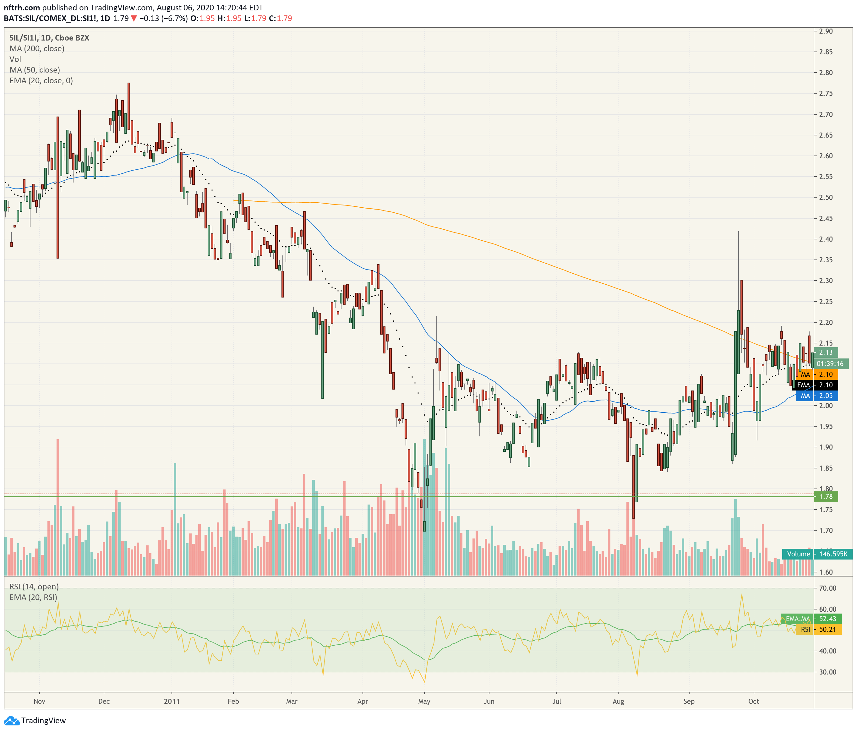
Since the SIL/Silver ratio is the one putting a hard test on its major uptrend (daily SMA 200), let’s take a closer look at the current situation in relation to the last big event in 2011 and the last big rally in 2016.
I will keep an eye on the daily chart of SIL/Silver, which right now does not look good. It will need to negate this breakdown below the SMA 200, and it will need to do it soon.
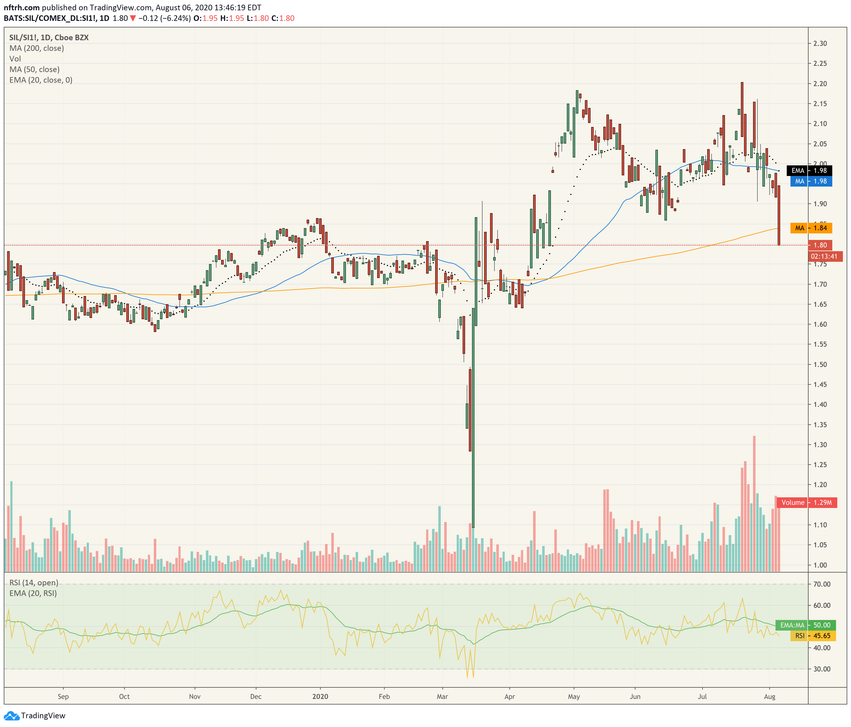
But it never did get hysterical like it did in 2016, which was a terminal event (although it has doubled topped, short-term at least). RSI is contained, which may be a bad sign or a fuel stop for momentum. Regardless, the noted support (and I am one who believes support levels for ratios are valid, if subject to more moving parts) level needs to hold to keep the situation intact from a silver stock leadership standpoint. Look at how strongly the miners led silver out of the crash depths.
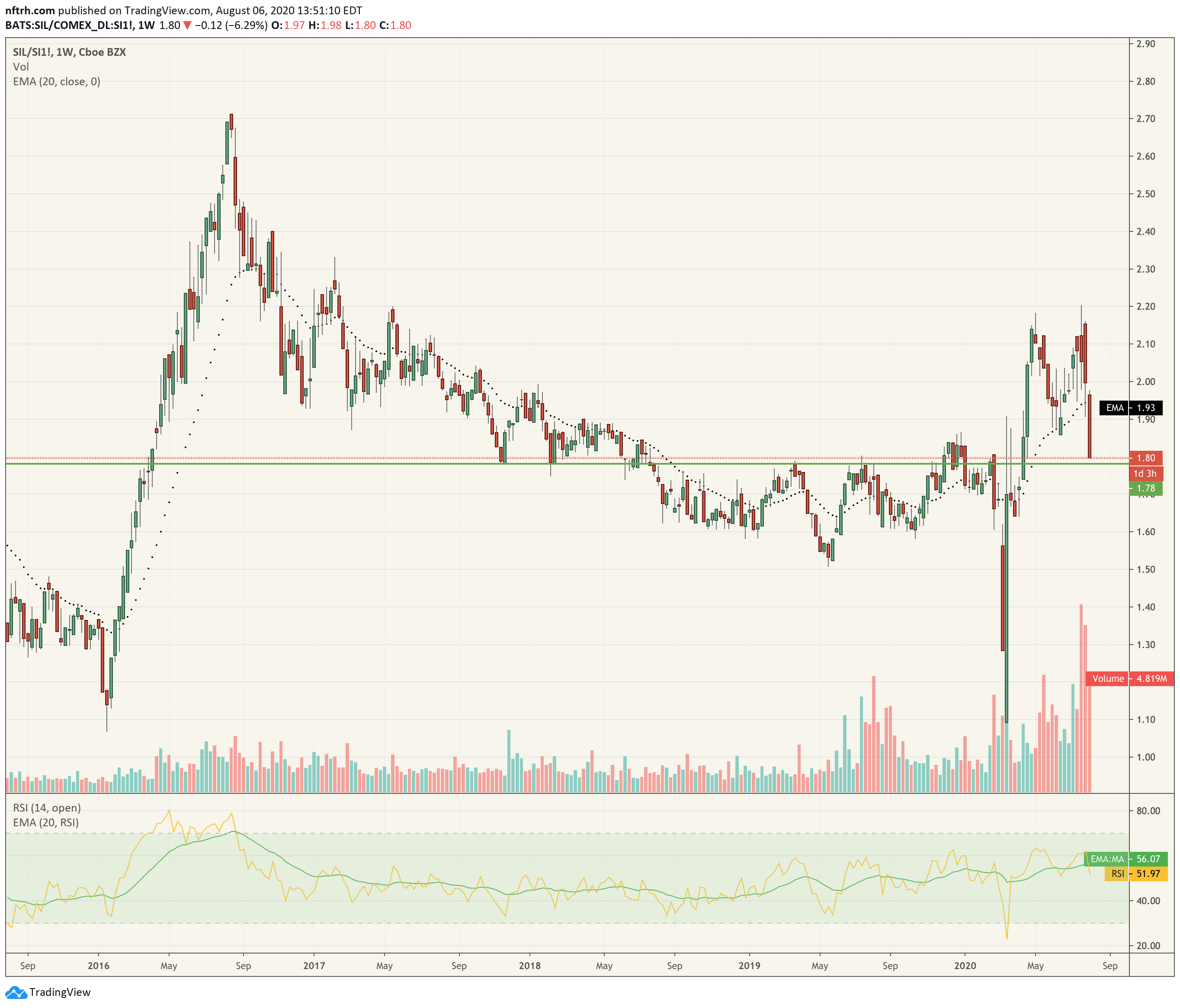
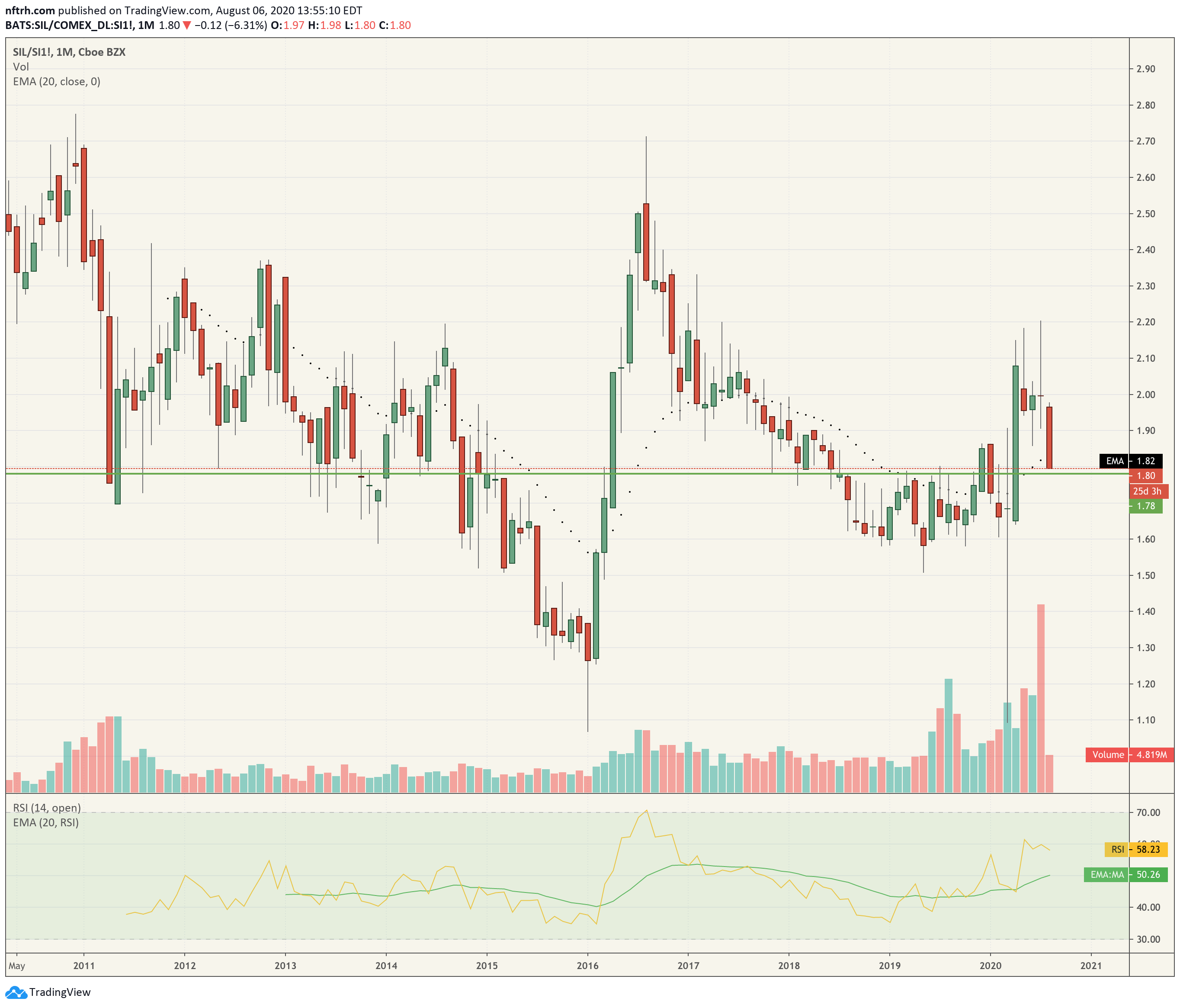
The monthly chart also shows RSI not nearly as frothy as 2016. I put the EMA 20 (moving average) into the RSI indicator on all time frames to get a look at trends vs. the EMA. This one looks normal. But again, we need to be aware that this is concerning now but will raise alarms if the support area is lost, which would mean say goodbye to the 200 day average on the first chart above.
It is entirely possible that the big performance in silver stocks pre-August has been forecasting the big move in silver (ref. our weekly wonderment at silver sector indicator, PAAS flashing bullish for silver). It is possible that silver stocks are now warning of a coming top.
Speaking of PAAS, I used to use it in the last bull market before the SIL ETF came out as a measure vs. silver, so let’s see what it is saying now. Doink… it’s testing the SMA 200 and its major uptrend.

Bottom Line
At the moment silver stock leadership vs. silver is intact, but it’s a hard test and we should not assume the test will succeed. One look at the weekly chart of silver tells us why. I think it is a bull market launch but our operating thesis has been that the launch phase will blow off and blow out. Right now it’s blowing off and the miners are negatively diverging. They need to fix that situation promptly. As a side note, the miners nominal charts (HUI, GDX, GDXJ, SIL and most individual stocks I see) are fully intact, technically. But that is why we watch for divergences in ratios like these. If they break down they are a warning.

[edit] With reference to the opening sentence, I neglected to include the 2011 comp. The top came without a hysterical overbought daily RSI, just like today’s situation. Both situations have a massive spike in silver as the culprit behind the under performance by the miners. Again, we need to watch the support level noted above.
The miners had been under performing since December before silver blew out in April that year. The under performance in the current situation either began in August or April, depending on how you want to consider the double top (1st chart above). In the second view, it’s been 3+ months. In 2011 it was about 4 months. As noted several times today, silver miner leadership needs to get its ass in gear and it needs to do it promptly.
Silver will halt at some point and when it does, it will not be pleasant.