Biiwii has been a busy little bee. Along with an actual gold bug worth listening to, Keith Weiner, the ever insightful Kevin Muir, our very own Quant, Rob Hanna, macro chart geek Callum Thomas, my long-time fellow blogging pals Mark from IKN and Tim from Slope of Hope, Alhambra, Chris Ciovacco and several other worth while (i.e. no effing robotic pseudo content) writers presenting the good, the bad and the ugly as they see it. There is also some not so shy political stuff going on from Wonkette and Jim Kunstler.
There is also an economics professor named Anthony B. Sanders. This post is an excuse to promo biiwii and the authors it presents, but also to show you Haver Analytics’ chart – by way of Anthony – that is one of many signposts to watch on the macro. People who are uninterruptedly bullish need to answer this question in the affirmative with respect to several macro indicators in play: Is it different this time?
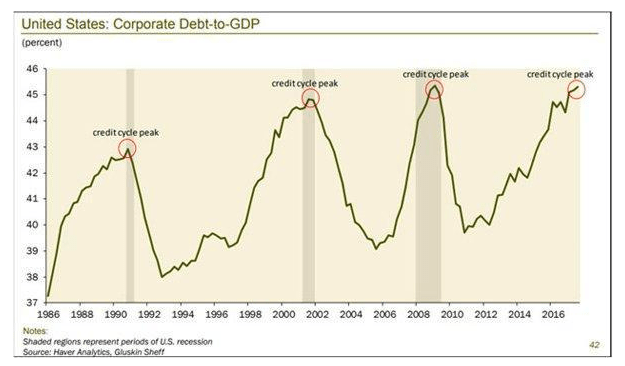
I spend so much time with so many indicators boring into a finer view of the backdrop, but sometimes the simplest and most obvious like the yield curve and this picture of corporate debt-to-GDP may say all that needs to be said to casual observers. It says… “It’s still bullish out there… but boy does this thing appear latter stage.” Ref. Anthony’s brief post that includes both the debt burden and the yield curve.
Subscribe to NFTRH Premium for an in-depth weekly market report, interim updates and NFTRH+ chart and trade ideas. You can also keep up to date with plenty of actionable public content at NFTRH.com by using the email form on the right sidebar. Or follow via Twitter @BiiwiiNFTRH, StockTwits or RSS. Also check out the quality market writers at Biiwii.com.