

Summary
Precious Metals: Correction is tanking the sector to the favored target levels. Lower possible, but risk/reward now very positive. It’s a bull market.
US Stock Market: Sentiment is contrary bullish, as investors are over-bearish. But there is both sentiment and technical room for more decline. Sentiment is not yet to extreme levels of April, 2025 and SPX technicals currently beg for a test of major support at 6174. Bull market.
Global Stocks: Many markets are closer to their major support levels than SPX. Europe is an example, per segment below. Bull market.
Bonds: The anticipated rally in Treasury bonds has been interrupted by the war, which is driving up some headline prices, stoking inflation fears and putting focus on a hawkish Fed. A cure for all of this? Aside from a prompt end to the war and a settling of oil markets, a liquidity crisis and stock market decline may do it. The inflation headlines are expected to be relatively fleeting and bonds can rally. Bear market.
Commodities/Resources: Most will follow gold/precious metals as usual. Most have flipped bearish, short-term. It will be important for the TSX-V index to hold base breakout support (see segment below). Bull market.
Comment: Currently viewing the situation much like the 2025 correction and to a more moderate extent, Q1, 2020. What we need to do is not be thinking like the majority of investors, i.e. the herd. Hence protection and risk management first, capitalize second. That second thing is the more fun thing.
Admin Note
Next weekend’s edition (NFTRH 908) will be abbreviated to key points. I will be hitting the road for some fatherly duty. It may be published on Friday, Saturday or Sunday as usual. It will depend on logistics.
Markets In Motion
Gold, gold stocks and silver have gone in the tank. And that tank is thus far right at our preferred downside targets (+/-) amid horrible (contrary bullish) sentiment and oversold status.
We have done a ton of management of the precious metals in reports, updates and notes. #907 is not going to waste much of your time or mine covering old ground. What was anticipated is happening. We have done a lot of work to manage it successfully. By successful I mean not losing nearly as much money as would have been the case without that work (speaking personally).
I began adding items and covered half of my miner hedge (DUST) and all of my gold, silver and NEM shorts (the latter two in a trading account; more on that later) on the greatly improved risk/reward situation.
But what I am interested in now is the question, will the stock market follow suit or will it not? Models of gold’s leadership and such an outcome are as follows:
- 2001 (upside leadership): Gold bottomed and began a new bull market. The miners and silver followed. Commodities followed, and eventually the stock market ended its bear market in 2002 and followed in 2003.
- 2008 (downside & upside leadership): Gold and the precious metals complex tanked, commodities tanked and stocks followed. Then gold and the miners led the revival in 2009 by a country mile.
- 2016 (upside leadership): Gold, the miners and silver bottomed and turned up, led commodities and stocks, and flamed out by mid-year while the stock market remained relatively bullish.
- 2020 (downside & upside leadership): Precious metals complex got hammered, recovered first and led the whole shootin’ match to the upside before flaming out by mid-year. The stock market remained bullish until the 2022 correction.
- 2025 (upside leadership): Gold, the miners and eventually silver led stocks and some commodities to a big rally.
- 2026 (downside leadership?): Gold, silver and the miners have gotten hammered in a much-needed correction. The stock market appears to be rolling over and…
…if 2008 and 2020 are good examples, we will see stocks play some downside catch-up while gold/gold stocks eventually stabilize and lead the next rally. But first we need to see downside follow-through in the pig.
SPX is well set up to make a flash decline to the pattern top around the 38% Fib at 6174 or so. Anyone who’s been a bear long enough would know that is easier said than done. SPX slipped below the 200 day average and is at a minor support shelf now.
But especially with the precious metals leading the downside (a mirror image of how they led the 2025 upside), I think the stock market has got a good chance to follow in the short-term. This assumes all things being equal in the news/jawbone backdrop.
Looking at the 2025 correction, we are reminded that an A-B-C correction (if applicable) could see a (B) bounce at any time before a final decline to target. Personally, as with the precious metals, I’d rather get a dramatic decline over with sooner rather than later. We shall see.

Trump and his hand puppet Bondi have been blabbing about Dow 50,000 and SPX 7000, with the U.S. AG timing the market top perfectly, blathering about Dow 50,000 during a serious hearing that had nothing to do with stocks. It would be fitting for the market to tank, scare enough people out of stocks, clown Trump and his puppet, and later provide a buying opportunity (as we have planned for).
The contrarian angle here is beautiful. However, you never know what a desperate jawbone might say. A further question is, will the market listen if he says something bullish, perhaps over the weekend? Also, let’s note that this market can take a real bear at any time. It has earned it, in my opinion. So a decline, if/when it comes, does not necessarily need to end at the pattern top. But that sure is compelling support.
If the stock market is to play out with a hard decline to SPX 6150 (+/-), gold stocks could hit the lower zone beginning at the 200 day moving average and the left Fib grid’s 62% retrace area (75-76). We have accounted for this possibility.

Sure, BPGDM is epic oversold. But it’s not a well focused timer.

If SPX were to tank hard, gold stocks could either put in new lows before bottoming or bottom and turn up while the stock market is still tanking. There is historical precedent for both options, given that gold and the miners led the markets in 2025, bulling first and best while a large market correction ensued into the April lows.
Commitments of Traders (CoT)
With the effects (on CoT) of the government shutdown behind us and some markets in hysterical declines, it’s a good time to resume occasional views of CoT data.
Gold
Before the big crack below its 50 day moving average last week (CoT data are harvested on Tuesdays) gold’s CoT was not surprisingly clinging to a reduced over-bullish alignment, as large specs were still net long and commercials net short. Small specs were already in retreat. It’s an excellent bet that they and large specs will be shown to have retreated markedly further in next week’s CoT release. The other side of the ledger should show significant reductions in commercial net shorts.

Silver
Before silver made the worst of its downside last week, large and especially small specs had been in retreat with commercial traders creeping toward flat. It is entirely possible that next week’s numbers may show a contrary bullish CoT alignment for silver (please remember, CoT is not a good timer but instead, a good risk/reward indicator).

USD
The US dollar index is developing a contrary bearish structure with commercials fading to net short, large specs net long and the little guy can’t get himself enuffa dat funny munny as he seeks liquidity refuge from bearish markets. This is a sign that the USD rally is probably closer to its end than its beginning.

–
Bottom Line
We are looking ahead to gold and silver bottoming and the US dollar resuming its bear market. It has been the favored view all along that the TACO will panic and devalue the dollar in service to pumping the US economy. But first a trigger is needed. Such a trigger could come in the form of a tanking stock market and reversal downward in Treasury yields.
In that respect, we’d like to see commercials continue fading and specs continue buying the thus far moderate decline in the stock market.

–
Precious Metals Snapshot
Gold: Testing the Feb. 2nd low and the 50% Fib retrace level (4429) again, closing the week at 4491. Next support at 4350 with 62% Fib below at 4155. Don’t be surprised if there is a flash decline to clear the pipes.
Silver: Testing the Feb. 6th low (64.10) and the 62% Fib level (63.94), closing the week at 67.90. If it makes a lower low to 64.10, next support is 58.30. After that is the “no brainer” at the big, multi-decade breakout area of 53.
HUI: Perched at clear visual support at 683. This could well halt the correction. But the 200 day moving average (626) is rising toward the next support level at 638. And what is 638 folks? It is the 2011 high. Quite significant. This possibility is why, for the moment at least, I continue to hold moderate hedge positions as well as refrain from buying too aggressively just yet. *
* With the lessons of Q4, 2008 in mind, as I bought the falling knives aggressively at HUI 250 and then found myself buying again, severed fingers and all, at HUI 150.
Trading Talk
I am so un-attuned to day trading that I have for months on end forgotten I even had a small trading account. But again, markets dey be in motion. Eh?
The way I am using the account is to have long periods of inactivity and then when I see a high conviction situation, give it a shot. I did this successfully by holding puts on the day silver finally cracked hard on January 30th. Then I did next to nothing until last week when gold miner NEM and silver tracker SLV appeared a relative shoe-in for downside. They cracked and I covered. Profits booked.
Here’s the thing. Both the puts and the shorts were covered too soon, where “too soon” means highly profitable, but not as profitable as if I were a swami with a crystal ball. What I want to do in trading is TAKE profits and get the fuck out. I want to build this small account into something a little less small by being ruthless, grabbing profits (and strictly limiting losses) and not looking back.
Currently, I am waiting for the next ‘no brainer’. As an example, I may take calls on GDX or some individual miners if GDX/HUI decline to the lower levels (75 or lower) we’ve allowed for, amid a terribly bearish sentiment backdrop. Take some calls, target a reasonable upside and GTF out.
Also, several stocks and ETFs look downright bearish and may still be candidates for individual shorts.
Portfolio Talk
Meanwhile, the darn portfolios don’t play that game. They hold core+ positions and they hedge as needed and to the best of my sometimes faulty ability. 50% of the gold miner hedges were sold on Thursday because risk/reward, if not price, has recovered markedly. As well, positions were added in AGI, RGLD and a couple others, per the downside projections from NFTRH 906.
I have shifted the hedge weightings to the broad stock market, increasing 3x leveraged shorts SPXS and TECS, and adding volatility hedge UVXY. This while holding preferred stock market positions because the plan is and has been for a liquidity-driven market rally when this correction ends.
Market Sentiment
To this point we have been gauging an over-bearish, but not extremely so sentiment situation. The situation is getting more intense, with bombs dropping, oil spiking, prices rising and stocks fading.
Let’s note that over-bearish readings such as we have today are contrary bullish. But market crashes and/or flash declines often come from such sentiment structures and can provide a final clean-out (hello precious metals).
So in holding SPX and NDX short and volatility long I am not particularly bothered by the contrary bullish sentiment backdrop in the very short-term. Especially since the positions are to hedge, not to profit.
Fear/Greed index is quite over-bearish, but it has not broken the needle yet.

Within the index we find 3 Amigos flashing extreme.

As of 3/18 Investment Managers continued to march bearish. By the end of last week it is a good bet they were more so. The reading below 40 on the graphic is the kind of contrary bullish (over-bearish) reading we’ll be watching for.

Alert! Ma & Pa are on their way toward the readings at the 2025 lows.

–
Sentiment Bottom Line
Market sentiment is deteriorating nicely. There is still room from more downside. Oh how a flash decline could complete the process (correction & buy opp). A note here: just because a letter writer projects a plan and wants to see it become a reality, it does not mean it will.
Right now, it’s a plan, not reality. But the risk/reward to a bullish view would improve greatly if SPX were to hit 6170 (+/-) with sentiment going peak bleak.
Triggers & Fire Hoses
With the spike in the VIX (red) and the moderate rise in High Yield spreads, risk is obviously ‘off’ in the short-term. If VIX continues to climb and Junk spreads follow, we’ll have a trigger to a perhaps end stage decline in stocks.

The way this racket usually goes is that the Fed plays hawk until the trigger is pulled in the form of a market liquidity crisis, as the above chart shows the potential for. Then the Fed turns on the liquidity spigots and sprays newly printed funny munny all over the place. The government then steps in and distributes that munny to its favored areas. Voila, inflation!
Today we stand at a point of a potential trigger. If this plays out and markets crack, expect our heroes of monetary and fiscal policy to step in and save the day with the worst inflation problem in many decades. This is not a statement I am pulling out of thin air. It is the statement made by the Continuum chart, one interpretation of which is that the macro has been saturated with inflation and is in rebellion (a return of the fabled Bond Vigilantes).

The Fed appears poised to accelerate Quant Easing, pending a trigger. Balance sheet assets (i.e. bonds) appear to have stabilized and turned up a bit. This is in line with the Fed’s stated intention to terminate Quant tightening and through Treasury bond purchases, initiate QE.

Change from a year ago shows a better view of the process already begun.
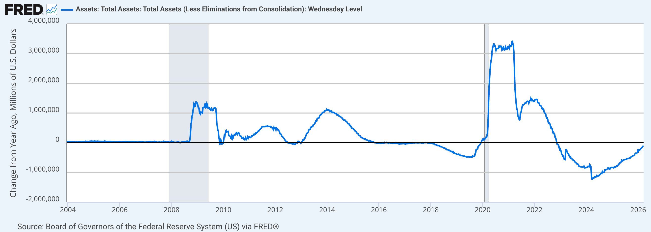
But the Iran war has spiked oil prices and other items like fertilizer, which could spike food prices, which could turn today’s inflation mini-hysteria (and bond market reaction) into a new trend. The market already expects Fed Funds rate cuts to all but be off the table in 2026.
Even Trump must know (and Bessent surely knows) that his decisions driving up prices will also pressure interest rates higher, not lower. Hence, he is very likely desperate for an off-ramp in the war (picture a little Bessent on his shoulder whispering in his ear). His constant tirades against Jerome Powell ring awfully hollow when everybody knows the Fed will not and cannot go dovish when the bond market is signaling the opposite. It’s absurd.
So again, triggers and reactions (fire hoses). There is certainly no assurance that I am right in the current view. But it does make sense: A stock market decline that could intensify a liquidity problem, start making headlines and drive a “flight to safety” into Treasury bonds (yields back down)? It’s a doable plan, in my opinion. Very doable.
Commodities & Global Markets
TSX-V must not crack 840 or the exploration plays as a whole will be technically dead for a while. Of course, individual drillers will drill and some will buck the trend even if the index breaks.

The monthly chart shows just how important the support at 840 is. Today TSX-V is still in base breakout mode. A loss of that level would seriously compromise that status.

I don’t want to micro-manage commodities right now. With the exception of special interests like oil, gas and fertilizer/Ags, the segment is under duress along with the precious metals. I still hold mineral exploration hole drillers, pending TSX-V and my own level of patience. I hold a Fert here, and a Gas there.
Otherwise, I am guarded on the commodity complex as long as the market perceives the Fed to be hawkish. Let’s keep in mind how self-conscious the Fed is (IMO) about its inflation-making machinery. It never wants to be seen as the source of inflation (IMO). But that is the system. Like it or not. The Fed is a one-trick pony. The trick is inflationary policy. Well, when it is self-conscious (IMO), the withholding of inflation (posturing hawkish) is another trick within the trick.
As for global markets as a whole (ex-US), ACWX would be well advised to hold the area of the 200 day moving average (+/-) on what appears to be a (C) leg down. A drop below the November low of 63.01 would break the daily chart technicals.
Again, this is the world. It includes some markets, like EM and Japan, that ramped hard and appear to have significant short-term downside. As well, China large caps (FXI) have just broken down

Using Europe as an example, the SMA 200 (orange) can be lost, but a higher low to November would be preferable. That level is the top of a massive support area equivalent to the S&P 500’s pattern support target at around 6174. Clear support in individual markets will vary. As it stands now, Europe is in a primary correction within a bull market and 554 (+/-) is a ‘buy’.

Portfolio
Gold is long-term risk management & monetary value/stability in a balanced portfolio.
Taxable “Savings” Account
In order of position size. The “savings” account still holds a few hole drillers, which as a savings account, it probably should not do. As for gold stocks, quality miner AGI was added, but so was Royalty RGLD. That along with fellow Royalties ELE, TFPM and a couple on watch (WPM, VOXR, OGN.V, FNV, etc.) would be the main focus here as far as gold stocks go. Going forward, they are generally favored over miners for reasons already covered.

The taxable account carries high cash levels as long as cash and equivalents are paying out. This is considered a savings account of sorts, rather than a speculation or even investment vehicle. The goal is to speculate around the periphery. In another market phase (e.g. post-correction/bear/crash), the account may get more in the game.
Roth IRA (non-taxable, no contributions)
Last week: “The chart has formed a double top. I don’t like that. Hence, I am doing what I can in the short-term to address that. The end.”
This week: Now it has made a lower low to the previous low and I hate that. I am using as much patience (and hedging) as I can muster to stick to the game plan that sees a buying opportunity across asset classes ahead.
I have dialed the chart out to 3 years and that gives good perspective on its intact “bull market”. But the chart sucks in the short-term. Let’s face it. I do not want to see it get much worse from here. I feel I am hedged up enough on the broad market, but in selling 1/2 my DUST positions and adding a few positions on the crash, I’ll need precious metals stocks to recover to avoid further decline and start producing net gains in that area.

Cash is 28%, Short-term Treasury is 40% and equity (long and short) is 32%. So it’s a pretty well guarded situation.
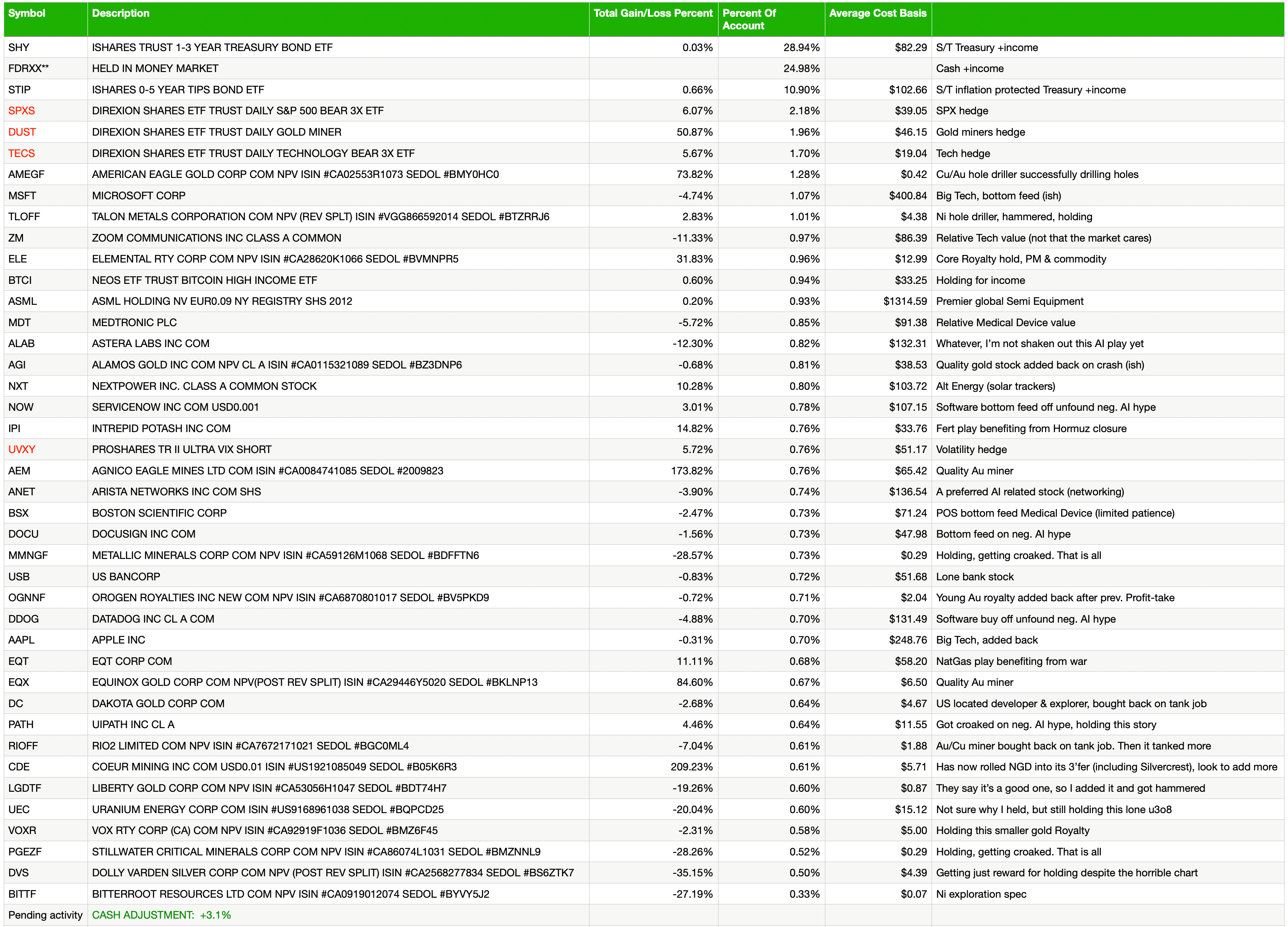
Cash & income-generating Treasury bonds are at levels that are right for me and my real-world situation. Your situation is different. Cash will be adjusted as needed.
Refer to the In-Week Notes under the NFTRH Premium menu at nftrh.com for market talk and occasional trading info, if interested. Also, you can follow on X @NFTRHgt for notice of updates.
NFTRH is not to be distributed to third parties without prior written consent
Notes From the Rabbit Hole (NFTRH) is a weekly market report in which we provide analysis on financial markets. We make every effort to provide accurate and high quality content, but this analysis ultimately represents our opinions and these opinions are provided without warranty or guarantee of any kind. See full terms & conditions of service under the ‘About’ heading in the main menu.

Hi Gary , what do you tink of GDXU for leveradge if we hit the hard bottom, Im not to familyar whith calls
Could be a useful tool to speculate on a recovery.