Please note, #878 went full-on gold bug this week with other markets barely getting a mention, except where they play into the view of gold, silver and the miners. It’s a new macro, after all, and the first big move of that new macro is in progress. We’ll settle back toward more traditional formatting, but given the earth shifting beneath our feet, future NFTRH editions will very likely be less regimented and more focused on particular areas. Precious metals being a prime example.
White Knuckles!

It’s fun, for sure, when something you’ve anticipated for years actually comes about. HUI closed the week at 515, within the 500 (+/-) target range.
However, it’s also a little stressful, because decisions have to be made. Decisions about whether to stick to your guns (if you planned to sell at 500 do you stick to that, or if you planned to invest longer-term, do you stick to that with those paper profits on the table?). Psychology, it’s a funny thing, eh?
For my part, I decided to tap the brake and put in a partial hedge on the miners (DUST) because I don’t want to sell my holdings in a serious bull market. But the way this probably goes when you’re hedged is that on Tuesday the sector would ramp again, pressure me into covering or wanting to cover, and then flop shortly thereafter.
But hedging is effectively like taking some profits, except that you’re taking them on the sector while you continue to hold preferred gold stocks. There is a reason they are preferred, after all. It’s because I think more highly of them than the average gold stock. So hedging the sector but holding most of my positions makes sense for me.
As noted in this public article (How High Can Gold Stocks Go?), in my opinion a melt-up scenario is viable, along with a grind or corrective scenario. So I am going to try to be nimble with the darn hedge. I want to see how the post-Labor Day market behaves and hopefully be done with the hedge before long.
In short, whether sooner or later, I think this bull market has a lot further to go. A target is an objective, not a stop sign.
Precious Metals, per Old Turkey: “It’s a bull market, you know”
It is a bull market and it could just as easily rip a short’s face off from here as flame out and correct hard. Some options:
Upside blowoff/blowout: could last longer than you’d think with no clear buying opportunities. But when it would finally flame out the fallout would likely be quite significant. Sort of like silver in 2011. However, what is going on now is fundamentally much better than the inflationary first half of 2011 for gold stocks. As long as the funda (we’ll review several funda and internal points below) remain intact, you know what Old Turkey thinks.
Correction now: would be a buying opportunity; a chance for FOMOs to get aboard the bull, unless their FOMO has already put them in. In that latter case, if they are substantially in, when they puke it could make a correction worse. But a buying opportunity in a bull market, nonetheless.
Chop & Grind: it would be logical for the sector to face some volatility, both ways, as it works on long-term resistance. If this is the case, the down volatility would be opportunity to buy as the sector works off its overbought conditions.
Let’s get to the sector’s key points, starting with monthly charts, mainly. Huey is flipping the finger to all of its haters. That hatred lasted 10 years, right into this very year. Sure, we’ve been managing a bull market since 2016, but who on earth felt good about this mess prior to 2023? The first 4 waves of the bull market were trades. #5 is a white knuckler and in my opinion, absent degrading fundamentals, a launch toward what could be much higher levels in the next year or two.
The hatred stored up for this sector is being released. Hatred turning to fear (of missing out). It’s not rocket science, just rocket fuel.

The log version of the chart actually shows a logical stopping point right here at the channel top. Log charts work better for trend lines and channels. Of course there is a thing in TA called a “channel buster”, but let’s realize also that August is done and da boyz is a comin’ back from da hamptins aftah sippin’ dem maahgaritas all summah (not sure why I’m using a pig Boston accent for these fabled New York playahs). So are the machines.

Gold, overbought and massively bullish.

Gold log scale is still pressing the the top of the Fork after breaking its uptrend channel. Among other things, let’s realize that this channel buster happened in gold and is conceivable, at least, for HUI log scale above.

Silver monthly wants us to believe that the measurement of its bowl is to 46. I believe it. I also believe that if ole’ Silver gets the bit in its mouth, the 2011 (and 1980) highs can easily get taken out.

The log chart wants to enthrall you with a couple of Forks. The purple one looks realistic for a tap of the upper tine at 46, conveniently per the measurement above. The blue Fork is for the lunatics and their targets of 100, 200, and so on. I actually think that 100+ is doable in a crazy macro like this. But that is analysis for down the road.

Let’s extend the chart further out for one more bit of eye candy, and then move on. This Fork from the 1993 low would imply the silver price taking out the old Hunt Brothers’ high and the 2011 high. That is actually what I’ve been expecting to happen, possibly as soon as 2026.

Internals & Macro Indications
Of course, silver bull analysis will depend on animal spirits of casino patrons, but also on macro dynamics. So, to slow the roll of the bull-making above let’s continue to note the daily chart downtrend in the Silver/Gold ratio (weekly chart). That DOWN trend is an indication of a disinflationary macro, not an inflationary one that silver would prefer.
This is the chart we used months ago to ask whether or not the spike down in March-April might precede spring-back similar to 2020. Well, it sprang back. Just not (yet) with anywhere near the ferocity as its 2020 forebear. That makes sense, given the macro, with inflation fears tamped down and a likely bout of disinflation ahead.
Silver could bust out relative to gold and change the trend, or our still-favored view of an interim market liquidity problem could keep the downtrend in force until another (inflationary) day in the future.

On a daily chart basis, however, silver is still leading. Here is the Gold/Silver ratio (GSR) trending down since the spring. So for the interim disinflationary, liquidity constrained macro to come about, the GSR would have to bust that intermediate downtrend, with SGR above obviously remaining within its downtrend.
The other items look good, although gold has work to do relative to stocks. The bottom panel shows a constructive view to our interim disinflationary view.

In the short-term, the partnership between the TSX-V/TSX ratio and the Silver/Gold ratio is intact. As long as these two are trending up a tailwind is in place for not only precious metals speculation, but also the wider commodity/resources areas.

I continue to favor gold stocks over silver stocks and this weekly chart of the GDX/SIL ratio does not (yet) argue against that orientation.

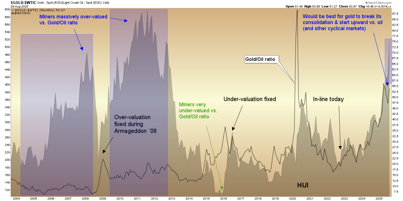
I was looking through an old chart list and found this chart gauging HUI against the Gold/Oil ratio (GOR). While the view of the GOR (miners’ product vs. an operational cost input per the daily Gold Ratios chart above) looks good and bullishly constructive, the gold miners have created separation from this sector fundamental underpinning. The divergence is nothing like the grotesque bubble divergences of 2004-2008 or the extreme excess of 2009-2012.
Those were bull killers. This is far from that. But the current divergence in the miners could be a prelude to a correction. That’s what markets do, they correct imbalances sooner or later.
As for sector internals, we all know the story. Bullish and at a caution point. Caution points in confirmed bull markets are different than bear market spikes. They can persist longer and when downside does follow them, that downside is a buying opportunity. Usually not nearly as low as the previous opportunity.

We conclude August with HUI on the + side of the target range, the HUI/Gold ratio furthering its base breakout and HUI/SPX barely nudging out of the base to tick a breakout. Follow-through needed there. But this is all bullish. Even more compelling is how the Gold/SPX ratio is still in a bull flag correction, testing its base breakout.
The miners seem to be forecasting a successful test and upturn. If, however, that does not happen, the miners could be exposed in a way similar to the GOR divergence shown above. One thing for sure though, the gold miners are leading the majority of macro. That’s not nothin’.

Gold bubble? Hardly. Another compelling chart…

…to go along with this one. Gold is booming nominally and yet has gone nowhere in stock market terms. To review, the story of this chart is not necessarily bearish for stocks. They could nominally go sideways as they did in the 1970s. But as adjusted by gold, they could well crash. We are in a new macro.

HUI sure seems to be forecasting a weakening Fed. A counter-cyclical sector reacting to what it thinks is a counter-cyclical economy up ahead. Now the Fed needs to play ball. If positive surprises come in for economic data or inflation data pops, firming the Fed, the gold miners could be in trouble. But that is not what appears in play at this time.

The HUI/Gold ratio shown above is breaking out of a base. Bullish. If that continues the big picture will eventually turn to a new trend in the HGR. In that case, the 2001-2004 analog indicates we might see resumed USD bearishness, a resumption of the uptrend in the Gold/Silver ratio and global currencies outperforming USD.
Nothing that has happened over the last few months has disqualified our analog view to 2001-2004.

Big Picture Macro, A Brain Dump & Precious Metals Bottom Line
It’s a bull market, baby (or per Old Turkey, “it’s a bull market, you know”). Thrills and spills ahead.
But the supporting theme is the new macro and its new rules that we’ve anticipated since the 30yr Treasury yield Continuum broke to the upside in 2022. Since then the job has been to interpret the implications of this big picture macro trend break, along with other indicators of major change.

The long-term SPX/Gold chart above hearkens back to the 1970s. So, in essence, does the Continuum’s long disinflationary trend, which was birthed in the 1980s after Fed chief Volcker whipped inflation through very hawkish interest rate policy in the 1970s.
The then new trend in disinflationary bond market signaling allowed policymakers of subsequent decades to routinely paint prosperity into the macro at will. This was most obvious during the Inflation onDemand era, launched compliments of Alan Greenspan, post-2001. But that was not real prosperity. It was inflationary policy, given license by the long bond’s decades of disinflationary signaling (thank you, Volcker), a license that became ever more abusive, post-Greenspan.
It was the core reason we now have a society so divided. As I have written many times, it is the act of inflating money supplies and monetary aggregates through bond market manipulation that has fabulously benefited the wealthy and routinely impaired the not wealthy. This is the root of our social problems.
In modern day reality TV America, the easy target is the other political party. And why not? They are both bankrupt of truly transformative ideas that would be helpful to a healthy society. They are little more than corporate divisions of particular ideologies that in my opinion are way past their shelf lives, as currently practiced.
So the Everyman blames the other side of the aisle, because the Everyman is programmed that way. We are TV programmed as a whole, while alternate media from YouTube to Substack * to X put forth everything from sound, progressive and thoughtful ways forward to utter ignorance and hatred. But at least they are saying what they think. Unlike major media, saying most often what its corporate boardrooms think.
Well, that programming is done. It’s just that a vast majority don’t know it yet because a vast majority don’t know that the macro framework has changed or more importantly, the implications of that change. The bond market signaling circa 1987-2022 is done. The stage is set for the preeminent monetary asset to rise as monetary policy is rendered more dysfunctional than the pre-2022 era.
This is my ideology speaking. I’ve quietly held this general ideology for decades. But now, it is time. The two charts of gold in relation to the S&P 500 included in this edition show the profound changes in the monetary value asset vs. the prime inflation-stoked paper asset. They also show that on the big picture, we ain’t seen nothin’ yet.
In the short-term, as we have shown in the report above, gold stocks are at a target and a classic technical halt/correction point. A correction from such an overbought state could feel quite severe. That’s the TA. Know if you’re a trader or a holder.
But there are other options in play here, from upside laser show to chop & grind. The former does not feel as likely as the latter.
Regardless, per the changes to the macro that became symbolically evident in 2022, and especially per gold’s long-term status vs. the stock market, it’s likely early innings in the bull market.
* Nod to Substack for having a much higher ratio of quality to ignorance than the other two, in my opinion.
Portfolio
Gold is and has been viewed as long-term risk management & monetary value/stability in a balanced portfolio.
Taxable Account
In order of position size. As stated, I held on to my gold stocks (with temporary partial hedge), especially in this taxable account. I forced myself to take a few taxable profits elsewhere, however. Broader market positions now tend to be more defensive/value oriented, like medical device guy MDT and telecom VZ. Still holding volatility for now.

The taxable account carries very high cash levels as long as cash and equivalents are paying out. This is considered a savings account of sorts, rather than a speculation or even investment vehicle. The goal is to speculate around the periphery of that. In another market phase (e.g. post-crash), the account may get much more in the game.
Trading Account
I’ve take the first steps toward shorting. We shall see.

Roth IRA (non-taxable, no contributions)
The chart took a new poke upward. I am, well, the chart tells you…

Cash and equivalents are 71%. That is lower cash than I would normally hold at a high risk juncture. But some of that cash is in the miners hedge and volatility. Speaking of cash, I’ve been increasing S/T Treasury bond fund holdings since my direct bonds matured and since the Fed is indicated to start reducing the income provided by cash.
Big picture, I am looking for much higher prices in gold stocks in the coming 2 years or so. Hence, hedging rather than profit taking. If all goes according to plan (which it often doesn’t) I’d hedge moderately successfully, hold favored gold stocks and add to them on corrections.

Cash & income-generating Equivalents are at levels that are right for me and my real-world situation. Your situation is different. Cash will be adjusted as needed.
Refer to the Trade Log under the NFTRH Premium menu at nftrh.com for trade info, if interested (not that you necessarily should be). Also, you can follow on X @NFTRHgt for notice of updates.
NFTRH is not to be distributed to third parties without prior written consent
Notes From the Rabbit Hole (NFTRH) is a weekly market report in which we provide analysis on financial markets. We make every effort to provide accurate and high quality content, but this analysis ultimately represents our opinions and these opinions are provided without warranty or guarantee of any kind. See full terms & conditions of service under the ‘About’ heading in the main menu.