A look-ahead to some of the US and global markets and sectors that would benefit from a weaker dollar, which is the theme shaping up on the macro as the Fed backs away from support of the currency and joins the global currency Whack-a-Mole game. Obviously, that which has suffered disproportionately under a strong dollar regime would benefit if/as it weakens.
First, here is a view of USD vs. the Yen, Euro and commodity currencies of Canada and Australia (weekly charts). The others are joining USDJPY in breaking the uptrend. USD is less bearish vs. British Pound and Swiss Franc, but the views below give a view of a good chunk of the world from a currency exchange perspective.


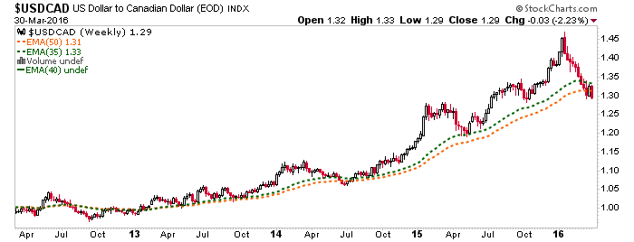
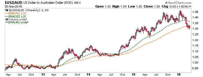
For USD denominated investors, it is time to arrange plans for a macro trend change.
US Manufacturing Sector
I am originally from this sector and so I keep a close eye on it. We have large corporations like GE, which would stand to do well, as would so many other larger industrial and tech companies that depend on exports. Think about all the companies that gave quarterly reports noting “currency moves” as a negative factor in financial results. They now become values on a relative basis to the broad stock market (after all, if a bear phase resumes, they may just go down less).
As you know, I like FARO. But I took a look at charts of related companies like SSYS, DDD (Faro is not a 3D printer company, however), HURC and other US manufacturers and saw new uptrends forming on the charts. Here is Faro’s chart having changed the short-term trend above the 50 day moving averages, for example.

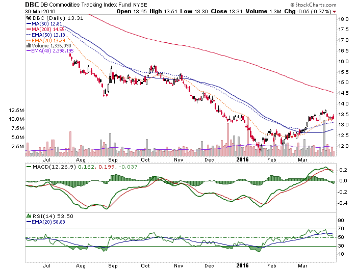
Commodities
We caught the energy bottom with the NFTRH+ big picture monthly view of XLE. The daily continues to show a short-term trend change. I would prefer to see a retrace down to the SMA 50 around 58. But with Yellen taking us to inflationary school this week, we have a fundamental wild card in the mix for this and all the other anti-USD plays. As with FARO’s chart above, a break above the SMA 200 that holds would be a sign that a larger trend is changing to up.

Here is the broad commodity ETF showing a similar setup. I’d love to get a tap of the SMA 50, but macro fundamentals call this into some question.
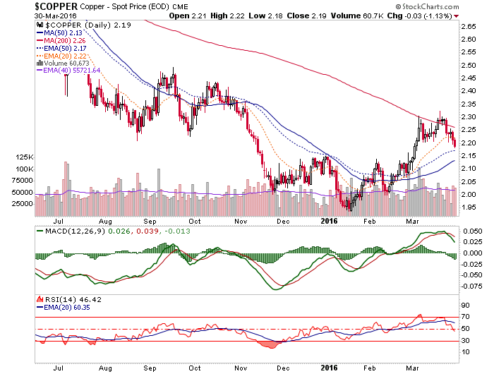
Although copper offers some hope that miserly bottom feeders may yet get better prices on commodities. I have been evaluating whether my long standing target of 1.50/lb. on copper is valid under a USD inflation regime. This chart keeps that view alive, although the probabilities have been reduced. Regardless, copper looks headed for a test of the SMA 50 as the mini hype in base metals cools down.
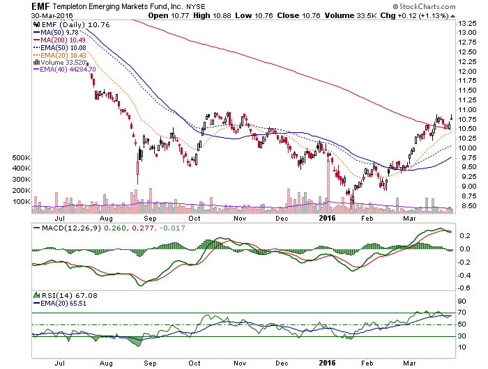
Emerging Markets
EM’s have suffered long and hard under the strong dollar and are now responding very sensitively to its weakening. I am still unhappy with EEM/MSEMF long-term chart resistance but that is how I am trained, to respect charts. That is why we need shorter-term charts as well. Because they are the near-term guide.
I use EMF instead of EEM because I want an active manager discriminating between investments. Let’s see how this (and EEM) does at the SMA 200. If this holds up, a bigger trend change will be in play.
Precious Metals
What more can we say? The Commitments of Traders data are bad (with our caveat that ‘bull market rules’ could be taking effect, potentially making the current CoT less worrisome), silver has gone nowhere vs. gold and the ETFs and indexes have looked like they want to roll over. So far? Not happening. The weekly charts for gold show support in the 1160 to 1180 range and I am going to stick with that, and also the idea that that range is not too far below yesterday’s close of 1225. We did note however, that on a daily chart 1200 was short-term support at the 50 day moving averages. That is where gold has bounced from since Yellen day.
I continue to believe silver will give us a big hint about when the PM’s are ready to lead an anti-USD phase, because it is more anti-USD than gold is (it’s got more commodity characteristics). Meanwhile, the broad sector continues to have best support at the equivalent of HUI 140 or GDX 16.50.

The silver miners have been leading gold miners for the last month, implying this change could be in the works. But SIL-GDX has not changed trend, much as Silver-Gold has not changed trend.

Still, we have noted that individual miners will form their own technicals and as an example, I look at the chart of Pretium (PVG) and see a nice looking pattern with the price above the SMA 200.

Bottom Line
The currency pair charts indicate that something sustainable is happening on the currency macro and confidence in currency has been a key to the entire macro. While I try to set support/pullback levels for people to calmly position for a new phase, there is much interference in the markets as the macro fundamentals shift. The charts are the charts and these support levels could well come about. But for investors (not traders), it is time to be thinking more about positioning for what could finally be an extended trade.
While the stock market is making hints that it wants to blow up the bear case, the caveat is that if the stock market croaks, this ‘inflation trade’ would go on a holding pattern. That would paint the gold sector as the safest play still.