

Summary
A brief summary of the work done in this week’s report and in the updates and reports leading up to this point. Please read the detailed report for the complete picture. There are many granular details that cannot be summarized so briefly.
Precious Metals (bull market)
Correction still technically in effect for gold, silver and gold stocks. Silver/Gold ratio got croaked, but it and the miners sit on key support. We’ll know soon: break down here and the play breaks down. Hold and turn up and… something more pleasant.
US Stock Market (bull market)
Broad SPX hit the 7400 target, popped above it, eased to test it and remains bullish. Semi leads Tech and Tech leads broad. It’s classic intact leadership. It also looks like ending-stage euphoria. The stock market is on the anticipated bounce-back in relation to gold on the wider macro. This can play out for months. Later, gold expected to take back the macro.
Global Stocks (bull market)
ACWX/SPY ratio at important support. If USD booms, global should under-perform US. If USD resumes its bear, the opposite.
L/T US Treasury Bonds (bear market)
Technically, long-term Treasury bonds are biased bearish (yields biased bullish). But a post-war (if the darn thing is actually ending) disinflationary phase could drop yields/boost bonds. Long-term, it’s a bear market, you know.
Commodities/Resources (bull market)
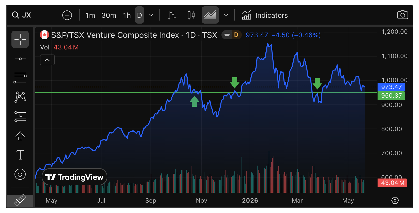
With a suspect TSX-V, there is a potential warning in play. But the commodity complex is not uniform in its status. Oil a wildcard, Copper and Nickel bullish, Uranium questionable. See segment for more.
US Dollar (cyclical bear market, L/T still a technical bull market)
USD hanging tough in its rally. If it rallies from here many areas could experience pain. However, the Gold/Silver ratio is lame at best. So that would-be support for Uncle Buck is not (yet) in play.
Could the Market Be Digesting the War?
Or is it simply rotating away from that which is impaired by higher oil (and other) prices to that which is perceived not to be?
AI is a thing. We know this (duh). It is helpful, productive, scary and it is powered by insatiable need for energy. In its voraciousness for data-centers, it is an agent of consumption (of resources) and destruction (of supply, and potentially, of its footprint on the environment).
AI is also driving the Semiconductor sector…

…which looks a lot like the chart of a certain 2025 star monetary asset.

In 2025 we noted that gold was massively bullish, and extremely overbought by the monthly chart’s RSI. Well, it’s not apples to apples comparing a stock index to a monetary anchor. But in the case of the charts, it is apples to apples. The lesson is that the move is going to end one day, and the correction from it will be severe.
The only reason I did not feel the correction in gold is because I do not view it as a price play. I view it as very long-term monetary stability. Also, we were prepared for the corrections in silver and gold stocks through profit-taking and hedging. So yeah, it may have been intense for some, but…
The point is that the vertical upside move in the SOX index will be corrected, it will cause a lot of pain, and it will likely coincide with a significant bear market in US and global equities.
But as of now, the bull is in play. Could end on Tuesday, could persist all year. ALAB is one that I trade, then bought back and held through its refusal to go up because I felt it was more than viable. I have trimmed the position, but it has grown back. I like when that happens. Yes, AI-related Semi is massively extended, but on the house’s money it’s sometimes easier to hang in there.
Examples
ALAB is richly valued, and I have no idea whether it will ever grow into its valuation. But hold it I still do. Pending the market, and with risk management always at the ready.

I was compelled to sell QCOM, which is a forward “me too!” Semi play with AI relevance, on its vertical spike higher. Then it was added back on May 20 per the in-day notes, as it flagged down to the 38% Fib retrace area. Simple, I guess. Err, not so simple. In watching the market I decided they might bull this thing again and the flag looked like a good shot to take.

Stonk Market
Meanwhile, the broad SPX (daily chart) broke through the long-standing target of 7400, eased a bit to test it, and is trying to tick a new high as well.

So yes, the market is digesting the war. It is rotating, as we’ve been noting. One area we’ve watched (and I’ve traded) is SaaS/Cloud (software) that I think was unfairly punished by AI fears. First it was cycled out amid the AI doom hysteria (valid for certain cookie-cutter software companies). Now the anticipated bounce back is happening. You can just feel the hedge hogs roving the landscape, looking for what’s ‘in’.
The portfolio below will show ZS, SAP, NOW and MDB as current holdings in this area. Watch list items are BOX, SNOW, TYL, PATH and now, IOT as well. Reference the comments in this NFTRH+ update (on silver, of all things).

So, keeping in mind that I was just made aware of the IOT chart and began checking out its story on Saturday (I recall the stock itself from a few years ago), here’s a daily chart of my new watch list item. I included the most recent earnings/revenue beat, with the next one upcoming on June 4th. IOT has had a habit of beating expectations on earnings.
As you can see, the intermediate (50 day) and major (200 day) trends are purely down. But RSI and MACD look pretty darn good. Also, the price is in a little hint of a pattern as it sneaks above the SMA 50 for a look around. I want to keep this on close watch and if the greater software play continues to look okay, it might be worth a shot that IOT could again beat expectations.
Those expectations are for about the same earnings estimate at .13, but revenue growth from 444M to 455M.

As usual, not a reco. Just something I am now watching, thanks to a heads up from subscriber Bernard.
Market Internals
Based on the sum of the information below, I think that the precious metals are laying in wait for the next down cycle. They are decoupling from their positive correlation with broad markets in preparation for the next cycle, which in my opinion is likely to be economic deceleration and policy panic (Trump/Warsh/Bessent). Meanwhile, happy days for stock bulls. As anticipated, given the state of the Gold/SPX ratio, which is dropping as if on cue.
The market’s internal situation is largely unchanged. It is still pro-bull as Semi leads Tech, and Tech leads broad. Sure it looks excessive. It even looks like potential ending stages. That is how it looks. What it actually is, as of market close on May 22, is bullish.


Growth/Value is still bouncing and as long as it does that, it is in line with the bull view.

Junk bonds are favored by casino patrons over Investment Grade. These charts include dividends. But excluding dividends the story is similar. Risk-on.

Global (ACWX)/US (SPY) is at a key support area. The ratio has been driven down by the strong US dollar of late. We don’t know yet if this is a limit point (to USD upside and global relative downside) or a breaking point. Best to evaluate in real time, unless you want to take a guess (which I don’t).

The Gold/SPX (GLD/SPY) ratio has started to crack the trend line, which you will recall is not something I put a lot of importance on. Of critical importance to Gold Bugs in their conquest of Stock Bugs will be making a higher low to the area in the shaded box.
To review, we anticipated a decline in this ratio (a rise in the SPX/Gold ratio) to adjust last year’s disastrous relative breakdown for stocks (see big picture SPX/Gold ratio below). Now the adjustment is here. Let’s not make a big deal about it. Let’s let perma-bugs get their panties in a perma-bunch. Let’s instead make like Bob Dylan: “Always on the outside of whatever side there was”… market manager as Joey Gallo.

On that note, check out how the SPX Advance/Decline line is rebounding…

…while the GDX A/D is declining. I lived through years of Gold Bug moaning and foul-crying on previous cycles, and I hate it. It’s a normal part of the macro. Today we are in one of those phases where the forces of cyclicality are dominant.
As noted above with Gold/SPX, this was anticipated, even necessary. It’s how markets work. The key is to set ourselves up to a) not be damaged by, b) take advantage of in the short-term, and c) capitalize strongly when this worm eventually turns. Not to sit around spewing slogans and dogma. Okay, off the soap box.

Gold continues to be in an intermediate downtrend vs. copper, but also a major uptrend, despite the break of the SMA 200 (orange). As this downtrend persists, the forces of cyclical markets hold at bay the forces of counter-cyclical markets. At least in this indicator’s opinion.

Gold miners vs. Copper miners look ahead to the anticipated test of the base breakout. It is conceivable, if not likely that the next counter-cyclical macro phase will begin with this ratio grinding somewhere in the noted base support area.
Looking ahead, let’s not assume that as soon as the ratio hits the support area it will rebound. It is possible there would be months, perhaps many months, before a new upturn.

Gold/RINF is clinging to the level noted last week as a line in the sand for the gold miners. Given gold stocks’ nice correlation with gold’s relationship to ‘inflation expectations’, this needs to hold or a significant (IMO) leg gets kicked out from under the miners’ macro table.

And the Gold/Oil ratio is a leg that already got kicked out from under it. The longer this persists, the worse it will be for the next quarterly reporting season.

And while there is no direct correlation to gold mining, the TSX-V/TSX ratio is important for the exploration end of the sector and indeed, a wider range of speculative commodity/resources areas. Critical support is nearby.

Internals Bottom Line
The stock market is getting its comeback vs. 2025’s stars, gold, silver and the miners. We anticipated this and for as long as it persists, it’s the market we’ve got and it is affording opportunities. Just not 2025 style opportunities.
The internals above are aligned with the realities of today’s market prices. They rightly reflect what is happening. But consider this; certain pro-cyclical indications like the AI-driven Semi sector are in upside blow-off mode (ref. gold in 2025) and certain counter-cyclical indications like, for just one example, Gold stocks vs. Copper stocks, are declining toward clear support.
Let’s be nimble. Trends in play can last longer than you think. But they can also abort and change on a dime. Now add in the terrible political and war noise of the current moment and well, we’re going to do what we’ve been doing all along. Take it week by week, update the indications and stay aligned with them.
Precious Metals
Gold blah blah blah. Silver blah blah blah. Miners blah blah blah…
Just kidding. Sort of. Play ’em as you will. The darn sector is intact and as noted in Friday’s NFTRH+ update, silver is intact. As noted in Wednesday’s NFTRH+ update, if GDX is going to bounce, it needs to do it from current levels (in essence unchanged from Wednesday). That update also showed the Silver/Gold ratio at its key Option #3 support,* which it continued to hold and even lift a bit above as of Friday’s close.
So let’s keep it brief. The sector is on the outs relative to King Stonk Market. After last year’s massive explosion, a correction was expected. Also expected was the stock market’s rebound in gold terms.
That is the short-term. The big picture macro is also well on plan. SPX/Gold has bounced enough to terminate its joyous revival. But folks, if you don’t think this can bounce higher I’ll ask you to think again.
The ratio is under no obligation to terminate as the 1972 bounce did. There is a very strong chance it will, as the ratio is at clear resistance now. * But we are in a world where the impossible becomes reality every day, by decree of a cult figure who somehow still holds control. It’s a ‘for all the marbles’ backdrop, and in my opinion Trump and Warsh (with a little Bessent whispering in his ear) still hold the marbles.
When they outwardly decide to gun the system, we could see a new bull phase in the precious metals in relation to stocks.

* As you may know, I hold that a ratio has viable support and resistance levels because its inputs (Au & SPX) have those levels. They are simply adjusted by the ratio.
Commodities (daily charts)
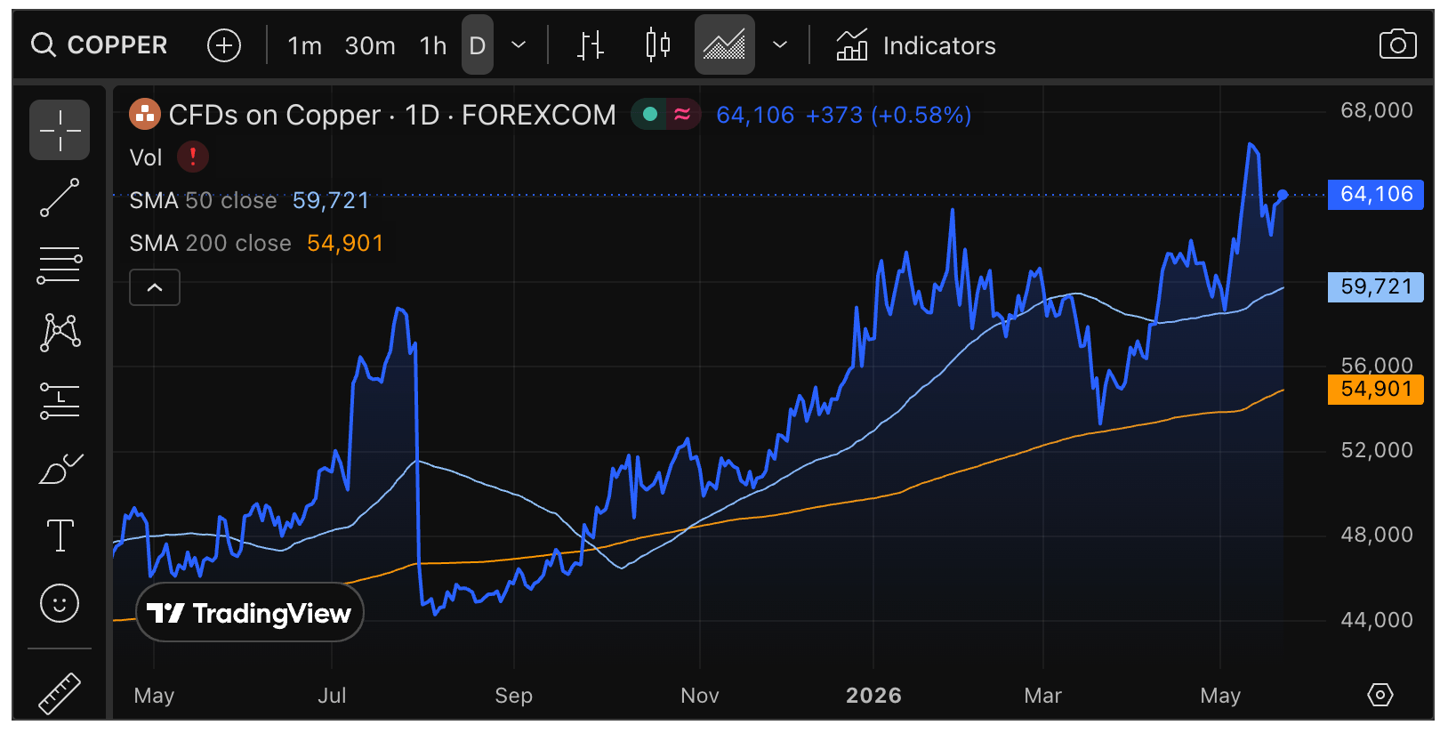
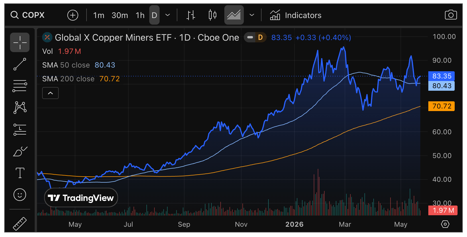
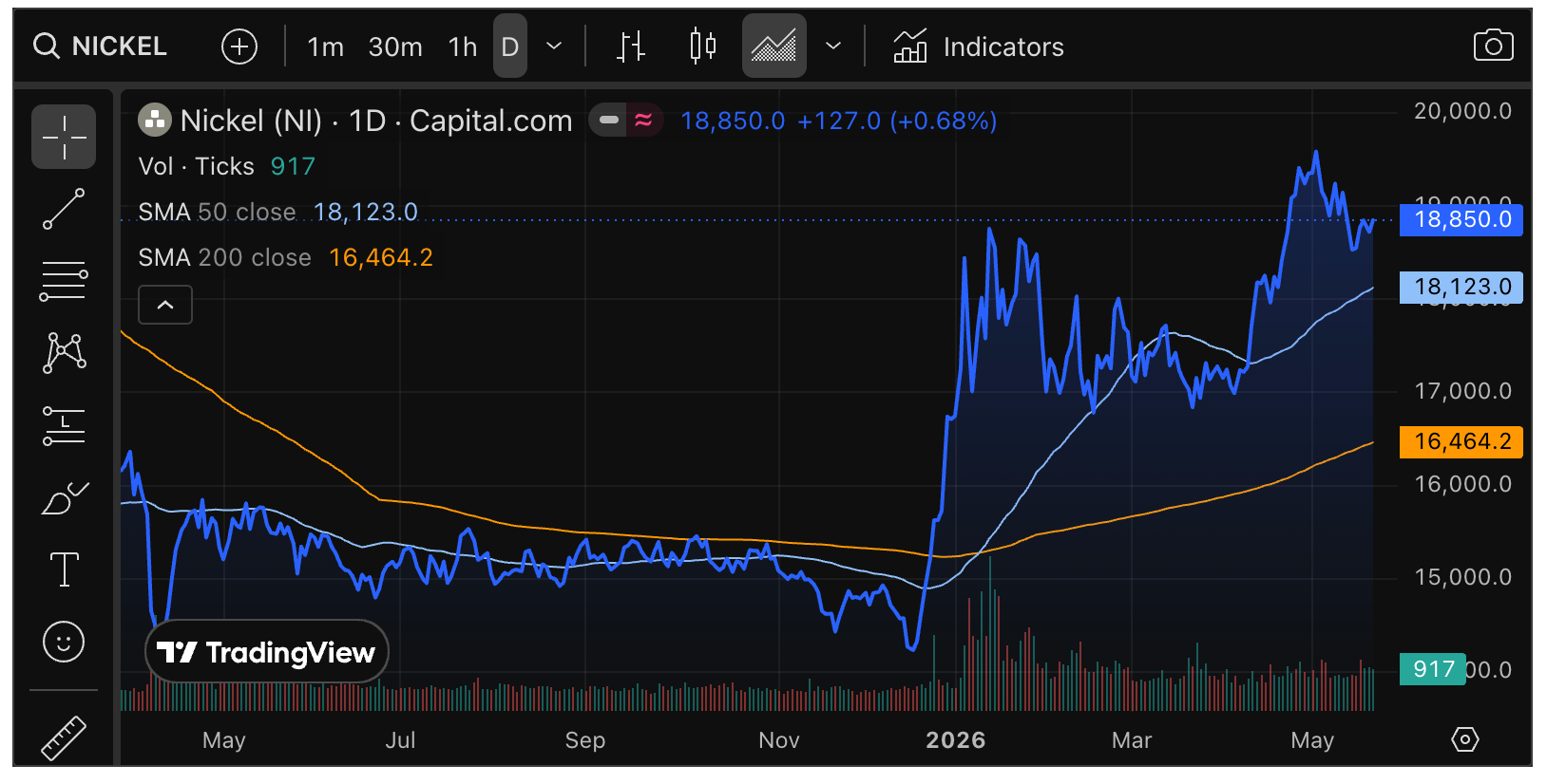
Above we noted the TSX-V/TSX ratio as an internal consideration to certain exploration stocks. It is also an internal consideration to the commodity sector and inflation trades in general. At the moment, it is suspect. However, as you will see below, some commodities – especially industrial metals – are in fine shape.
So too is the nominal TSX-V, which needs to hold the 950 area to avoid further damage to many of its mineral exploration constituents and the wider commodity/resources trades.
Copper is flat out bullish. It is a rebuilder of traditional (and war torn) economies and technological economies, with critical mineral aspects.
Copper Miners completely intact to the uptrends. I am covering Cu stocks thus far with ARG.TO and the Copper Miners ETF, with an open mind on others.
Nickel continues to look like it has left its bottom-making behind as it climbs its 2026 uptrend. I may have to cast an eye toward adding more TLOFF (TLO.TO) and seek others.
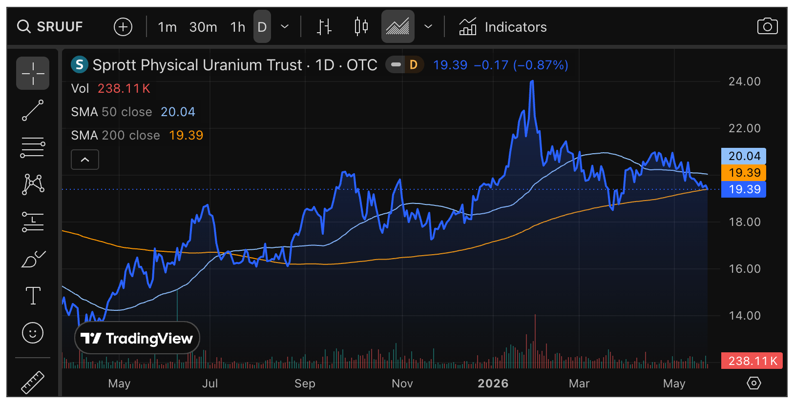
Uranium is having trouble again. Personally, with the supply/demand consideration it’s got going for it, I can’t see why. But it’s the markets. This could be the limit to the downside in the u3o8 holder. But lose the SMA 200 and the previous low and it would be that other, more painful thing.
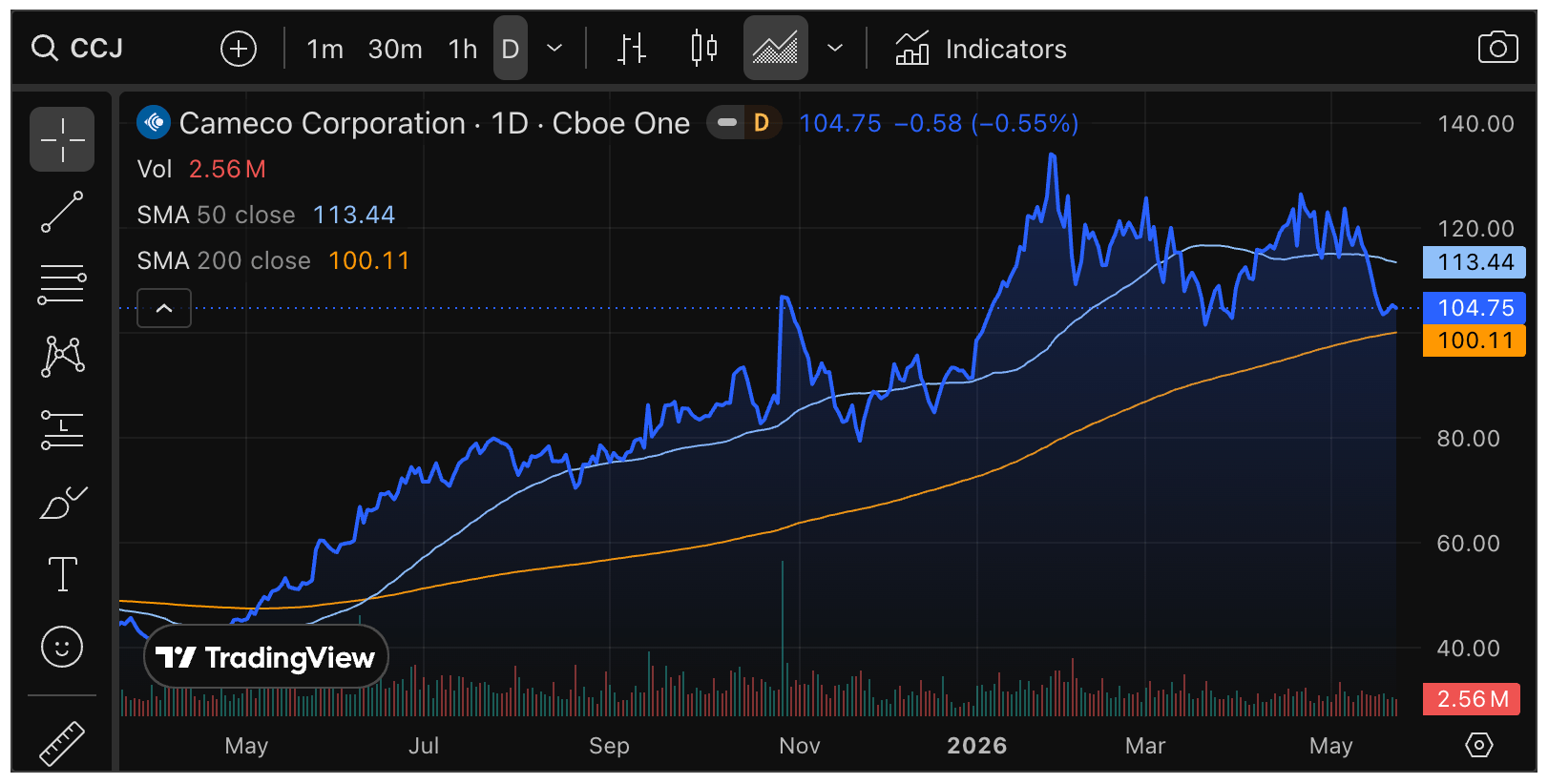
I did add CCJ to my “savings” account, where I will try to put a few stocks that I think are more stable, needing less babysitting. The Portfolios segment will simply provide a snapshot of those holdings, with no discussion.
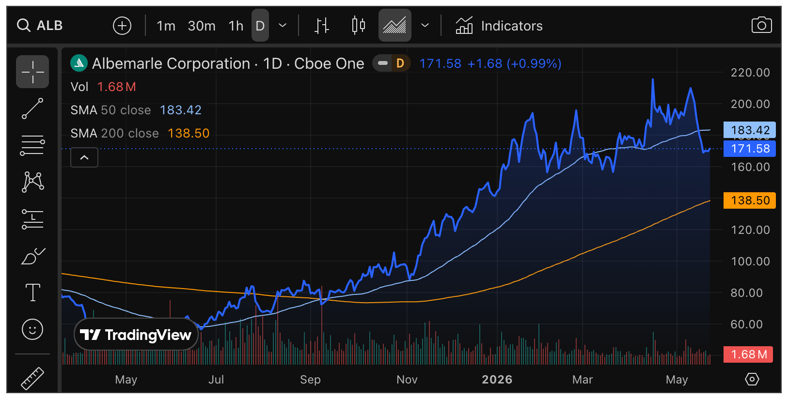
Profit was taken in SLI, so I have no current Lithium exposure. It, along with LAC and big boys ALB and SQM are on watch. If ALB holds above the March low I may be interested. But for our purposes it’s a proxy for the Li patch.
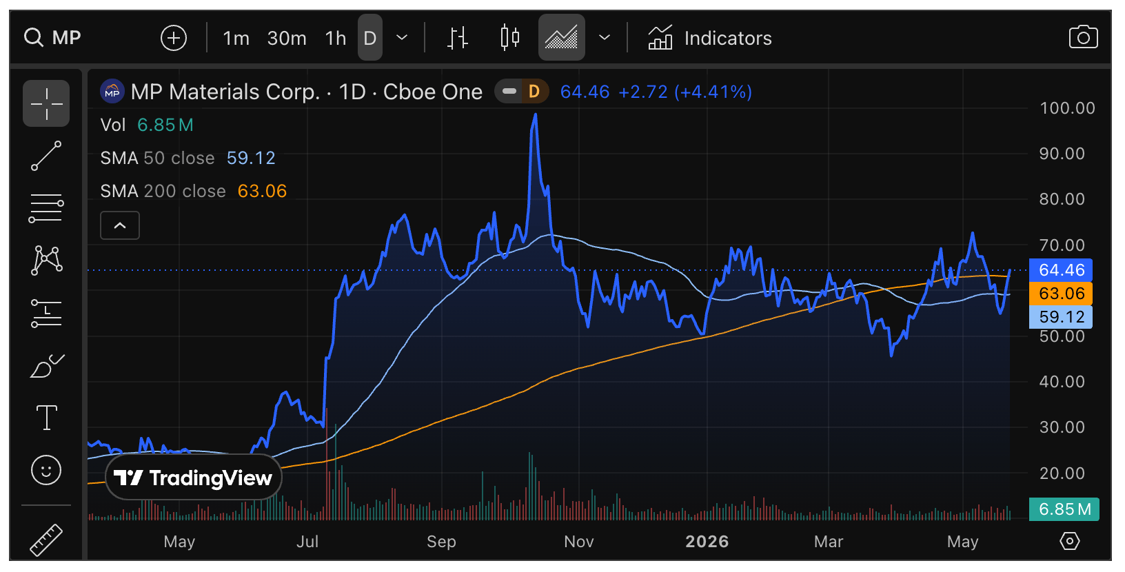
Over in REE, MP is the primary play. It’s chart is attempting some repairs. I have it in my “savings” account.
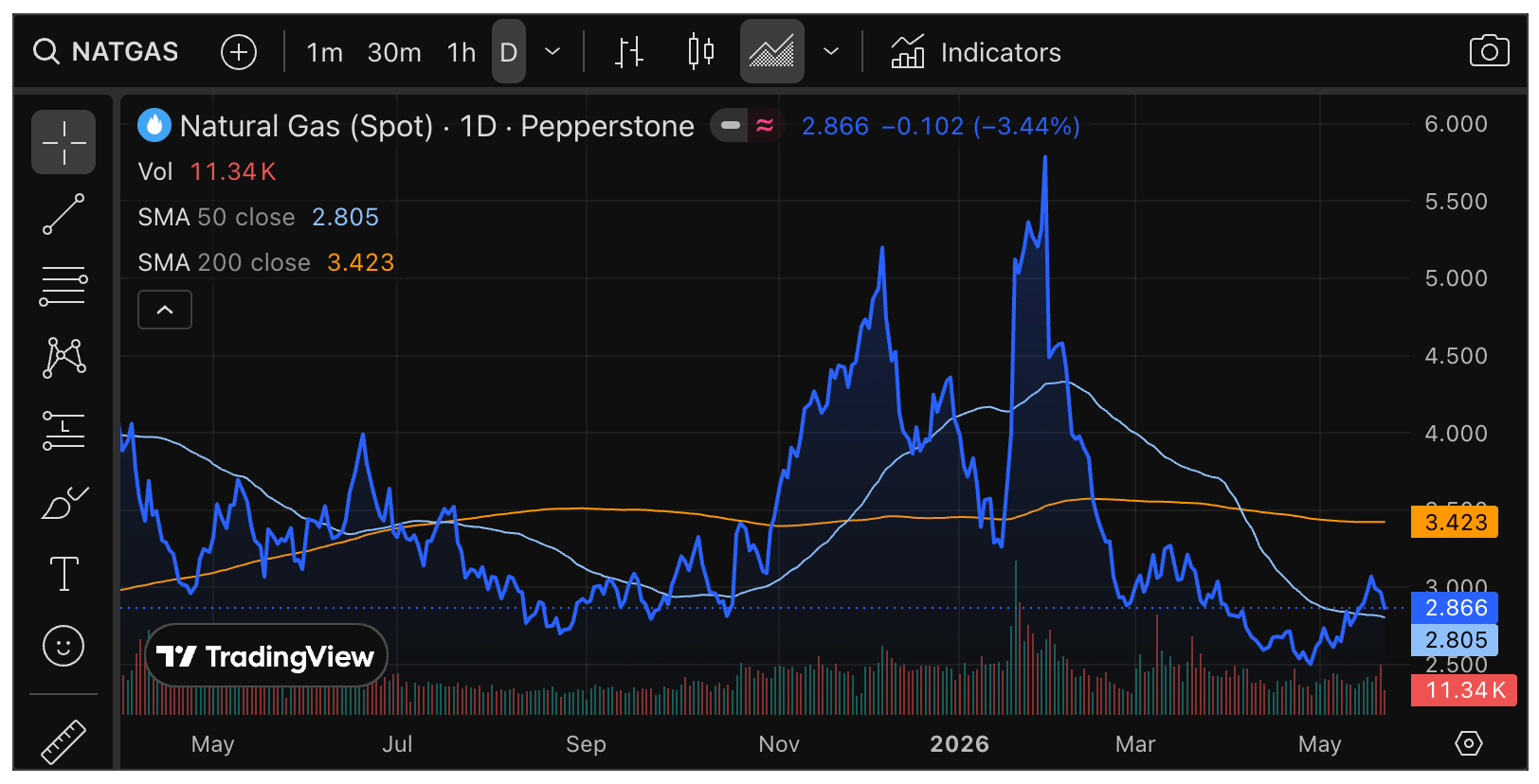
NatGas is its own animal. Sometimes affected by the war, sometimes by supply stocks and often by the weather. I hold EQT and AR for the prospect that April-May might be a solid low.
Finally, the problem child, Oil. WTI crazy volatile now with the war’s wax-on/wax-off routine with respect to cease fires, the SoH and negotiations. All I will say is it’s in a wild consolidation. Within that consolidation the bulls have the ball. We can, however, watch to see if it turns into a topping structure. Regardless, I have zero interest in oil or oil related stocks at this time.

–
Sentiment
In closing, I did not get to sentiment and I am out of time on a busy weekend.
Fear/Greed index is still in a mushy middle, ticking barely out of Neutral in Greed.
NAAIM is 82% bulls. A mushy and moderately bullish reading, but actually lagging the market’s price.
AAII backed off from 39% to 32% bulls.
The bottom line is that sentiment structures are about what they were. Mushy bias toward over-bullish, but certainly not to levels that would be deemed extreme. Permissive of more bull.
We will most likely take a closer look at more sentiment indications next week.
Portfolios
Gold is long-term risk management & monetary value/stability in a balanced portfolio.
FYI, along with cash, here are the positions held in the savings account in order of size. Insofar as I hold stocks here, I will try to keep them on the less volatile and more established side (cough cough, AMEGF…).

Trading Notes
No positions.
Roth IRA (non-taxable, no contributions)
The chart shows a hold of support thus far. I will not pretend to know what is directly ahead in the news cycle. But insofar as it may affect the markets I am ready to get longer or less long. Or, if it ever becomes legal again, short.
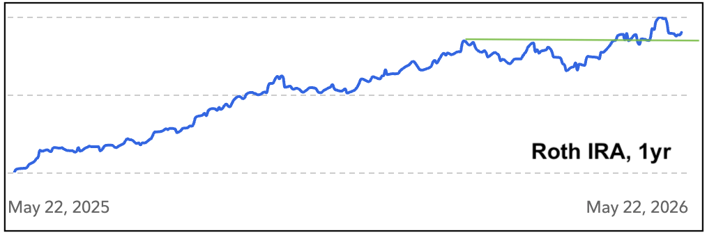
Cash is 74%. I am about set for now, pending incoming info, any trades, and a couple watch list items.

Cash & income-generating Treasury bonds are at levels that are right for me and my real-world situation. Your situation is different. Cash will be adjusted as needed.
Refer to the In-Week Notes under the NFTRH Premium menu at nftrh.com for market talk and occasional trading info, if interested. Also, you can follow on X @NFTRHgt for notice of updates.
NFTRH is not to be distributed to third parties without prior written consent
Notes From the Rabbit Hole (NFTRH) is a weekly market report in which we provide analysis on financial markets. We make every effort to provide accurate and high quality content, but this analysis ultimately represents our opinions and these opinions are provided without warranty or guarantee of any kind. See full terms & conditions of service under the ‘About’ heading in the main menu.
