
Summary
US Stock Market: Further pullback potential was not realized last week. Instead SPX & NDX bounced to test the earlier highs, while SOX lagged. SOX > NDX > SPX leadership chain still intact. So is the potential for a major double top.
US Market Sentiment: Gross over-bullishness continues to be bled out with a curious pullback in BOTH smart and dumb money indicators. II, NAAIM and AAII are all over-bullish but twitching nervously. Usually, a real market top does NOT occur with dumb money pulling back.
Market Indicators: See the segment below this Summary segment. I wrote way too much about the indicators and am too drained to repeat here.
Inflation/Deflation: Also see next segment…
Global Stock Markets: We take a look at some areas that could play catch up if the world stays anti-USD and USD and Gold/Silver ratio turn down. Caveat is the bullish looking GSR.
Precious Metals: The pained rally theme is still intact, holding its daily chart parameters last week before a good pop on Friday. Silver is the most suspect and needs to hold and get above its daily moving average resistance. Bigger picture, if the rally continues as planned we continue to look at a likely ‘sell’ at the top side of the HUI downtrend channel (280 to 300 area). Meanwhile, there are viable measured targets of 2400 gold and 35 silver if these items clear resistance.
Commodities (per last week): We have a very preliminary theme developing that could see an interim up tick in inflation signals. Considering how far bond yields have dropped, there could be room for an interim inflation trade featuring commodities and resources. This is a very preliminary view and is in part the product of your letter writer checking himself from becoming ‘perma’ in his disinflationary/deflationary view.
Currencies: USD is the anti-market to most asset markets. It is stuck at resistance. But with the constructive Gold/Silver ratio at its side it is recommended to have a level of caution until such time as these two may reverse.
Bond Market, Gold, Yield Curve and the Changes to Come
While it is far from the only important indicator for the markets, the Treasury bond yield curve (10yr-2yr) is very important because it takes what is probably the most important market for macro signaling (the bond market) and gives us a view into the dynamics between short and long-term yields. In the bond market, duration means a lot.
For one example, long-term bonds are much more vulnerable to inflation’s negative effects than short-term bonds. Short-term bonds also act as a liquidity haven during deflationary market crises. Long-term bonds can work quite well during disinflationary times and pay out better income than short-term bonds, but in a full out deflation scare when the very system (and its exponential debt load) comes into question insofar as you want bonds, you want short-term (in my experience 1-3 year Treasury, T-bills and Treasury Money Market). In other words, relative safety.
From an American perspective, as long as the government says that stuff is safe it is safe. As long as the government is intact and functioning, that is. But it is only safe because of the fact that the governing body of a society long past its shelf life of sound monetary management says so. Otherwise, it’s a government operating under the dual pressure of unpayable debt (short of attempting to inflate it away) and waning confidence – with the first overt sign of revolution occurring on January 6, 2021.
So, short-term Treasury bonds are safe. But short-term Treasury bonds are not really safe, are they? They sure are not gold in that regard. Unlike the trillions in debt attached to the US and many global bond and currency markets, gold has no such liability as it pays no income and is just an old rock that ancient societies used as money. It had stability in its finite quantities and the fact that it was no one else’s debt. Today it is just an anchor within the storm of modern finance and in a storm you probably want your boat to be well anchored lest it be tossed to and fro and cast upon the rocks as wreckage.
But the bond market is absolute gold as a macro signaler. Look no further than the Continuum chart we have used over the last 15 years to identifying the correct macro backdrop at any given time. Since the 1980s, and until 2022, that backdrop was signaled to be disinflationary by definition of the gentle, robotic trend downward in long-term yields.

To review…
- While the entire history is not shown on this chart, the downtrend goes back to the 1980s, coming off the Volcker panic-hike regime of the 1970s after inflation got well out of control.
- Downtrending bond yields (uptrending bonds) signaled ‘nope, no inflation problems here’ (reality might have had a different opinion, but we are talking about the signaling of a heavily manipulated market) and this was implied license for big brained Fed chair people and little brained politicians alike to create policy to inflate the system at all points of stress, let alone crisis.
- For many years we used the now-green moving averages (which can now be viewed as support for the new macro) as resistance to changing the macro. Those MA lines used to be red as were the arrows. They were the backbone of the long-term disinflationary trend. In 2022, something broke and in my opinion, it was a profound move that we are tasked with interpreting correctly, now and in the coming years. The decades long disinflationary trend by which inflating policymakers were given license, is over.
- In my opinion, if they try their old tricks on bond yield pullbacks (e.g. the big pullback we’ve seen over the last few months or even all the way back to the moving averages) the efficacy is not going to be the magical and heroic kicks saves of the past.
- The implication of the bond market rebellion of 2022 is ‘Enough!’ In my opinion a saturation point was hit and the bond market could not sop up anymore of the chicanery (i.e. inflationary bubble making by policy).
- The inflationary signaling of the broken Continuum does not mean inflation as far as the eye can see, however. It may mean that new deflationary episodes met with dovish policy response will no longer work as effectively as it did over previous decades. Again, the bond market says the system became choked with inflation manufactured from debt.
- At best, new inflationary phases may be more corrosive for more aspects of the economy and/or benefit a different set of assets, like precious metals and commodities critical to social progress (thinking Uranium, Copper, Rare Earths, Lithium, etc.). There is always a need for food/Ags as well. Ah, yes there is.
- Now that long-term yields have shown their hand I would no longer bet on real estate as a good long-term investment. RE was stellar during the Continuum’s intact phase. In the future? There could be quick bursts of optimism on yield declines, but if the new macro holds we may not see sub-3% again in some of our lifetimes. This could grind at real estate over time.
- However, a new macro may cast its net globally to emerging and frontier markets, many of which are rich in natural resources, including precious metals and commodities. In essence, we might also speculate about the possibility that the world (everything bubble) is not ending but instead, is shifting… away from the over-financialized western complex that has benefited from remote monetary management (bond market manipulation), to markets that have lagged during the era of financialization. We’ll look at a few charts of EM, Asia and the Frontiers in the report below.
Yes, I realize that just above I sound like the BRICS-promoting/De-dollarizing people I sometimes criticize. But the criticism is only for the ‘perma’ nature of those promos. There is a thing called timing and another thing called activation. On a big picture, measured over years, the shift in the macro may shake out per the above.
Here we have the yield curve (10yr-2yr), doing as expected and breaking upward from the latest consolidation that gave Goldilocks a new bounce in her step as silly Santa season came to an end in December. The steepening yield curve can come under pressure of deflation or inflation or, over the course of an extended steepener, both at varying times. What it will do is signal to Dorothy that “we are not in Kansas anymore” and likely signal pain for herds of trend followers most recently conditioned by the previous flattener into inversion. That pain could come deflationary or inflationary. It’s the steepening that tends to hurt Goldilocks, one way or the other.

Very generally, remember that a curve flattening comes with an economic boom and a steepening comes with a bust. The flattening of the curve had implied policy makers in full control and inflation a waning problem, as short-term bonds were not well bid in relation to long-term bonds. A steepening implies that short-term bonds are now favored. Short-term bonds are a liquidity haven, long-term bonds are risk.
As for the steepening, it is heading toward de-inversion. Remember now that the media and mainstream economists have been touting the dangers to the economy of an inverted yield curve. Now that the curve has started to steepen might that not be part of the relief felt by today’s ‘happy days are here again!’ soft landers? All along we have noted that it is not the inversion that brings on the pain. It is the steepener that follows the inversion. But why let reality get in the way of good media stories?
The signaling by the yield curve is that regardless of whether it sticks to the deflationary view that has been our primary 2024 view or takes on in interim inflationary flavor (ref. Thursday’s public article) Goldilocks is destined to get eaten by 3 pissed off bears. Goldilocks dies when pleasant disinflation morphs deflationary and she also expires when it morphs inflationary.
Bottom Line
Changes are at hand for 2024. I don’t say so. The bond market says so. Our plan has been for those changes to be disinflation to a coming deflation scare. But the decline in yields since the October ‘call’ below :-) has been significant. For reasons illustrated in the article linked above we can also be aware of something unexpected by a majority (unlike a year ago), like an interim inflation trade.

The two 2024 (and beyond) options, based on the Yield Curve’s new steepener and other signals are:
- Interim inflation trades now, deflationary episode, and then in the coming years a bigger, badder and more global inflation in an age of war, unrest, social discord and shifting monetary systems from the monetized west to the commodity/resource-rich east and EM/FM. Cue the “Dedollarization” cult, I guess.
- Disinflation into deflation sooner rather than later (our original plan), followed by balls out inflation that again, will not benefit those areas (e.g. western stock markets) to the degree it has previously. Commodities, resources, precious metals and EM/FM could see a new era of out-performance.
US Stock Market
I took a short on SPX at the end of the day on Friday. So you might guess (correctly) that I hold open the possibility that the US markets are double topping here and now. However, after bull trapping below the January 2022 highs SOX and NDX bear trapped right back above them. SPX continues to lurk in a double top posture.
Our theme has been to expect a new all time high for SPX as well so that the good news may be trumpeted to the masses and breakout enthusiasts can finish FOMO’ing. So the short position could be very temporary. I am going to periodically poke this pig however, given the signals I seen in the Yield Curve among other things.

The Semi > Tech > Broad leadership chain is still intact and until it breaks down there is all the more reason to have caution on the likes of the SPX short position.

Let’s get a look at various sector trends using weekly charts. Use these charts for reference to the long-term trends.
SPY is at its ‘double top or new highs?’ decision point. If a new inflation trade manifests I’d expect Energy to hold its uptrend and participate. Cyclical Industrials, Financials and Materials are each constructive to bullish. Real Estate got a boost from the drop in long-term yields and would obviously favor that to continue. The chart looks to break the downtrend but again, yields will probably decide that.

Tech and Semi are doing their Tech and Semi things; leading the stock market out of Goldilocks/disinflationary 2023. Communication Services is actually a disparate group of industries centered around media and communications. It’s on a firm uptrend but still well below a ‘double top or breakout’ point. Cloud was a 2020 ‘stay at home’ deflationary star that got croaked by inflation and rising yields. Its base and rally are ongoing. Consumer Discretionary is very similar, while defensive Staples have robotically risen since October.

Defensive Healthcare has the same type of robo uptrend as defensive Staples. It implies a steady march by man and machine into the defensives (although a look at a chart of the XLV/SPY ratio would still show this defensive/caution indicator elevated of late but still within a downtrend). I think that Pharma combines defensive Healthcare with a lot of ‘value’ stock holdings, resulting in a firmly uptrending situation. Biotech ETF, not so much. Although it has popped nicely of late. At this time it is trying to break the downtrend. Trannies are bull biased. Defensive Utes are doing what defensive Staples did. These had been rolling over and then aborted said rollover and rallied in rigid fashion.

US Stock Market Sentiment
Well, this is a bit of a curve ball. Both smart and dumb indicators tanked last week while the market ended at its rally highs (and on the verge of an all-time high breakout, no less). Might the market wish to jerk these micro-twitchers back with an all-time high FOMO? It might. Had players chased the price upward I’d have more short-term caution (I’ve had longer-term big picture caution for quite a while now). What are the chances that dumb money was right to fade the new high? That’s not usually how it works. Usually, dumb money will be eating a new high.

Investors Intelligence (Newsletters): At a robustly over-bullish 3.07 Bull/Bear ratio on 1.9.23.
NAAIM (Investment Managers): Still ‘depressed’ at an over-bullish reading of 80%. Depressed compared to the previous hyper bullish reading of 102.7% a couple weeks ago. NAAIM has gone from 102.7% to 71% to 80%. Over bullish, but a little skittish lately.
AAII (Ma & Pa): A still over-bullish 2.01 Bull/Bear ratio, but down from an extreme at 2.6.
The indicators above show generally over-bullish but skittish sentiment. As if everyone is ready to react to a market top that never comes. That includes your letter writer if he’s being honest. But a market top usually does not come with so many people vigilantly watching for it.
I’d interpret the data above as big picture dangerous as it has been, but also as having the potential to fuel another leg up in the markets. That is the short-term. The bigger picture continues to advise that complacency is embedded and some day that will matter. The VIX is rarely more sound asleep than it is today. Sleep comfortably little bulls.

Global Stock Markets
I’d like to try something different and focus only on markets I am considering positioning in if the macro takes a swing toward the inflation trades as speculated upon recently. If the anti-USD ‘inflation trades’ do manifest even for just an interim trade-able rally, some global markets could benefit and play catch up. Namely, Emerging and Frontier markets and some of the less traveled Asian markets.
As a side note, China (FXI, ASHR) shows no technical inkling yet of getting on the rally train but boy that is some serious punishment that could be like a flame looking for kindling in 2024 if the global macro holds together indefinitely.
Each of these charts is postured with a neutral to bullish bias, in patterns that could easily resolve to the upside if USD were to decline again. These markets are notoriously impaired by a strong US dollar. Many EM and FM are resource rich, as are parts of Asia. If you are a “dedollarization” adherent and an equity investor, you would be scouting these areas for inclusion in a diversified portfolio. Mind the “IF” however, where a US dollar correction is concerned.

For reference, here are the geographical breakdowns of the three items above.
EEM

AAXJ

FM

One global market I still cannot stop watching (yet have failed to take action on) is Japan. If you favor Japan and think that the Yen has bottomed, EWJ would be a good way to go as it is not Yen hedged. HEWJ or DXJ are the ETFs that hedge out the Yen’s influence. Were I to buy Japan, and it appears little late for me personally, I’d do EWJ because I think the Yen has had enough downside, possibly double bottoming in 2023 amid positive divergence by weekly RSI and MACD.

Personally, if USD does drop anew and I do decide to go global I may just as soon pick individual stocks. But the above vehicles are viable as well. Other interesting charts are Singapore (EWS), Taiwan (EWT) and other regions likely to do well in an inflation trade backdrop would be Latin America (pick your countries carefully).
Meanwhile, over in junior resource/commodity land, the TSX-V is thus far successfully flagging at short-term support and as such is still eyeballing our primary target at the downtrending SMA 200 (580) and secondary target above that at 595. Da ‘V’ would be a guide for a lot of those smaller more speculative juniors (like the ones populating the bottom section of my portfolio below) and outright scams alike. The forward view was post-tax loss silly season, after all. This does not mean the situation is bullish. It means that a rally was likely and it is still technically ongoing.

Precious Metals
As you can see, the Commitments of Traders for gold and silver are as we’ve been calling them; far from contrary positive but also not a clear bull killer either. At last reading on Jan. 9, gold’s price was pulling back as was the speculative CoT, while commercials covered a couple shorts. This came from a bullish extreme compared to 2023, but not compared to 2022 (or 2020 for that matter).

Silver got a little froth taken off of it as well.

The bottom line on CoT is that should the sector break bullish (with its technicals still intact for that potential) the CoT could go from contrary not positive to a contrary ‘sell’. This could happen with our targets of GDX 40, HUI 300, silver 35 and gold 2400. Extrapolating this projection further, a correction from these levels could be harsh as the broad market finally makes a top and takes the bear.
The paragraph above is not analysis. It’s a projection. A logical chain of potential events seen in a crystal ball. Nothing more. In other words, a sequence of educated guesses.
Gold Miners Bullish Percent continues to show the situation is not overbought. After all, until Friday’s burst this was one heck of a lagging sector. Even if it remains in a bear trend a top would be expected to be higher than current levels.

HUI/Gold ratio is either painting HUI as overbought and vulnerable (ref. red shaded areas) or it is preparing to take another leg up in an uptrend in play since November. I am leaning toward the latter. But the lag in the HGR is another reason the sector could be a sell if it rallies to projected targets. As long as the ratio and nominal HUI hold higher lows to the previous (Dec.) low, we’re on an intact rally plan.

Gold is getting drubbed vs. US stock market headline indexes. And so my friends, the decades old bubble (by policy) is still intact. On the positive side, Gold/Oil has given the gold mining industry a potential tailwind this earnings season and the Gold (counter-cyclical)/Copper (cyclical) ratio is trending up and bullish (bearish for the global economy).

We have shown how Gold is actually trending up vs. the median stock (Value Line Geometric index, XVG) and it is also much better vs. small cap stocks than it is in relation to headline indexes. So along with gold’s relationship to commodities, we can add outlier aspects of the equity markets to the ‘improving fundamentals’ picture. But the bubble was blown to allow the headliners (SPX, DJIA, NDX & even SOX) to puff out their plumage and prove to the world that stocks always win. Always, except after those all too rare occasions when bubbles pop.

Gold’s daily chart remains bullish, if you don’t look at the ugly (though positive) RSI and MACD.

The bigger picture for gold could not look more bullish to my eye, when viewing the log scale monthly chart.

The linear scale version is not bad either. Like, very not bad. In particular, that monthly MACD has a long-term implication of much higher prices (perhaps after a theoretical correction from 2400 after a theoretical rally from current levels). To more seriously engage these theoreticals, we’d want to see the daily chart above take out 2100 and keep it taken out.

Silver (daily chart) needs to get its ass in gear. Friday’s pop was nice, but it did not help the technicals, which have been fading. Take out the moving averages and rally and our target of 35 (per weekly chart pattern) would come into play as a reasonable objective.

We had a simple video update on the cut and dry daily chart technical situation for GDX on Friday morning. It’s only 3 minutes and shows the parameters we are working to. Here is an even simpler daily chart showing the higher low maintained. The linked update notes that the chart in the video does not include dividends. This one does and when factoring that, a higher low was neatly maintained, unlike the drop lower and upward reversal in the dividend-free chart. But the story is the same: hold that low and get above the moving averages to reactivate the pattern (and the rally).

HUI daily also made a higher low. But let’s use Huey for the weekly and monthly views. The weekly shows a solid hold of very important support and a rally trying to grind out of that. 220 looks like the key. As long as the daily technicals remain intact our eventual target is the upper line of the downtrend channel (first things first, the real bull market breakout from the channel may have to wait until after the broads top and bear markets in stocks become known to all). Meanwhile, if the bull holds sway in the near-term a rally from 230 to 280-300 could be very worthwhile indeed.

The monthly chart situation by log scale continues to be well intact.

And by linear scale it sports RSI and MACD that appear capable of breaking the index through resistance for a shot at the channel top. All of this could happen without a break to the next leg of the gold stock bull market that has been in progress since 2016 in the most volatile (and painful to perma-bulls) way possible.

Let’s end the segment with a daily chart showing the various ‘tax loss seasonal’ Amigos (speculations). Each of these are held for the post-tax loss seasonal play, although MAI.V may turn to something more if/when it receives its permit to expand its operation. These are generally in tow with the still rallying TSX-V index.
MAIFF was increased last week and maintains a constructive bottom/base breakout view above the moving averages. AMXEF is similar above the SMA 50 (but below the SMA 200, not shown). IAUX was bought back on a hard pullback to a higher low after it was unloaded on the previous rally leg. That higher low must hold. Finally, sneaky LGDTF is hanging around in consolidation with a higher low needing to be maintained there as well.

Commodities
If we are constructive on the TSX-V (Global Markets segment) to continue to bounce, the same could be said for the commodity complex. But CRB index is still trending bearish from the September high. Note that a weekly chart would show an ongoing consolidation from the 2022 high that could yet turn out to be a long bullish flag. First things first; the daily needs to activate by taking out the SMA 200 at 272.
WTI oil has been the culprit, yet I continue to hold USO for seasonal, sentiment and technical support reasons per a previous NFTRH+ update. Gas is making a strong move and I am ‘this’ close to adding AR back as its own chart is sporting a bouncy look after a harsh pullback.
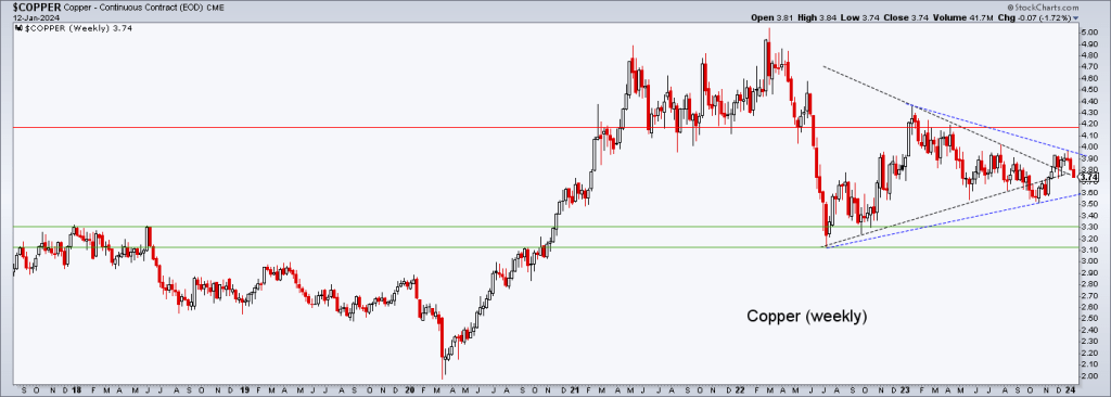
Industrial metals, including copper, are laggards of late. You would think that if the macro flips to an inflation trade they would participate, along with the still bearish Ags.

As for copper, the weekly chart shows that the high made on the breakout (and subsequent failure) has created a new symmetrical triangle. If you are a copper bull (or bear) I guess that extends your waiting game for the bullish or bearish outcome. Personally, I have marginal interest in the copper sector at this time.
What I do have interest in is the Uranium sector, which I screwed up on by taking a premature (and reduced) profit in URNM, getting shaken out before this hysterical up move. Luckily, I had added the lagging UUUU shortly before the move. But while it exploded upward too, its chart is less impressive than its Amigos. This owing to an REE acquisition (I do like UUUU’s dual product situation as well as its recycling and processing capabilities).
As for those holding the sector, it looks like a launch to a coming hysterical top. But that top could come much higher depending on animal spirits and momos that may jump the sector.

Finally, here is the chart with some bottom feed, post-tax loss seasonal specs. In the bigger picture, MP is much more than a spec to me. It is strategic for its US Rare Earths production. Again, ref. NFTRH 786 for the details of the case for MP. Of note the top and long downtrend in MP’s stock price during a phase when its product materials are up in price from 2020.
I am keeping an eye on the Lithiums (ALB, which has pulled back to support)and ALTM, which is the combo of Livent and Arcadium. I’d consider SBSW, perhaps only if I don’t add PALL back.

Here is that chart of Pd fund PALL, still in pullback mode after filling the gap and re-testing long-term support.

Currencies
Note that USD – the anti-market to most of the markets noted in the report above – is still on its bounce but also still below the targeted resistance (with an allowance to the SMA 200).
I’ve shaded a pattern that could spike USD to a lower high to the December bounce high with a temporary break through the moving averages. But below resistance is below resistance. So unless you have firm macro-fundamental conviction one way or the other it would pay to have some patience. If USD were to fail here we’d probably start managing a new low target below the ‘bear trap’ low.

Meanwhile, aiding USD would be a continued up move in the Gold/Silver ratio. Especially if it becomes impulsive. The combo of these two impulsing upward would likely wreck the macro sooner, not later. It sure would take talk of near-term inflation trades off the table.

Other currency notes:
- Gold continues to trend upward in all major currencies.
- Bitcoin dropped hard within its consolidation pattern, but thus far this hard drop is only testing the uptrending daily SMA 50.
- Gold is of more inherent value than digital/paper currencies created to back the debt of developed world governments.
- Gold is more readily understandable to older folks like me as it is ripped out of the ground, is processed into a pretty chunk of metal that is heavy in my hand, whereas Crypto-currencies are (IMO) a speculation that is ‘mined’ and stored on servers, making it a great tool for robbing naive old people and evading governments (I guess).
Portfolio
So that note on gold reminds that I have my balance in place with a heavy rock vs. paper assets.
Roth IRA (non-taxable, no contributions)
Cash is 79% and there is one bearish hedge position in a fairly well risk managed portfolio that is still in the game for a seasonal rally. If USD fails and the signals are positive for the rally I’ll get more in the game. If it goes the other way I’ll go the other way and raise cash just as high as my little heart desires.
If the move on Friday was a precursor to the next leg of the precious metals seasonal rally however, I’ll continue to cobble new positions with the HUI target of 300 (+/-) in mind. As for the other stuff, I hung on to SMCI, a second nice trade in the making in the Semiconductor area, TENB in Tech (Cloud security), crude oil (with an eye toward XLE, AR, NOG, etc.), biotech value GILD and biotech spec CDTX. BioPharmas ALNY and AMLX primarily on watch. Yeah, DVAX too I suppose.
Let’s see this week whether Friday was the re-start of the seasonal rally – especially for commodity/resource/PM related stuff – or perhaps a bounce before failure if the Gold/Silver ratio pulls USD upward. The yield curve can steepen under inflationary or inflationary pressure, after all.

Cash & income-paying Equivalents are at levels that are right for me and my real-world situation. Your situation is different. Cash will be adjusted as needed.
Refer to the Trade Log under the NFTRH Premium menu at nftrh.com for trade info, if interested (not that you necessarily should be). Also, you can follow at Twitter @NFTRHgt for notice of updates.
NFTRH is not to be distributed to third parties without prior written consent
Notes From the Rabbit Hole (NFTRH) is a weekly market report in which we provide analysis on financial markets. We make every effort to provide accurate and high quality content, but this analysis ultimately represents our opinions and these opinions are provided without warranty or guarantee of any kind. See full terms & conditions of service under the ‘About’ heading in the main menu.