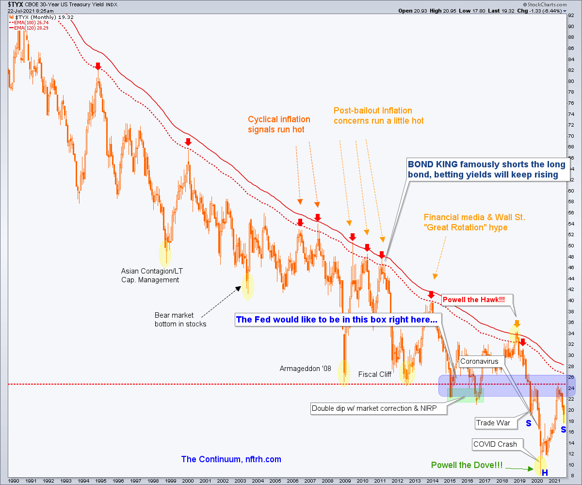
The way it is shaking out as I see it, it’s the 30yr yield Continuum’s right side shoulder (which, if it manifests and turns upward would be consistent with new inflationary pressure) vs. the 2 riders of global liquidity destruction, USD and the Gold/Silver ratio which, if they continue upward would signal pervasive corrections (at worst) or Goldilocks and its ‘not too hot, not too cold’ economic backdrop (at best).
As noted in a post on Wednesday I am wondering if that was it, the summer cool down, with a renewed inflationary backdrop soon to engage. The Continuum is right there and postured for the original plan to follow through, as the right side (would-be) shoulder remains fairly symmetrical with the left.
Check out the monthly Hammer candle in the making. As originally projected a year ago the rise in long-term yields went along with the inflation trades and if the picture stays intact I think it will do so again (and likely eventually morph to what the public would perceive as ‘bad’ inflation AKA Stagflation).
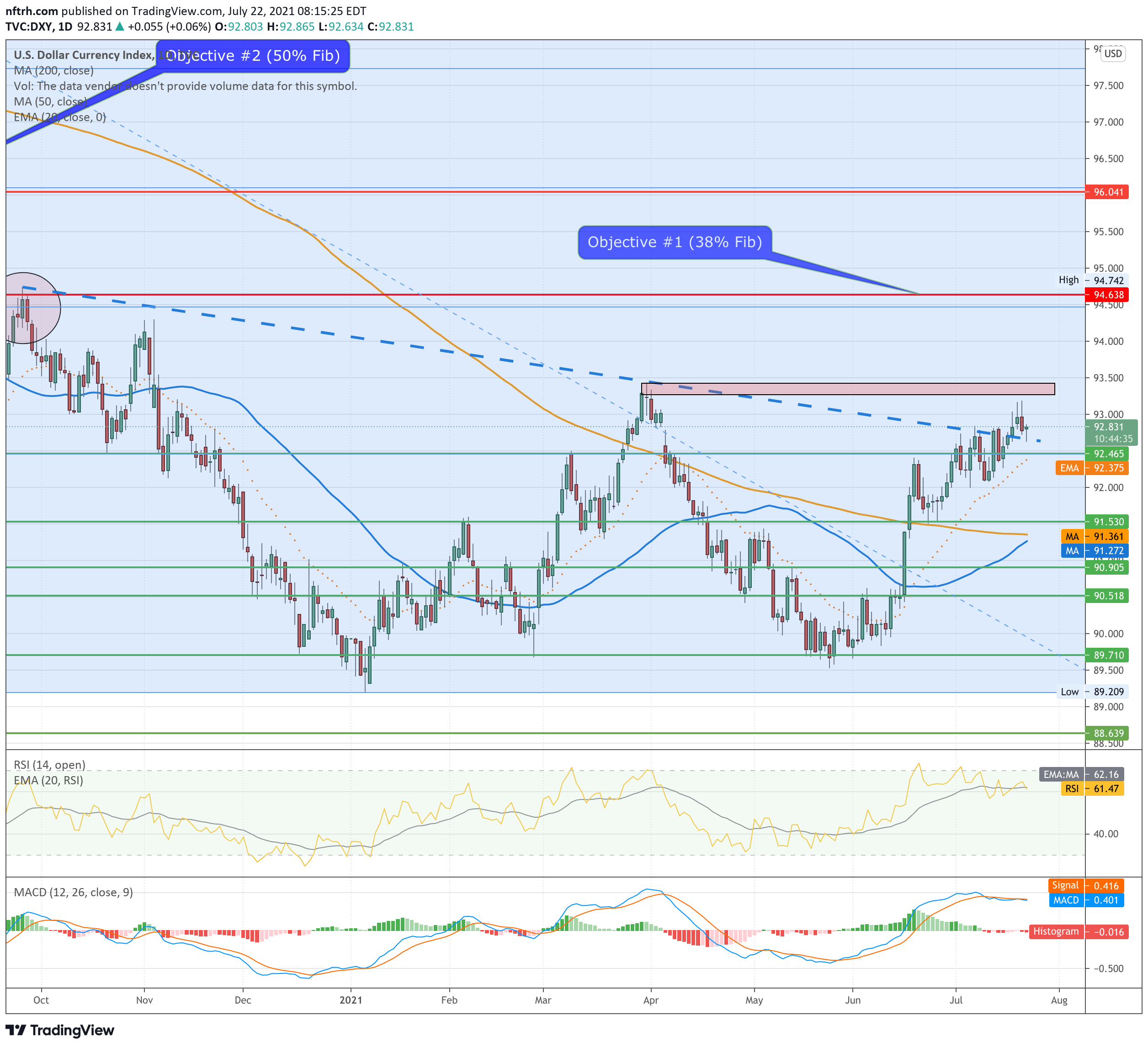
Standing in the way of this is the anti-market, the US dollar (DXY) which hit the resistance of the March high, recoiled a bit and is now testing the neckline breakout. This means only everything in my opinion because it was that neckline breakout that set our sights on the March high and then the targets above.
Side note: I had originally called the 62% Fib target #2 because I got wrapped up in the inverted H&S measured target, which roughly coincides with the 62% Fib. But here I’ve added the 50% Fib level as well, which also comes at a resistance level defined as the March 2020 low.

Dialing in the neckline retest view.
Finally, the USD’s companion in the liquidity removal game, the Gold/Silver ratio is fading to test the SMA 200 after breaking above it.

Bottom Line
To put it in simple terms, this view of the macro pits the inflation-bullish view of the Inverted H&S on the 30yr yield’s monthly chart vs. the Inverted H&S on the USD’s daily chart. You can also read a double bottom into USD on a weekly chart.
The wild card is the Gold/Silver ratio, which acts as a warning of weakening market liquidity when it rises. Usually such a rise means widespread price pressures on asset markets, although an exception – at the hands of Ben Bernanke and Operation Twist – was an extended Goldilocks environment in the US from 2013 to 2016. I see that as a blueprint for MMT, now used so handily by the Fed and a signal that there is nothing they will stop at to try to manipulate markets to desired outcomes.
I’ll continue to lean about 60% to 65% toward the inflation view from here. But not until at least one or the other of the USD and the Gold/Silver ratio fail in their attempts to rally while the 30yr yield continues to rebound will that view gain stronger conviction.