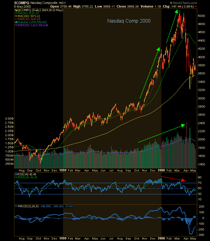
The Nasdaq bubble popped in 2000 after motoring upward on increasing volume in two separate phases. Volume rammed upward and RSI diverged. Like shootin’ fish in a barrel it was, except that at the time I was too inexperienced to see it. It was a steep slope and blow out.
The 2006 bubble in copper made a consolidation and a steep slope and blow out of its own with a little help from rising volume, but nothing like the above. No notable divergences here. The inflation trade of the time was starting to rotate, and rotate commodity herds did…

…to Uranium for instance. This one had 3 separate pumps to the top with volume surges on the first two and lamer volume on the top, which like others is a near vertical slope.

Then came the PEAK OIL!!! induced mania and bubble. Pickens, take a bow. Martenson, take a bow. Who ever else was out front pumping, take a bow. You even had congress convening and trying to legislate oil speculators as if it were some sort of national emergency instead of a friggin’ play, a bubble. The volume surged, congress convened and the bubble, which never went vertical, finally expired.

Now for silver, which reached the fabled Hunt Brothers bubble high of 1980. Why, it was going to its next stop at 100/oz. and beyond, maybe even on par with gold (little brother Palladium has become Platinum’s daddy after all). Silver was a bubble in the spring of 2011 as Bill Gross shorted long bonds because… INFLATION!!! among other hype making the rounds at the time (of inflation’s dramatic blow out). A big time volume surge accompanied silver’s final drive to 50.

Okay, speaking of Palladium here is the current specimen. There’s the vertical price action, there’s the building volume and there’s the overbought RSI. Matter of time?

And that brings us to the current headline bubble du jour. Oh wait, it’s not vertical and volume is not building. What is the meaning of this??

Well just maybe this one is going to expire of its own bloat as volume continues to be less interested. It’s been supported by panic monetary policy every step of the way and since 2016, a heaping layer of fiscal (read: political) policy as well. The above are all daily charts showing the approaches to and crack at the top of the respective bubbles. SPX excepted of course, because it has not cracked.
This monthly chart shows that SPX has gone up in 3 major phases with what could be the final one in process now. In this view the current rally looks vertical. Hmm. RSI is diverging negatively, unlike some of the momo volume bubbles of the past. But again, my thesis is that the bubble is in the extreme policy propping it literally from 2008 to the current day.
It’s going to stop where it stops. Our targets have been 3200 and 3300, which SPX hit this week. There’s another up higher. But among the things I’d be looking for on the daily chart above is a short burst of volume and a short burst of parabolic activity. May happen, or as noted above the pig may just roll over of its own bloat (legacy and current policy is bloated beyond comprehension in support of this monolith to the folly of man).

[edit] Okay, can’t resist…
History shows again and again how nature points out the folly of man…
NFTRH has tracked and been on the right side of this rampage since it began on Christmas Eve, 2018. The above give some clues about what we’ll be looking for going forward because when this Godzilla gets pissed, he’s not gonna rampage through Tokyo. Been there, done that. He’ll have another city built too high on false hopes to deal with.
Subscribe to NFTRH Premium (monthly at USD $35.00 or a discounted yearly at USD $365.00) for an in-depth weekly market report, interim market updates and NFTRH+ chart and trade setup ideas. You can also keep up to date with actionable public content at NFTRH.com by using the email form on the right sidebar and get even more by joining our free eLetter. Follow via Twitter @NFTRHgt or StockTwits.